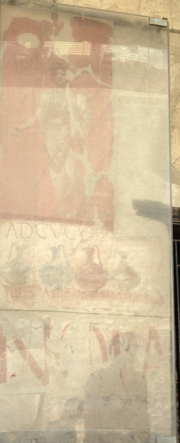
What scripts did the ancient Romans use? In the absence of a printing press, everything was handwritten, but we can still identify distinct scripts that were used for different purposes. It was square capitals (capitalis quadrata) for inscriptions on public monuments since the early imperial age, old and new Roman cursive for daily writing (shopping lists, inventories, birthday notes etc), and rustic capitals for copying out literary works.
We can only get a glimpse of ancient handwriting from the few surviving manuscripts from antiquity, such as the Vergilius Vaticanus (written on vellum, or parchment made out of calfskin), now in the Vatican Library, and from papyri excavated in Oxyrhynchus and Herculaneum. In Oxyrhynchus, the garbage heaps containing papyri scraps were covered with dry sand, preserving the scraps. Herculaneum, a town next to Pompeii, was encased in tuff after Vesuvius erupted in 79CE, preserving the papyri rolls in the Villa dei Papiri.
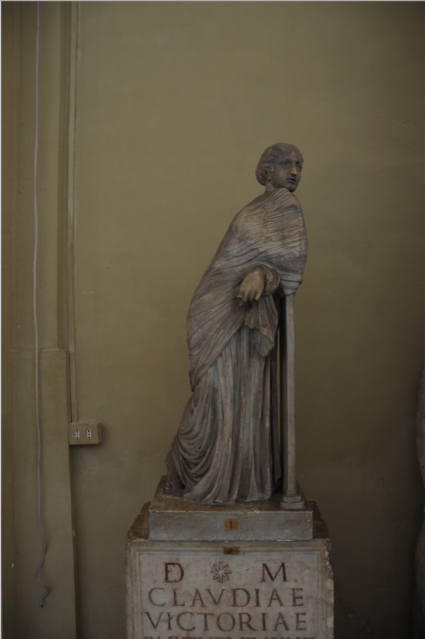
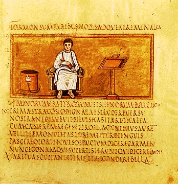
Rustic Capitals
Used for book texts, rustic capitals are easier to read than the old and new Roman cursive handwriting, but often written in scriptio continua, or continuous script without any spacing between words. Earlier examples, like De Bello Actiaco from Herculaneum have interpuncts, or dots used for interword separation, but they disappear completely around 150 CE, and word separation does not appear again until the Middle Ages. It seems that ancient Romans preferred having a stream of letters with no word separation aesthetically. Also, it was a status symbol to have an educated slave who could read texts without word separation.
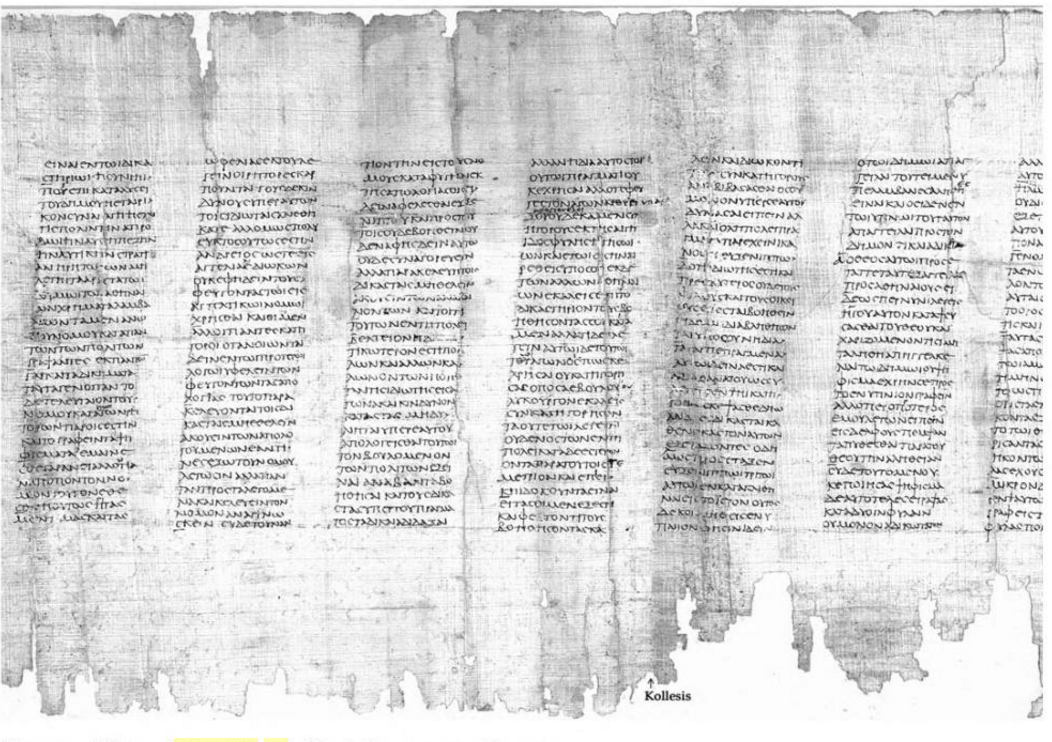
Consisting of straight lines and sometimes very narrow, the script would have been well suited for writing on rough surfaces such as papyri, although they were used on vellum as well, like the Vergilius Vaticanus. The forms are also majuscule, fitting between two lines, with no ascenders and descenders.

There is very little internal evidence to date rustic capitals. Manuscripts are few and far in between, and the stylistic features give little detail on when the text may have been copied. For the De Bello Actiaco, the subject matter suggests that it was written after 31BCE, when the Battle of Actium (between Octavian and Mark Antony) took place, and the eruption of Vesuvius in 79CE, but for other documents, dating is trickier: for the Vergilius Vaticanus, some of the miniatures accompanying the text are closer to landscapes in classical antiquity than the mosaics in S. Maria Maggiore, suggesting that the book was made before 430 CE.


Most of the examples of rustic capitals we have are pagan texts, such as Vergil, Terence and Cicero. Only one extant Christian text was copied out in rustic capitals, a copy of the four gospels (Codex Palatinus). However, as there are very few examples that have survived to the present day, it might simply be that the Christian texts that were copied in rustic capitals did not survive.
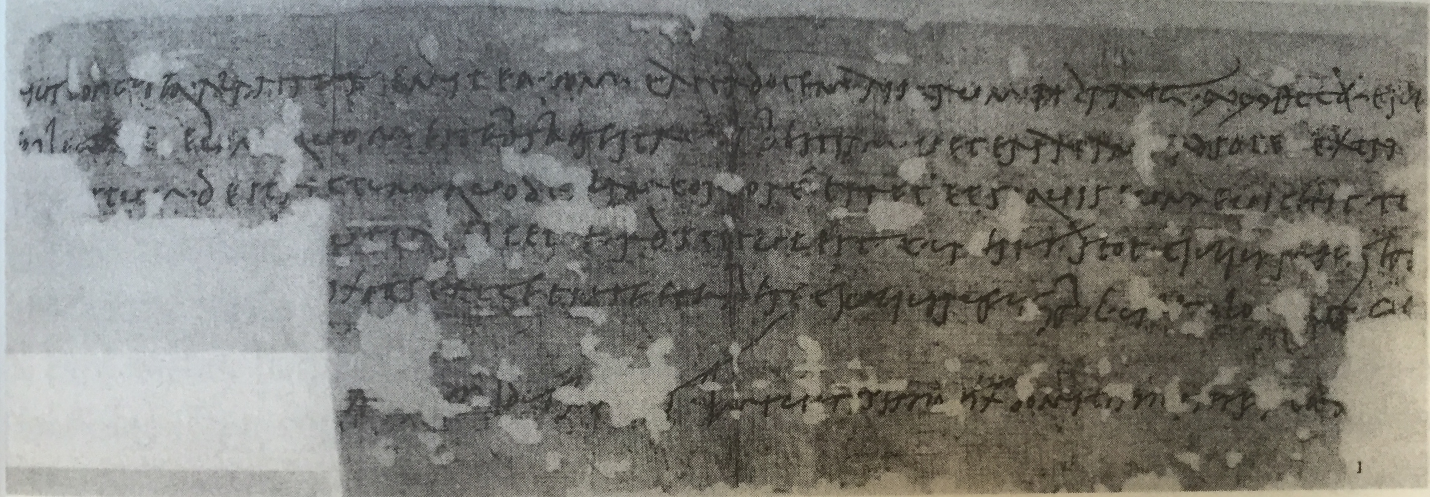
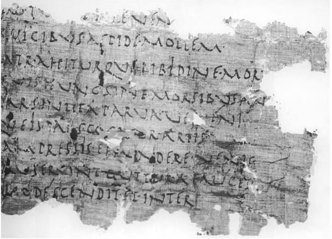
Old and New Roman Cursive
We were not the first people to complain about illegible cursives. The ancient Roman comedian Plautus wrote that 'unless Sibyl [female oracles] could read these letters, nobody can understand them' (Plautus, Pseudolus, 30). Cursive forms, where letters are joined to one another by ligatures, were mainly used in daily life, such as merchants writing accounts, shopping lists, birthday notes and letters. The Old Roman Cursive (also called the majuscule cursive) is thought to have been used widely from the 1st century BCE to the 3rd century CE (although cursive forms seem to have been illegible even when Plautus, a 3rd century BCE comedian was writing), and can be found in a few examples of wooden or wax tablets, tabellae defixionum (curse tablets), graffiti, and inscriptions on clay. The New Roman Cursive (also called the minuscule cursive) seem to have been used from the 3rd - 10th century, and influenced the development of the uncial script (used widely from the 4th century onward).
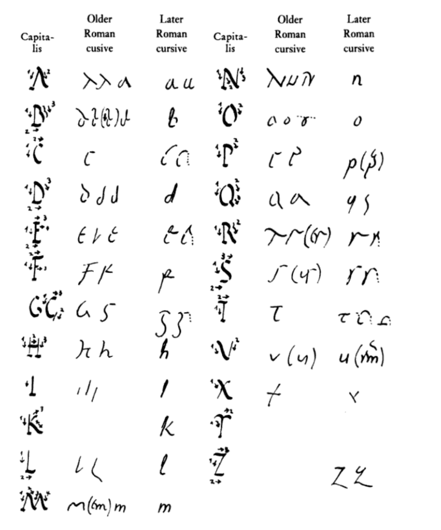
One of the most defining features of the Old Roman Cursive is the B with the round bow on the left, instead of the right, where we would expect it, and the Q with a long tail slanted to the left. Even in neater handwriting, A, R, B, and D look incredibly similar. Older examples of the Old Roman Cursive style seem to have been more upright, like in an edict of Nero's, but later examples are more slanted and narrower.


The Old Roman Cursive persisted even to the 4th century in legal documents. In 367, it was banned from public use, and only the imperial chancery was allowed to use the script. Individual letters, like the B with the bow to the left, lasted longer in other scripts and even codices.
The oldest example of authentic Latin cursive is a copy of Claudius' (Roman Emperor, r.41-54 CE) speech, a papyrus of the oratio Claudii on reforming justice. We can date it to later than 41-54, as Claudius was not emperor until 41CE. We can see that even in the 1st century AD that Latin cursive had deviated from the straight strokes suited for incisions on tablets, in the B with the round belly to the left and Q with a long tail (Cavallo, 2009).
But the New Roman Cursive had taken over for public use by the 3rd century. The B starts having the round box to the right, instead of the left (perhaps to avoid confusion with the D), and the script became more erect, so that the ascenders (lines that extend above the mean height of the text) and descenders (lines that extend below the baseline of the text) stand out. The M and the N also develop into forms that are closer to our own minuscule M and N, and the structure of the New Latin Cursive demonstrates the development of the dual majuscule and minuscule system. By the fifth century, the New Roman Cursive had spread to western charters such as those issued from Ravenna, and the structure of the script remains the same until about the 10th century.
References:
for more information on ancient scripts,
Roger Bagnall, The Oxford Handbook of Papyrology. Oxford: Oxford University Press, 2009.
for more information on the Vatican Virgil (Vergilius Vaticanus):
for a guide on how to write the scripts discussed:
Photos are own, unless stated otherwise.
Why was Old Roman Cursive banned from public use? If it was only because it was difficult to read, why was it still used by the imperial chancery?
Thanks
Pingback: Why Does the Letter ‘S’ Look Like an ‘F’ in Old Manuscripts? – readly.info
Pingback: Why Does the Letter'S' Appear like an 'F' in Old Manuscripts? - Science and Tech News
Pingback: Why Does The Letter'S' Resemble An 'F' In Old Manuscripts?
I need help.. translating an inscription on a 6-8 century byzantine cross... anyone I can send a pic to?
Pingback: The Twisted History of Cursive Writing - TownTalk Radio
Pingback: 7 Ancient Western Calligraphy Fonts That Will Enhance Your Presentation - muqahhar