I’ve mentioned the paper for the project and a bit about the structure of the book, but not in detail. Originally I thought a series of one-sheet books in an enclosure would be interesting. Maybe one book per poem (when I thought there would be 4-6 poems). But eventually I realized that was an idea I was interested in with my own personal work and it didn’t make sense for this project.

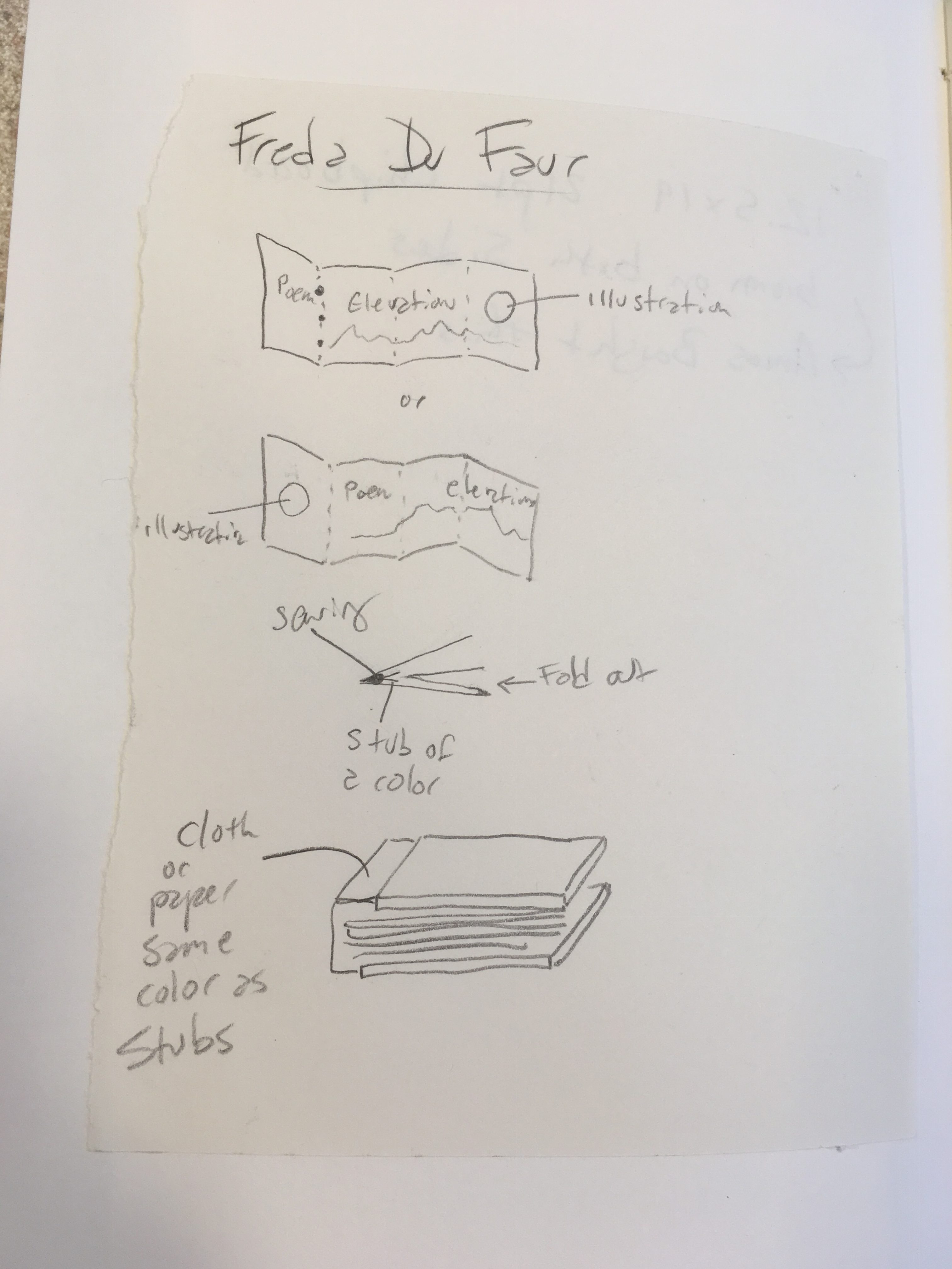
Then I considered many variations of binding structures. Our book has to do with the Southern Alps, so I wanted to do something that alluded to a mountain range. I tried a number of ideas…
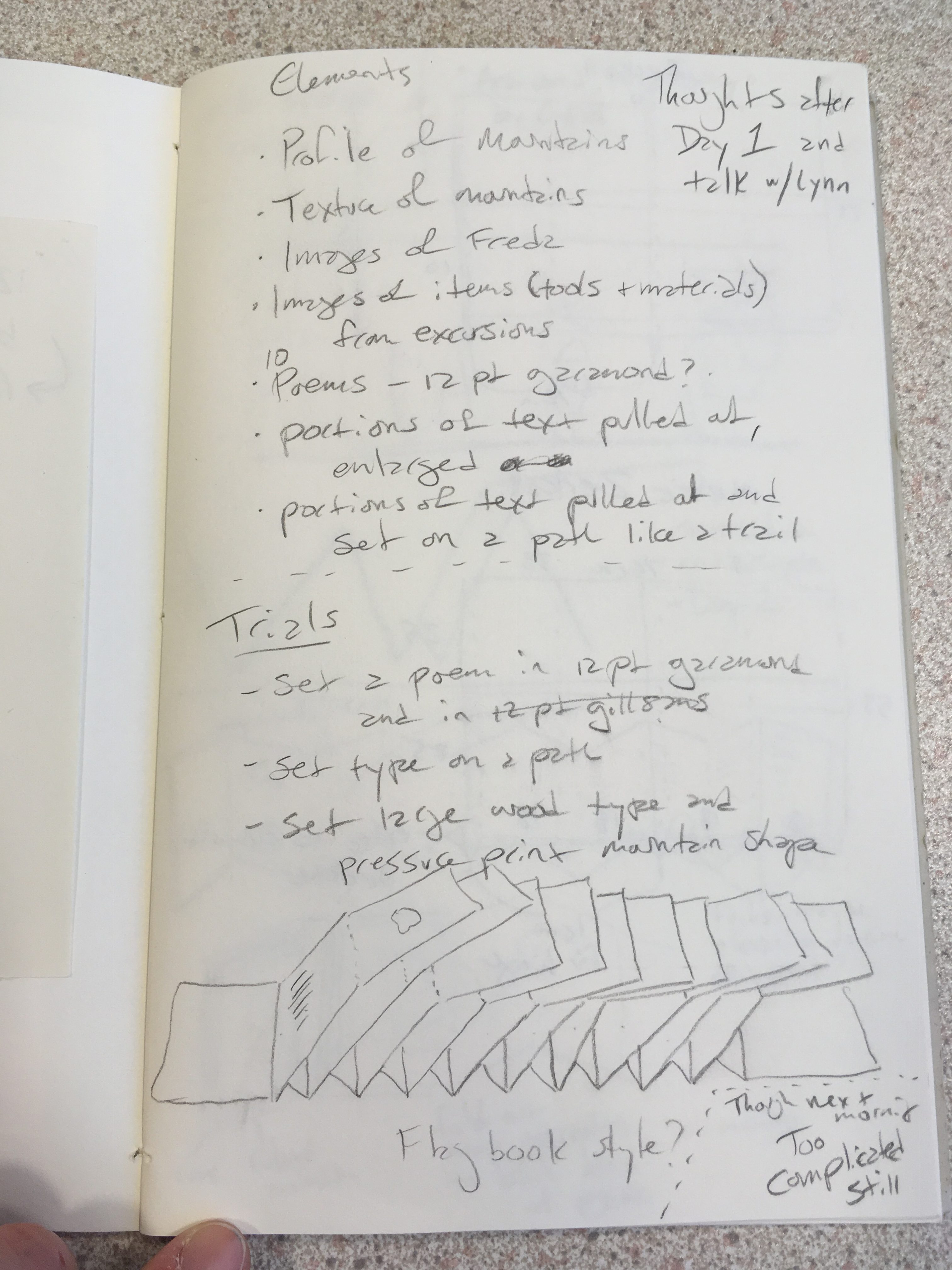
and made a bunch of models.

Mostly they all seemed a bit forced and over designed. Then there was this to think about—this is a fairly large edition of 120 that will be bound by the University binders while I’m still here in New Zealand—so keeping it simple is very important. So I went back to a structure I used recently. It’s a simple accordion in a case—attached on one board.

This will be pretty simple to print (so she says)—no need to worry about imposition and little printing back to back. So that’s appealing when time is short. But what makes the accordion structure so appealing for this project is that it refers to the shape of a range of mountains and allows for a bit more variation in image making techniques for Lynn’s work.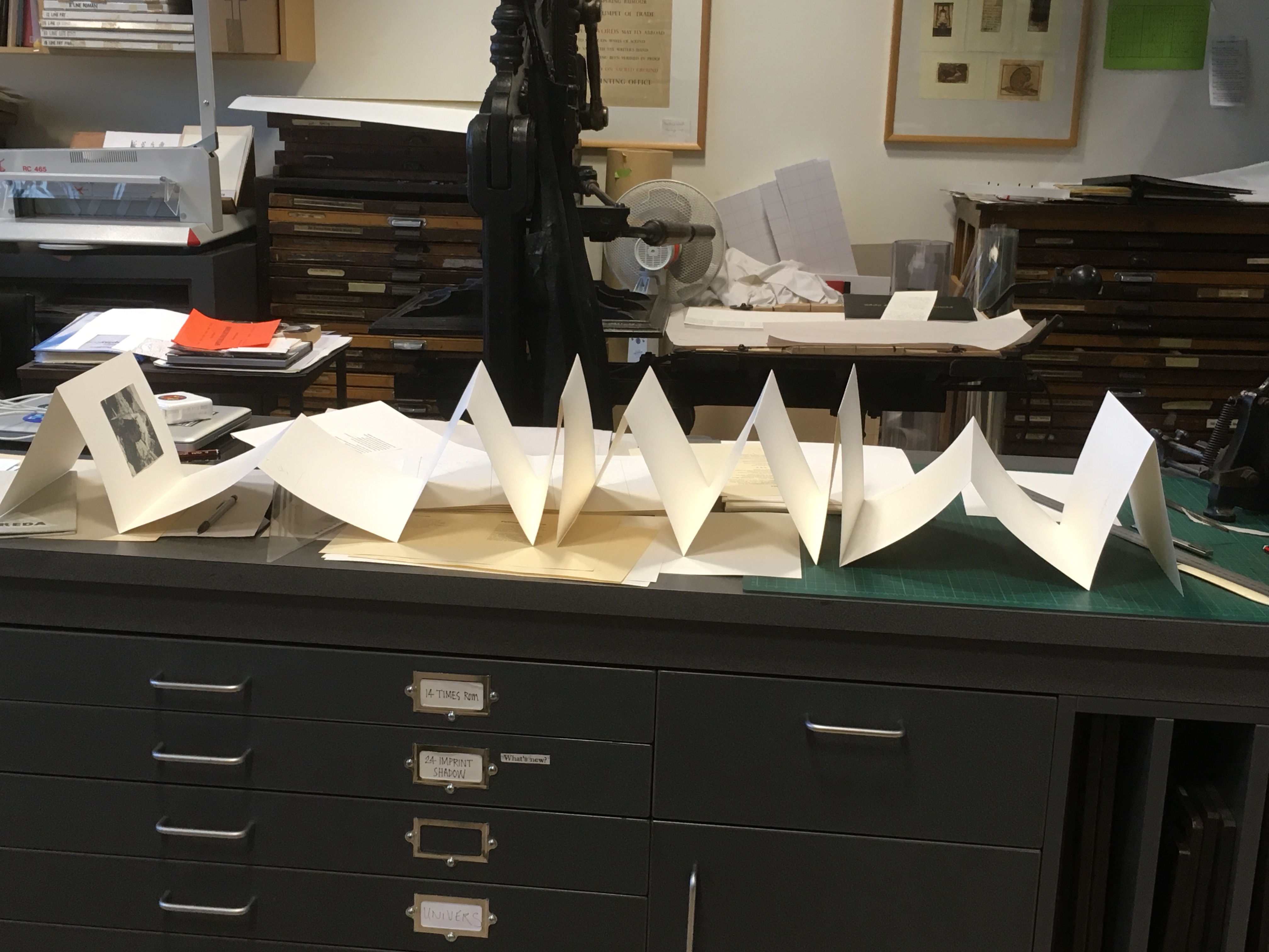
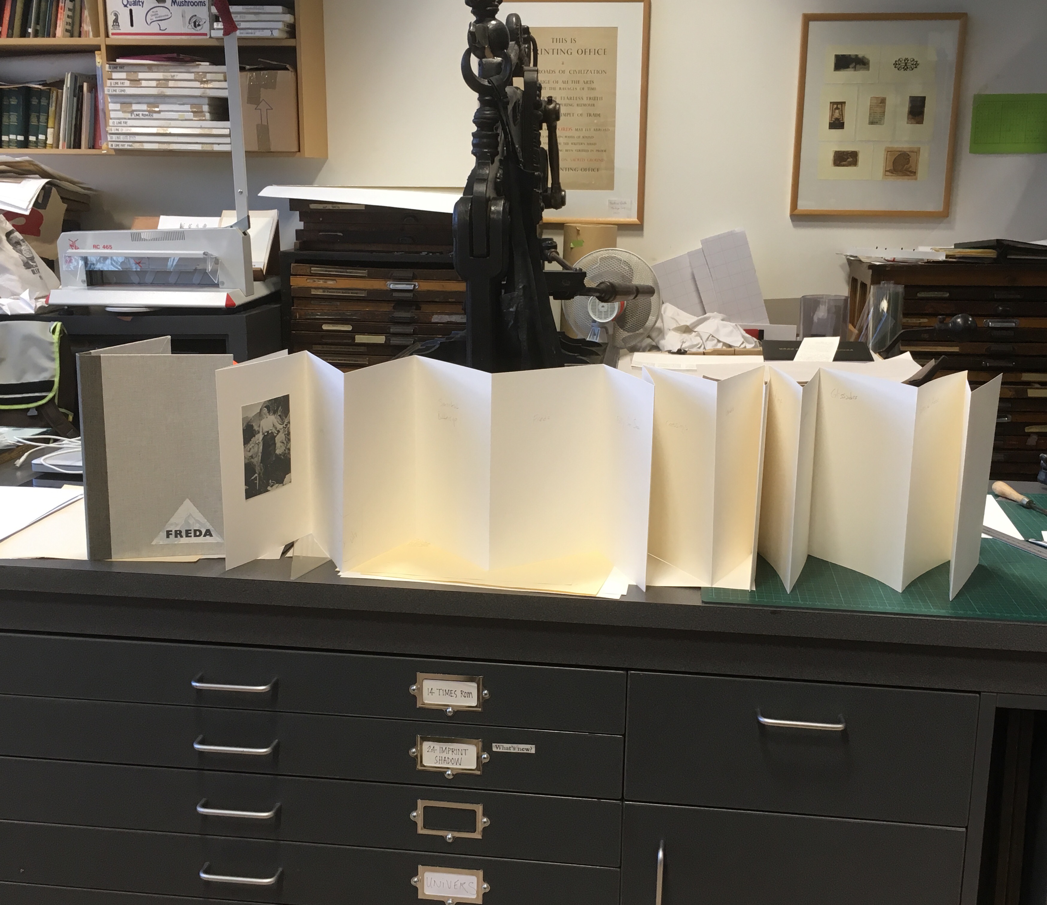
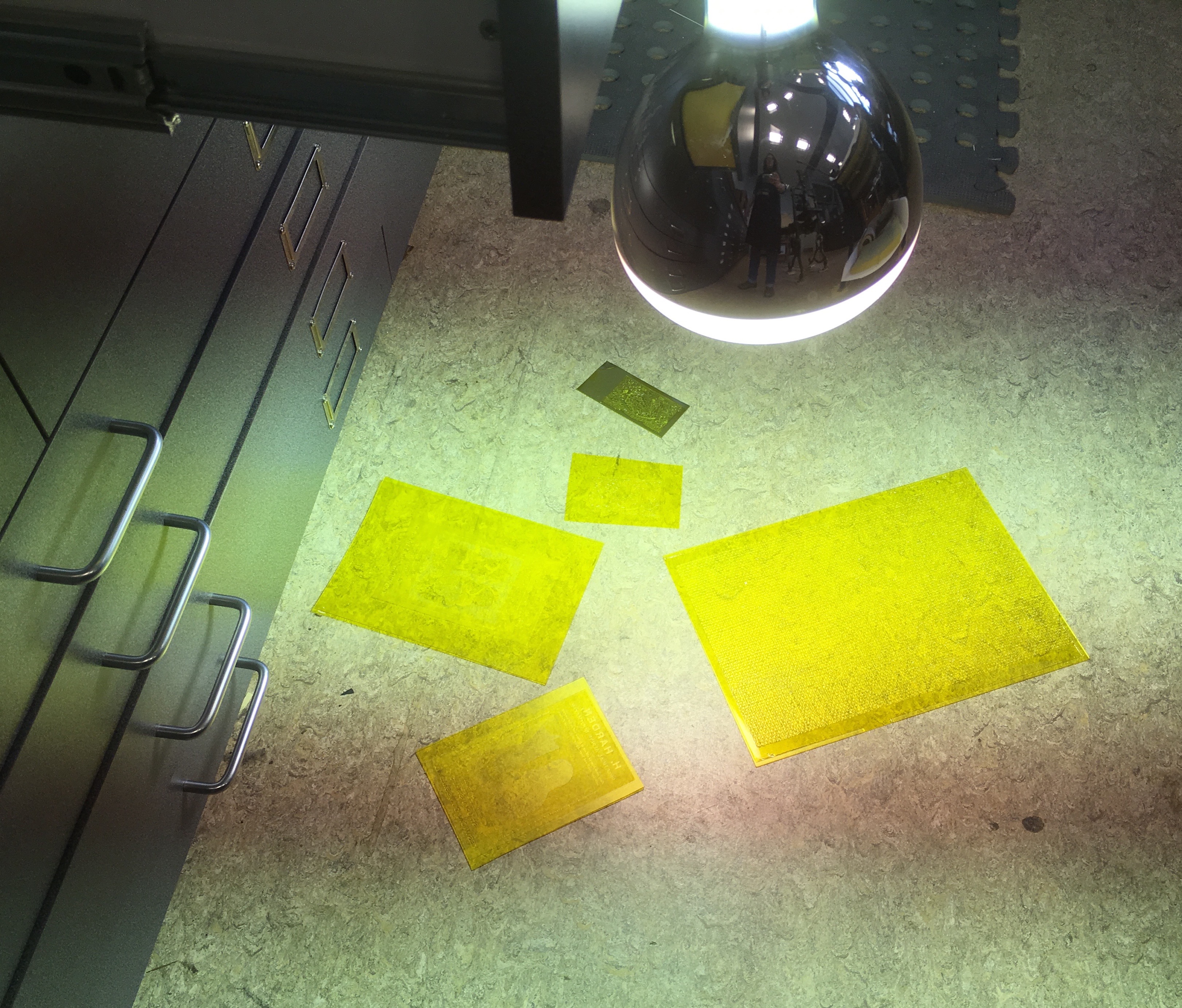
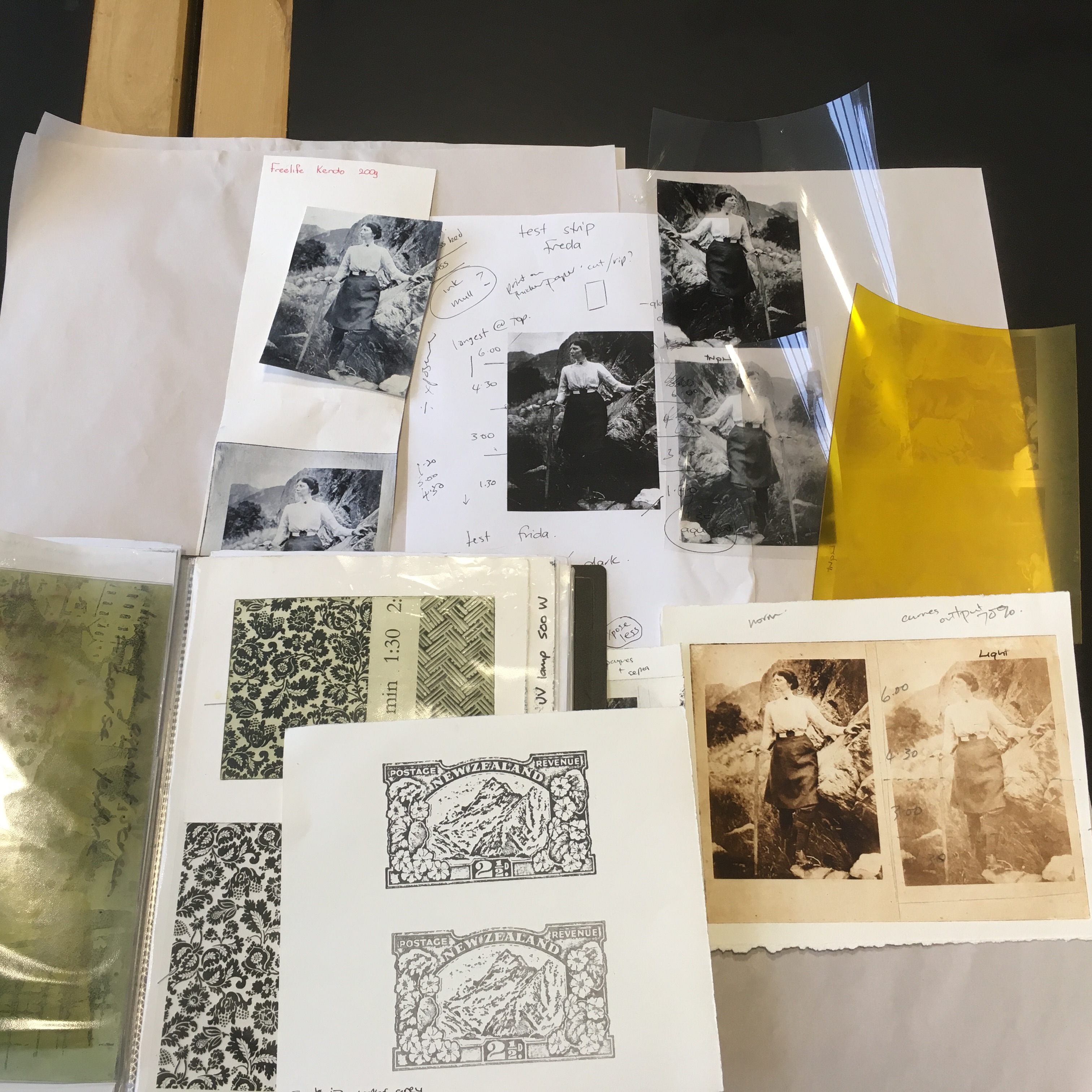
So that’s the plan. Lynn has been making plates galore. There will be a photo of Freda in the front, so she’s been working hard to make a big edition of prints.

Rhian, Lynn and I have been getting together in the studio pretty often to talk about ideas, adjust work in progress and generally enjoy our collaboration.
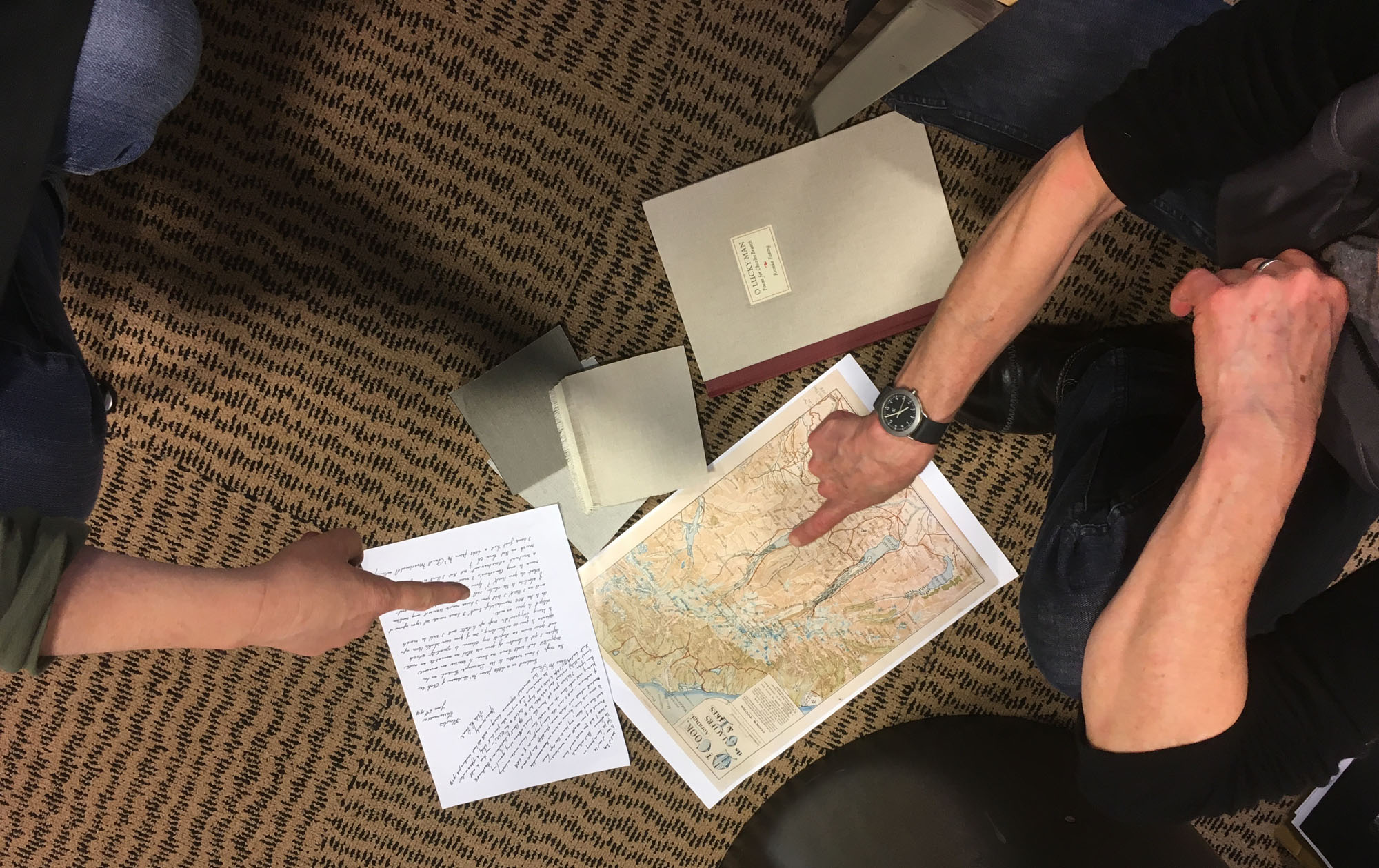
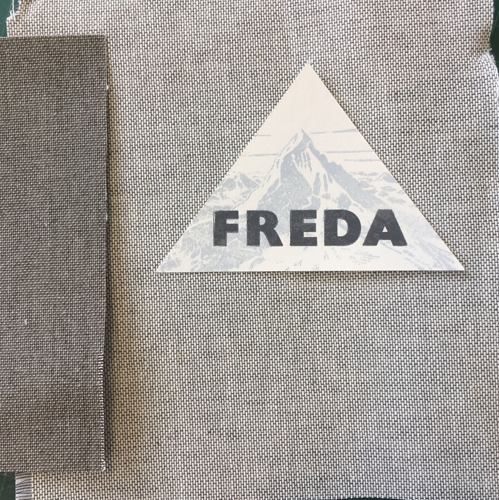
I met with Don Tobin at the University Bindery and picked out some cloth for the cover.

We decided to inset the title label, but that meant I had to decide quickly what that label would look like and where it would go. I remembered the printers cuts of Mt Cook that John Holmes brought out when he came in.
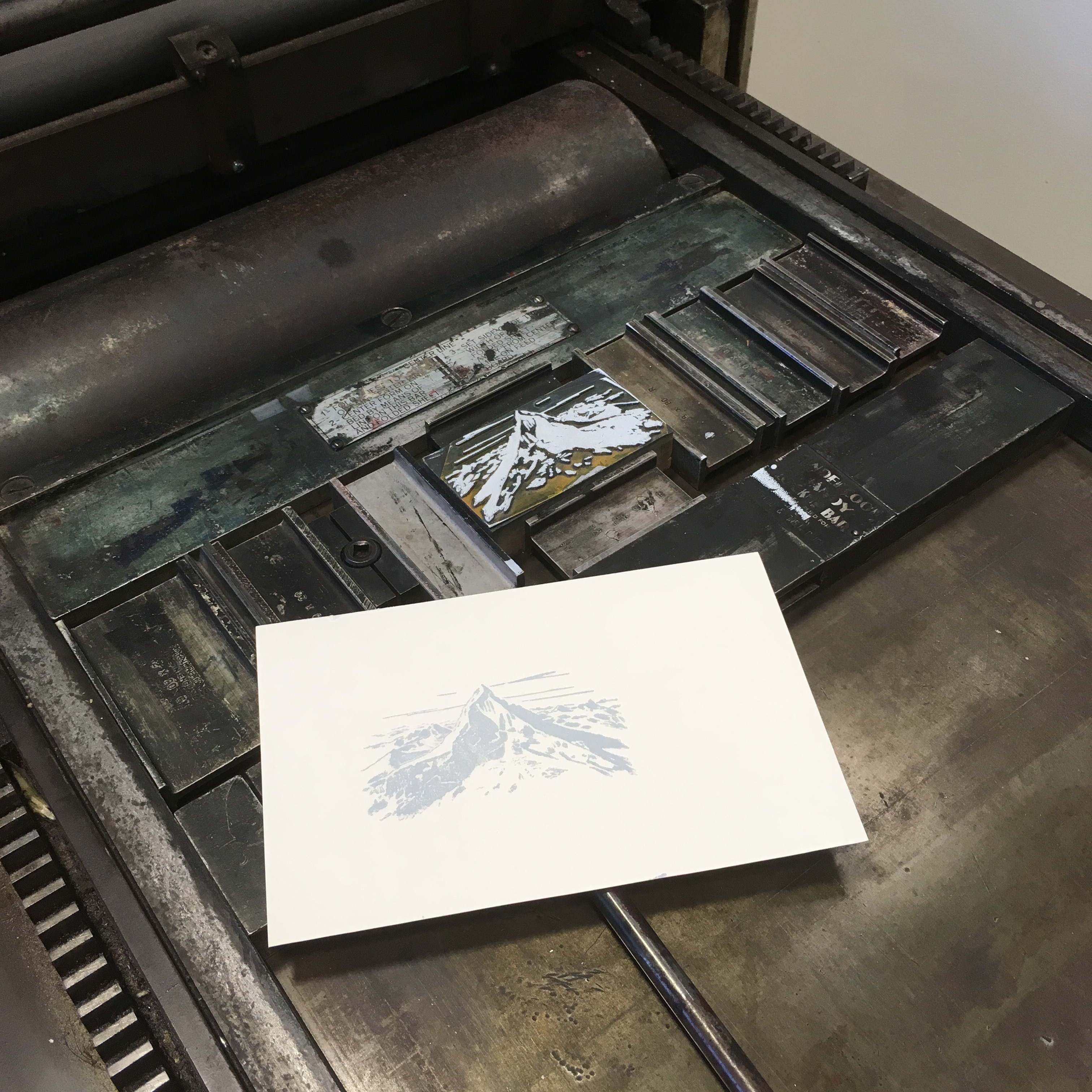
I tested some different colors for the mountain and the type over it. We all agreed that grays and icy blues made sense for Mt Cook and also the black and white photos of Freda and her excursions.

The book has a longer title than just “Freda”, but it seemed like a good idea to have just her name over printed over the mountain. So here’s the label and the cloth colors. Now Don and Romilly at the bindery can get started making the cases for the book.
Looks like the book is coming along well! And this is quite a bit of work!
It is so exciting seeing the book shape up – lots of other people think so too – we have constant visitors coming in to checkout the printing and meet Sarah.
Such an exciting project, Sarah!