Leveraging Quiz Submissions Data to Inform Quiz Design

The visualization of quiz submission data can help faculty make an informed decision on quiz design. For instance, the analysis of quiz submission data can inform faculty of the difficulty level of quizzes. Faculty can use the information to select a set of quizzes that are neither too difficult nor too easy. Faculty can also use the information to select quizzes that are best for pre and post assessment. If quizzes are set to allow multiple attempts, we can leverage quiz attempts data to identify students who might struggle with a given topic.

Graph 1 shows the number of attempts that students took to get a full score for a given quiz. The graph indicates that it took all students only one attempt to get a perfect score for Quiz_2. In comparison, it took quite a few students two, three, or even four attempts to achieve a full score for Quiz_1. This type of visualization allows faculty to identify the most difficult quiz (Quiz.1) and an easier quiz (Quiz.2). Quiz.3 appears to be neither too difficult nor too easy.

graph 1: Attempt_1 to Attempt_4 sectors represent the attempt(s) that students took to get a full score (attempt sector). Quiz.1 to Quiz.3 sector represent the quizzes (quiz sector). The width of quiz sector denotes the number of attempts made to a given quiz. The width of the attempt sector denotes the count of students who made the attempt. The thickness of directional link from a student to a quiz represents the quantity of attempts.

StuQuizAttempt

The graph 2 below is another way to present the information. This visualization allows faculty to identify the students who struggle with a topic. For instance, student 1 seems to have difficulty understanding the content that Quiz.1 and Quiz.5 are designed to assess.

graph 2: S1 and S2 sector represent student one and student two (student sector). Quiz.1 to Quiz.7 sector represent seven quizzes (quiz sector). The width of quiz sector denotes the attempts to a quiz made by all students. The width of the student sector denotes the attempts to all quizzes made by a student. The thickness of directional link from a student to a quiz represents the quantity of attempts.
QuizAttempts

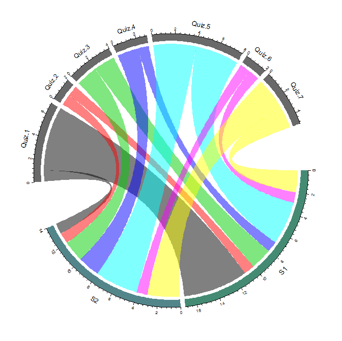
Below includes the sample matrix that I used to generate graph 2 in R. The x-axis represents seven quizzes, and the y-axis represents 12 students who took the quizzes. The value in each cell denotes that number of attempts that a student took to a quiz until got a full score.

Quiz 1 Quiz 2 Quiz 3 Quiz 4 Quiz 5 Quiz 6 Quiz 7
S1 6 1 2 1 4 1 2
S2 1 1 2 2 4 1 3
S3 2 1 2 1 4 1
S4 2 1 2 2 5 1 1
S5 3 1 2 2 3 1 1
S6 2 1 1 1 3 1
S7 2 1 2 2 1 1 1
S8 1 1 2 1 1 1 1
S9 2 2 3 4 1
S10 2 1 2 2 4 1 2
S11 2 1 1 2 3 1 1
S12 2 1 2 2 3 1

R code:
order=c(“S1″,”S2″,”quiz.1″,”quiz.2″,”quiz.3″,”quiz.4″,”quiz.5″,”quiz.6″,”Quiz.7”)
grid.col=c(“aquamarine4”, “cadetblue4”, “dimgrey”, “dimgrey”, “dimgrey”, “dimgrey”, “dimgrey”, “dimgrey”, “dimgrey”)
circos.par(gap.degree=c(rep(2,nrow(mat2)-1),20,rep(2,ncol(mat2)-1),20))
chordDiagram(mat2,column.col=1:7,grid.col=grid.col)
circos.clear()

The application of chord diagrams in examining Canvas course engagements

We sometimes get questions from faculty related to student engagements concerning Canvas course content access, such as

  • “How do students engage in my Canvas course?”;
  • “Do students tend to download or preview course files?”;
  • “How often do my students check their submissions for comments?”

From a course design perspective, visualization of Canvas content access may help us identify effective Canvas course design strategies that utilize various Canvas features to facilitate student engagements.

The following chord diagram (graph 1) illustrates how much students are accessing different features in a Canvas course. The quantities represent the number of clicks on a given course element by each student.

graph 1: There are the “student sectors”, labeled S1, S2, …, S6, that represent six students. Canvas course content and features are called “content sectors”, which include categories such as announcements, assignments, discussions, and pages sectors. The width of content sector tracks represents the total clicks on a content made by all students. The width of the student sector track denotes the quantity of clicks by a student. The thickness of directional links represents the quantity of clicks.

SingleCrsContentAccess2
A Chord Diagram is commonly used to represent relations between elements(https://cran.r-project.org/web/packages/circlize/vignettes/visualize_relations_by_chord_diagram.pdf). The data format used in the above example is an adjacency matrix. The value represents the number of clicks on a given course element by each student.

announcement assignments discussions file_previews file_download file_tab gradebook submissions pages
S-1 42 39 29 0 20 19 17 16 3
S-2 80 74 60 40 28 24 22 21 5
S-3 62 59 47 34 28 27 25 23 3
S-4 50 46 34 0 27 25 23 22 3
S-5 58 55 48 33 24 23 21 20 4
S-6 67 63 50 0 36 26 23 22 8

The R circlize package allows us to draw a chord diagram without much scripting in R. After an adjacency matrix is created (you may download the example data to practice), and the “circlize” package is installed in R, follow the steps to generate a basic chord diagram:

  1. import the csv file to R — mat <- read.csv(“file directory”,header=T, row.names=1)
  2. convert the csv to matrix — mat <- as.matrix(mat)
  3. set the gaps between sectors — circos.par(gap.degree=c(rep(2,nrow(mat)-1),20,rep(2,ncol(mat)-1),20))
  4. customize order of the sectors (optional) — order=c(“S1″,”S2″,”S3″,”S4″,”S5″,”S6″,”announcement”,”assignments”,”discussions”,”file_previews”,”file_download”,”file_tab”,”gradebook”,”submissions”,”pages”)
  5. define R color for the sectors (optional) — grid.col=c(“aquamarine4”, “cadetblue4”, “darkolivegreen4”, “deepskyblue4”, “firebrick4”, “deepskyblue4”, “dimgrey”, “dimgrey”, “dimgrey”, “dimgrey”, “dimgrey”, “dimgrey”, “dimgrey”, “dimgrey”, “dimgrey”)
  6. draw the chord diagram — chordDiagram(mat, order=order, grid.col=grid.col)
  7. reset the default circos graphical settings — circos.clear()

To customize sector labels:

  1. follow 1 to 5 steps described above
  2. switch step 6 from ‘drawing a basic diagram’ to ‘drawing an empty track’: chordDiagram(mat,directional=1, order=order, grid.col=grid.col, direction.type=c(“diffHeight”,”arrows”),link.arr.type=”big.arrow”,annotationTrack=”grid”,preAllocateTracks=list(track.height=0.3))
  3. go back to the first track and customize sector labels: circos.trackPlotRegion(track.index = 1, panel.fun =function(x, y) {
    xlim =get.cell.meta.data(“xlim”)
    ylim =get.cell.meta.data(“ylim”)
    sector.name =get.cell.meta.data(“sector.index”)
    circos.text(mean(xlim), ylim[1], sector.name, facing = “clockwise”, niceFacing = TRUE, adj =c(0, 0.5))
    }, bg.border = NA)

SingleCrs

Resources: