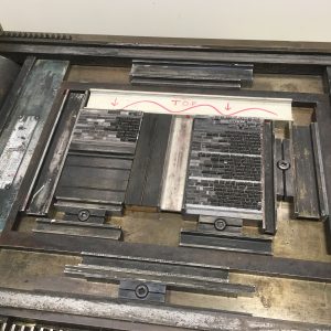
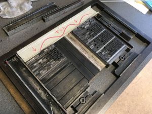
There have been a few aspects to this project that have been tricky. Working in a new place far from home, collaborating with new people and using unfamiliar equipment are a few things that caused a bit of anxiety—and excitement before I arrived here. A few weeks before I set out, I was looking at photos of the Otakou Press room and the equipment. I looked at them before, but somehow I had missed the fact that the Vandercook #4 had no rollers. I emailed Donald to ask about the press. He confirmed that the rollers and inking system had been removed a while ago and that many printers he knew preferred hand inking for better control. My anxiety increased.
I’ve used a number of different models of Vandercooks and done a lot of tricky printing, but I haven’t hand inked blocks of text in small type. The prints I’ve hand inked before were usually with larger than 12 point type and with designs that were a somewhat loose or that made use of imperfections. It would have probably been a good idea to design our book in a similar way, so there wouldn’t be too much pressure to be precise with the inking. However, Rhian’s poems and Freda Du Faur’s story didn’t seem to lend themselves well to wild typographic or inking experiments.
So onward I went, determined to get this right and not embarrass myself. And now I’m telling you all about my trials and errors. So much for not embarrassing myself I guess.
In an earlier post I mentioned that the titles of the poems would be gray, while the poems themselves would be black. “What a great idea!” I said at the time. “Why not make twice as much work for myself!” Usually each color in a print is printed separately. I often have students wanting to take a “short cut” by hand inking separate colors in one run. I always tell them they’ll be sorry and it’ll end up making more work as they try to be super careful with their inking. For some reason all that left my head when starting to print this project. With the time crunch I felt like printing both colors at the same time would be better. Here’s a video of how that went.
Using roller bearers—strips of type high metal or wood—to support the roller as it goes over the type would have helped me have much more even inking. That would have been great if I was using a roller wide enough to be supported outside the paper area. But with the smaller rollers (and the one I ended up using was still pretty big) and the large paper area, there was no way to avoid making marks on the paper if I used roller bearers. I thought about putting them in for inking and taking them out for printing, but that would have been too fiddley. So no roller bearers.
The roller I’m using in the video is one I brought from Dartmouth. At first it was working great and it’s lighter than the one already in the print room. Eventually though, I realized it wasn’t working so well after all. Seemed like the rubber was too slick and maybe glazed, so the ink wasn’t distributing well. When I switched to the heavy, freshly covered one—nice fresh rubber—it was much better.
Still, wiping the black ink off the titles was slow and way too fussy. It was also impossible to clean the black all the way off (or to ink so carefully as to avoid the title type all together. So eventually I smartened up and printed the black and gray separately—like I knew I should have from the beginning! This didn’t make the process go any quicker, or slower really—just less irritating and more successful.
I didn’t get any video of me inking up the poems in black, but here’s the titles being inked.
I also changed a bit of my technique in that I charged the roller (got more ink on the roller)more often. I found that many passes in different directions—around 4 passes with maybe extra attention on problem areas—with thinner layers of ink worked best. By the last poems the inking was looking great!
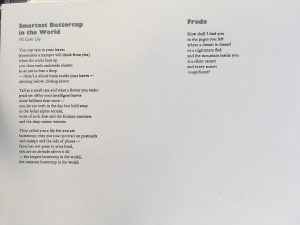
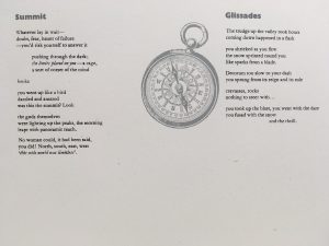
Here’s a couple of the early attempts
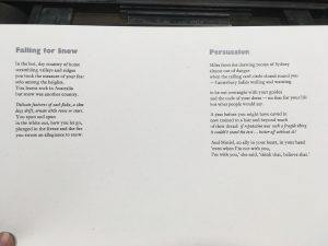
An one of the later ones.
The whole process was a good experience. I certainly learned a lot and managed to print the text for 120 books.
