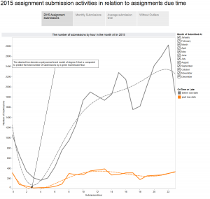
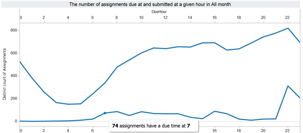
Our Canvas discussion data shows that about 20% of courses that are published in Canvas use the Canvas discussion tool. However, little is known as to how students interacted with their peers in Canvas discussions, whether students were actively engaged in discussions, and how instructor involvements shape/facilitate a community of inquiry. To see if network analysis is useful to address some of these questions, we applied network graph approach to visualize discussion interaction data.
For the proof of a concept, we fabricated a small set of discussion interaction data. We converted the discussion data to an edge list. An edge list contains “from” and “to” columns that represent the two nodes connected in a network. Table 1 includes the sample set of discussion interaction data in an edge list form. The values in the first column are discussion feedback providers and the second column includes the feedback receivers.
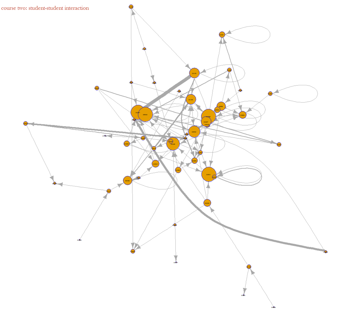
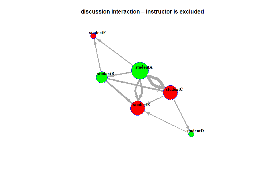
The Graph 1 was derived from the sample data set and generated in R with the igraph package. Each node represents a discussion participant. The direction/edge arrow indicates a directed interaction from a feedback provider to the feedback receiver – the author of the target thread to which the provider replies. The feedback can be a reply to a new post, or a response to a reply. The size of each node implies the total counts of the directed interactions for the node. The graph reveals interesting elements related to students’ discussion engagement. For instance, we can quickly see that studentA tended to respond to most of his peers, but did not get much feedback from his peers at all. In contrast, studentE received responses from many of his peers, but only initiated one thread to the instructor. Maybe the initial thread that studentE posted was so interesting or debatable that grabbed the attention of other students. studentF appears to be less interactive than his peers, and provided no feedback to peer postings.
Graph 1:The size of each node implies the count/degree of the directed interactions for the node
 To further explore the relationship between online discussion behavior and classwork performance, we experimented to add student grades as node attributes. We also added the word count of a reply as weight to each directed interaction.
To experiment with the nodes’ attributes in our analysis, we fabricated students’ grades, assigning them either an above median or below median value. We also added a weight for each unique interaction by counting the number of academic words by excluding English Stopwords in the thread. Graph 2 was generated by adding the weight values and the nodes’ attributes.
Graph 2: The color green means a performance above the median, and red denotes a performance below median. The size of each node represents the amount of the two-way interactions for the node. The thickness of the arrow line implies the number of academic words in each interaction.
 With the same edge list, we can apply different igraph layouts to an interaction visualization. For instance, the following three graphs were derived from the same set of data, the circle layout gives us an overview of the students who either provided at least one feedback to their peers, or received at least one reply from their peers. The kamada-kawai layout allows us to quickly identify the students who are less interactive. The sphere layout helps us see the reply threads that contain the most words.


Table 1 includes a sample set of discussion interaction data in an edge list form. The values in the first column are discussion feedback providers and the second column includes the feedback receivers. Table 2 is the edgelist with associated edge values, the weight for each unique interaction, which was used to created a weighted network. Table 3 is the nodes’ attributes representing student performance, above median-Above or below median-Below respectively.
Table1:
| discussion feedback provider |
discussion feedback receiver |
| studentA |
studentB |
| studentA |
studentC |
| studentA |
studentE |
| studentB |
studentF |
| studentB |
studentC |
| studentB |
studentE |
| studentC |
studentD |
| studentC |
studentE |
| studentD |
studentE |
| studentE |
instructorA |
| studentA |
studentF |
| studentA |
studentC |
| studentA |
studentE |
| instructorA |
studentE |
Table 2 – nodes’ attributes:
| ID |
performance |
| studentA |
above |
| studentB |
above |
| studentC |
below |
| studentD |
above |
| studentE |
below |
| studentF |
below |
Table 3 – a weighted edgelist:
| provider |
receiver |
weight |
| studentA |
studentB |
12 |
| studentA |
studentC |
30 |
| studentA |
studentE |
20 |
| studentB |
studentF |
9 |
| studentB |
studentC |
16 |
| studentB |
studentE |
18 |
| studentC |
studentD |
10 |
| studentC |
studentE |
11 |
| studentD |
studentE |
7 |
| studentA |
studentF |
10 |
| studentA |
studentC |
30 |
| studentA |
studentE |
20 |
install.packages(“igraph”)
library(igraph)
#load the edge list and nodes to R
nodes links
Resources: http://kateto.net/network-visualization


 Graph 1 is presented in ‘kamada.kawai’ layout: