

Under the assumption that instructors may use online discussion with different focus to meet instructional needs, we tailor diagrams to effectively present the core elements of the same data and help faculty make informed interventions to engage students in discussion activities. For instance, some instructors would like to promote discussion interactions among students. They may choose not to provide answers/feedback to individuals’ postings, instead to encourage or specifically require students to read and comment on peers’ threads. While some other instructors tend to use online discussion as a means for students to share their written reflections upon a topic/concept, and then provide feedback to individual students’ work, all communications are intentionally designed to share with the entire class.
In the following, we will demonstrate how we can tailor the visual representation of same data to help instructor address a particular pedagogical concern.
Scenario One:
Instructor posted a discussion topic each week, the requirement for a complete participation was twofold: 1)post an initial thread; 2)comment on at least one peer’s posting. In order to effectively facilitate each discussion topic, the instructor would like to see 1)how students interacted among one another? 2)who did not provide any feedback to peers’ posting? 3)whether there were popular threads that receive many replies? 4)whether the amount of student interactions differed each week?
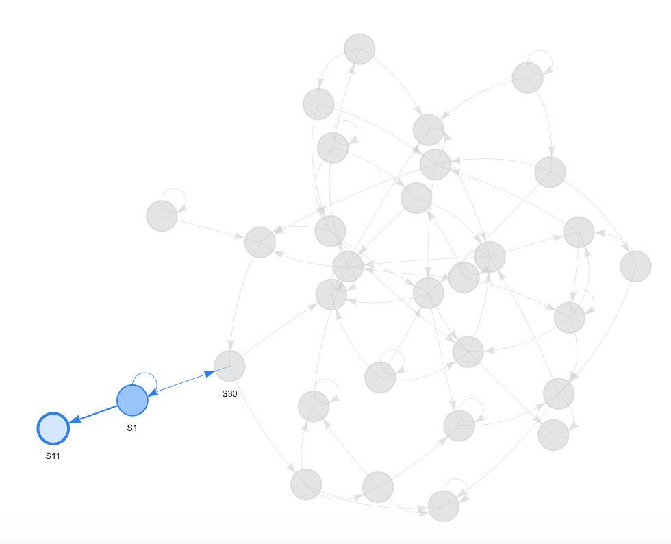 This diagram shows that S11 posted an initial thread, received one reply, but did not interact with rest of the class. Depending on nature of the discussion topic and circumstance, with the information, instructor can decide whether it was necessary to ‘nudge’ or send a ‘reminder’ to S11.

This diagram suggests that S8 was the most active student in this discussion topic. S8 posted a well-written initial thread, which received a number of replies, and also provided feedback to peers’ postings.
Boxplots indicate that there were difference in the number of interactions between Discussion 2 and Discussion 1, Discussion 4 and Discussion 1.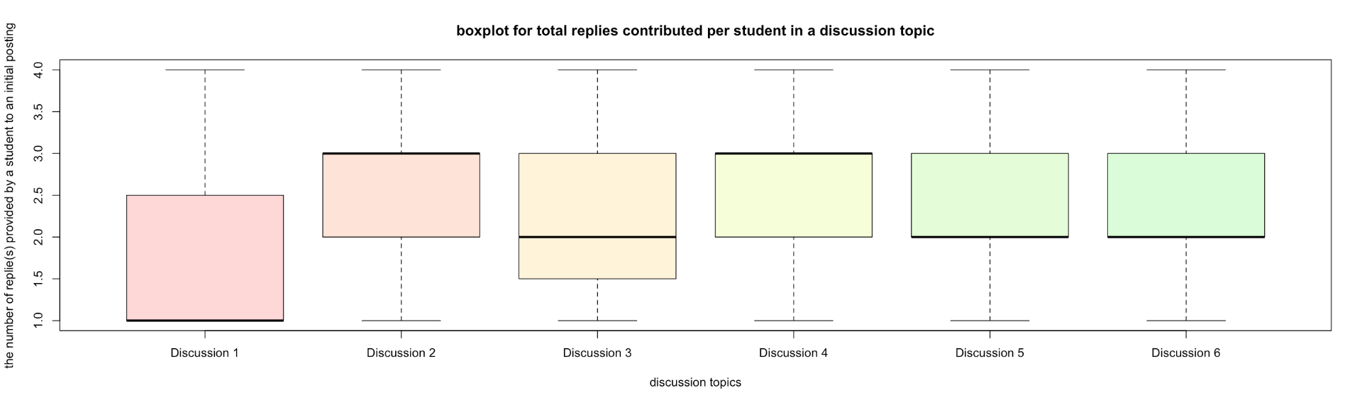 The top and bottom lines of the rectangle are the 3rd and 1st quartiles (Q3 and Q1), respectively. The length of the rectangle from top to bottom is the interquartile range (IQR). • The line in the middle of the rectangle is the median (or the 2nd quartile, Q2). • The top whisker denotes the maximum value or the 3rd quartile plus 1.5 times the interquartile range (Q3 + 1.5*IQR), whichever is smaller. • The bottom whisker denotes either the minimum value or the 1st quartile minus 1.5 times the interquartile range (Q1 – 1.5*IQR), whichever is larger.
Scenario Two:
Instructor used online discussion as a platform for students to share their written reflections with the class. The instructor requires students to post their essay on discussion without the expectation of student-to-student interactions, but only instructor-to-student interaction. In order to effectively facilitate the activity, the instructor would like to know: 1)who has not submitted his/her work? 2)which submission has not been replied and still needs feedback?
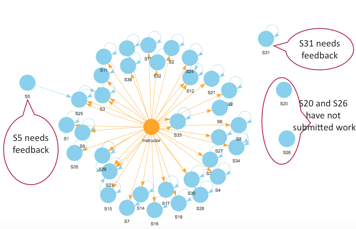 The diagram shows that the instructor provided feedback to most students’ assignments. S20 and S26 did not post their work. S31 submitted work, but his/her submission was not commented. S5 made a reply to peer’s thread, but did not receive comments from the instructor.
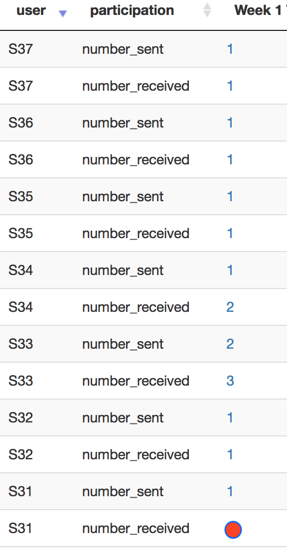
The matrix is another visual presentation of the same data.