Exploration of student-generated educational data in LMS

The types of educational activity data captured by a LMS that can be harnessed and translated to actionable knowledge:

  • Click stream data
  • Page views and content access
  • Discussion participation
  • Assignment and quiz submissions

Google Analytics for student’s click stream data:

Data solution 1: Nodes are points through which traffic flows. A connection represents the path from one node to another, and the volume of traffic along that path. An exit indicates where users left the flow. In Events view, exits don’t necessarily indicate exits from your site; exits only show that a traffic segment didn’t trigger another Event. Use the Behavior Flow report to investigate how engaged users are with your content and to identify potential content issues. The Behavior Flow can answer questions like:

  • Did students go right from homepage to assignments/quizzes without additional navigation?
  • Is there an event that is always triggered first? Does it lead students to more events or more pages?
  • Are there paths through a course site that are more popular than others, and if so, are those the paths that you want students to follow?

Behavior Flow: Like all flow reports, the Behavior Flow report displays nodes, connections and exits, which represent the flow of traffic in a course site.

Data solution 2: Funnel Visualization: how students funnel through to a destination page in your course site? https://support.google.com/analytics/answer/2976313 and https://support.google.com/analytics/answer/6180923

Funnel Visualization: The funnel visualization shows the stream of visitors who follow specific paths of a website and thus interact with it in order to reach a website goal. https://support.google.com/analytics/answer/2976313?hl=en

The sample data for the example funnel visualization was gathered from a Canvas (LMS) course site, the goal was set to be the Modules navigation menu. 843 users accessed the course homepage during certain period of time. Of those 843 users. 31 percent of them went from the homepage directly to the course module page (destination). (581-177)/843=48% navigated to a different page of the course and 177(21%) exited the course.

The funnel conversion rate (59.20%) indicates the percentage of visits that included at least one page view for the first step before at least one page view of the goal page. Page views can occur non sequentially for a funnel match. We can look at each step of the funnel, analyze the number of users to the first step versus the number of users to the second step. Wherever we lost a drastic number of people, we can go back to that page and optimize it to increase that conversion rate percentage.

Social Network Analysis for discussion interaction data:

  • How active do students interact with each other on online discussion forums?
    • identify the students who are actively engaged in discussions by providing many comments to peers’ postings.
    • identify the students whose initial discussion thread became so popular that received quite a number of replies.
  • Does the quantity and/or richness of discussion posts vary across topics?
  • Does the community structure of discussion interactions represent subgroups of students who have common interest in reality?
  • Does discussion interaction patterns represent or reflect students’ participation in class activities?
  • Does the role modeling using centrality metrics represents the level of influence of a student in reality?

Histogram and scatter plot for quiz submission data (quiz performance and correlation between quizzes):

samplequizexam

  • How well an individual student did in comparison to the entire class?
  • What was the overall performance on a quiz?
  • Is there a relationship between quiz performance and content access, or overall activities in a LMS?

References:

https://journal.r-project.org/archive/2016/RJ-2016-010/RJ-2016-010.pdf


Role Modeling in Online Discussion Forums

As LMS becoming more widely adopted in fully online, hybrid, blended courses, its asynchronous discussion platforms are often used as the channel for information exchange and peer-to-peer supports. For F2F courses that leverage online discussion forums as a complement to classroom communications or a tool for flipped-classroom that facilitates active learning, asynchronous discussion activities correlate to higher engagements in courses and better performance overall. Under this notion, insights into roles in discussion forums can contribute to improved design and facilitation for asynchronous discussions.

In light of the research conducted in the field of role mining for social networks (Abnar, Takaffoli, & Rabbany, 2014), we limit our focus on the roles which have been identified in social contexts, and we re-defined them in the context of asynchronous discussions.

We developed a Shiny application using social network methods, centrality and power analysis, to analyze and visualize online discussion interactions. Degree and closeness centrality scores are used to identify leaders and periphery/outermosts, and mediators yield a high betweenness centrality score. The graphs shared below were produced in the application.

Graph 1: each node represents an individual, the color corresponds to a group/community.

Roles derived from asychronous discussion activities

Leaders: the most active individuals in online discussion forums, i.e., posting well-thought threads that welcome peers’ comments and meanwhile, providing feedback to peers’ postings.Peripheries/Outermosts: the least active individuals in an online discussion forum, who posted few threads, which got none responses from peers, and replied to few peers’ postings.Mediators: the individuals who connect different groups in a network.Outsiders: the individuals who had minimum participation in a discussion, i.e., posted one thread to a discussion topic.

Implications

When asynchronous discussions are structured and designed to promote deep learning through collaborations, such as seeking information from peers, suggesting alternative solutions and providing answers/feedback, it would be desirable to help participants move from the periphery of the information exchange network to the core. When an online discussion forum with a well-defined topic or prompt is used primarily for students to post responses to the topic, instructors can incorporate incentives into the discussion forums to motivate learners to participate in discussions in a constructive manner (Hecking, Chounta & Hoppe, 2017).

REFERENCE:

Abnar, A., Takaffoli, M., Rabbany, R., & Zaiane, O. (2014). SSRM: Structural Social Role Mining for Dynamic Social Networks. 2014 IEEE/ACM International Conference on Advances in Social Networks Analysis and Mining.

Hecking, T., Chounta, I., & Hoppe, U. H. (2017). Role modeling in MOOC discussion forums. Journal of Learning Analytics. 4(1), 85-116.

Leveraging Canvas quiz submission data to inform quiz design

Quizzes are often used as an assessment tool to evaluate student understanding of course content. Practice quizzes, an informative self-assessment, have also been utilized to help students study for final exams. This self-assessment capability through the use of the practice tests enhances the usage level of course materials.

If course instructors used quizzing assessment strategy in Canvas, we can gather quiz submission data and use it to analyze the effectiveness of quiz questions. By analyzing the quiz submission data, course instructors are able to verify whether a quiz is effective in helping students grasp course content, and whether the quizzes produce meaningful data about students’ performance and understanding of course materials.

In this blog, we will introduce a self-service tool that leverages the quiz submission data to inform student learning and the efficacy of quiz designs in helping students master course materials. If a quiz is particularly designed for students to study for a high-stake exam or a formative assessment, we can use a scatter plot (with a smooth regression line) to see whether there is a correction between student performance on the practice test and on the final exam. If faculty implements a pre and post test to evaluate the efficacy of an instruction in helping student grasp course content, we can use a density plot to display the distribution of score percentage (kept_score/points_possible) for the pre and post quiz.

Canvas built-in Student Analysis tool allows course instructors to download quiz submissions data for one quiz at a time, and examine student performance. However, it is cumbersome if course instructors would like to to gather submission data for all quizzes in a course.

Course Instructors can install an userscript that gathers the submission data for all quizzes in a course:

  1. Install a browser add-on: Greasemonkey for Firefox or Tampermonkey for Chrome/Safari. Please skip this step if you have already installed the add-on previously.
  2. Install the Get Quiz Submission Data userscript.
  3. Login into Canvas, go to a course, navigate to the Quizzes page, scroll down to the bottom of the page and click on the “Get Quiz Submission Data” button.
  4. Save the data as ‘Comma Separated’ csv file format to your local computer, you may name it as ‘quiz.csv’
  5. Open Shiny app https://jing-zen-garden.shinyapps.io/quizzes/, load the quiz.csv file to the app, and a series of visualizations of the submission data will be created for you.
    • The plot shows student score percentage in comparison to the mean and median score percentage for the class side by side, which allows course instructor to easily see where a student is at in relation to the entire class.
    • If a quiz is particularly designed for student to practice for a high-stake exam, we can use a scatter plot (with a smooth regression line) to see whether there is a correction between student performance on the quiz and on the exam.
    • If faculty would like to use a pre and post test to evaluate the effectiveness of an instructional strategy in helping student grasp course content, we can use a density plot to display the distribution of time_spent on the pre and post quiz and percentage (kept_score/points_possible) for the pre and post quiz.


Learner Content Access Analytics

If you are interested in exploring learner content access data to inform your course design, you are at the right place. This blog is geared to inform instructors and course designers about the efficacy of a course design, such as how many students returned to access a course content after a course ended and how often? Which format/type of content was mostly viewed? How often did learners access course content while the course was in session?

In this blog, we will demonstrate self-service tools that allow course instructors to answer the questions with regard to how students interact with Canvas. We will show you how to download student access report data for a Canvas course using an user script, and upload the data file to a Shiny app that visualizes student engagements in the Canvas course.

The Shiny app produces a number of visualizations for student content access activities over time. The information provides course designers/instructors with insights about the efficacy of a content design. For instance, if you embedded a number of files in a page hoping students review them, it is helpful to know whether students accessed the page, which files in the page students were more likely to view, and which files they rarely clicked on.

A user script is a script that runs in a Web browser to add some functionality to a web page. The user script we are going to use is to add a ‘get user page views’ tab on a Canvas course People page. To enable a user script you need to first install a user script manager. For Firefox, the best choice is Greasemonkey. For Chrome: Tampermonkey. Once you’ve installed a user script manager, click on Student Usage Report Data userscript, and click on the Install button. The script is then installed and will run in a Canvas course site it applies to.

Quick Installation of an userscript that downloads the access report data for an entire course

  1. Install a browser add-on: Greasemonkey  for Firefox or Tampermonkey  for Chrome/Safari
  2. Install the Student Usage Report Data userscript.
  3. Login into Canvas, go to a course, click on the ‘People’ course menu and navigate to the People page. (If you don’t see the tab after you have successfully installed the user script, please refresh the People page) 
  4. Click on the ‘Get User Page Views’ tab, and click on ‘Start’ to begin data extracting process.
  5. After the page views info for every student is extracted, you will be prompted with a dialogue box asking you to either save or open the file.
  6. Open the file in Excel, and save it as a ‘Comma Delimited’ file on your local computer.

Loading the data file to a Shiny app that analyzes and visualizes the data

  1. Click on the link https://jing-zen-garden.shinyapps.io/CanvasAccess/ to open the Content Access Analysis app.
  2. Click on the Browse button to upload the student usage report csv file to the app, and the visualizations for students content access will be created for you.
    • Category refers to the content type: announcements, assignments, collaborations, conferences, external_urls, files, grades, home, modules, quizzes, roster, topics, and wiki.
    • Title is the name of a specific content that you defined, such as a file name, a page title, an assignment title, a quiz title, etc..
    • The time series plot visualizes student content access by first and last access date.
    • The primary reason for referencing the Last Access Date is to examine whether or not students access course content after a course has ended. And is there a pattern as to when they are more likely to revisit a course site after the course ends?
    • In addition, we added a date range control widget to the timeseries plot, which allows course instructors to analyze course access between a date range. For instance, course instructors can select a date range to see whether students revisited course materials after a course has ended, or whether students leverage course materials to prepare for an exam right around the exam date.

Debug:

  1. If you get an error message after you load the access_report csv file to the Shiny app, “Error: replacement has 0 rows, data has #####”, the error is a result of mismatch in headers (column names), please open the csv file in Excel, make sure the data file includes the following headers, and there is no space in each header: UserID, DisplayName, Category, Class, Title, Views, Participations, LastAccess, FirstAccess
  2. If you get an error message for a time series plot like this, “Error: ‘to’ cannot be NA, NaN or infinite“, please open the csv file in Excel, and save it as ‘Comma delimited’ csv. Reload the data file to the Shiny app, and the time series plot should show up properly.

Data visualization in Treemaps

Treemap is a visual representation of a data tree, where each node is displayed as a rectangle, sized and colored according to values that you assign. Size and color dimensions correspond to node value relative to all other nodes in the graph. (https://developers.google.com/chart/interactive/docs/gallery/treemap)

When your data has a nested/tree relationship, a treemap can be an efficient way of presenting your data. The reason being is that when the color and size dimensions are correlated within a data tree, one can often easily identify patterns that would be difficult to spot otherwise. “A second advantage of using interactive treemaps is that, by construction, they make efficient use of space. As a result, they can legibly display many items simultaneously.” (https://en.wikipedia.org/wiki/Treemapping)

For instance, we can use two charts to present two sets of data that have a ‘tree’ or hierarchical relationship.

chart one – parent nodes chart two – child nodes
chart1 chart2

We can combine the two sets data and use treemap to visualize the data tree in nested rectangles.

Below, I include two treemap visualizations for the same data tree. In comparison to treemap one, treemap two makes elements highlight when moused over, and set specific colors for certain elements to use when this occurs.

treemap one – nested treemap two – hightlights
chart3 treemap2

This above treemap graph allows me to more easily spot a pattern than using the two bar charts to identify:

  • Among the users who posted discussion threads, they are likely to watch videos as well
  • Among the users who clicked on FAQ, they tend to participate other activities as well

Another more complex example is available at https://jqi.host.dartmouth.edu/1176treemap.html

  • The root level represents the level of completion status relative to all the nodes
  • The first nested nodes correspond to individual participants who went through certain percentage of the course modules
  • the second nested nodes correspond to the individual pageview activities

Community-based approaches: using data from online discussion boards, part 3

This is part 3 of a series I’m writing on how data can inform classroom and online discussions. If you’d like some background on this topic, check out part 1, and if you’d like to see a different way to encounter the discussion data, check out part 2.

Like many instructional design teams, our team at Dartmouth is skilled at solving problems from multiple approaches. We don’t believe in a one-size-fits-all approach to education. Recently, we’ve had a chance to contrast, complement, and balance our approaches to an important educational tool: online discussion boards.

We were spurred by a new app developed by our colleague Jing Qi. It’s for use in the Canvas Learning Management system, the system we use at Dartmouth to help manage the course content for our students and instructors. One of the features of this system is online discussion boards, where students can answer instructor prompts and interact with one another’s ideas. Jing built a custom script that instructors – or the instructional designers, on the instructor’s behalf – can install on the Canvas discussion boards. The script prepares a data file of every student response, its word length, who it was to, and who it was from. The script can then be loaded into a freely available shiny app (also built by Jing) that visualizes the communication connections between the students.

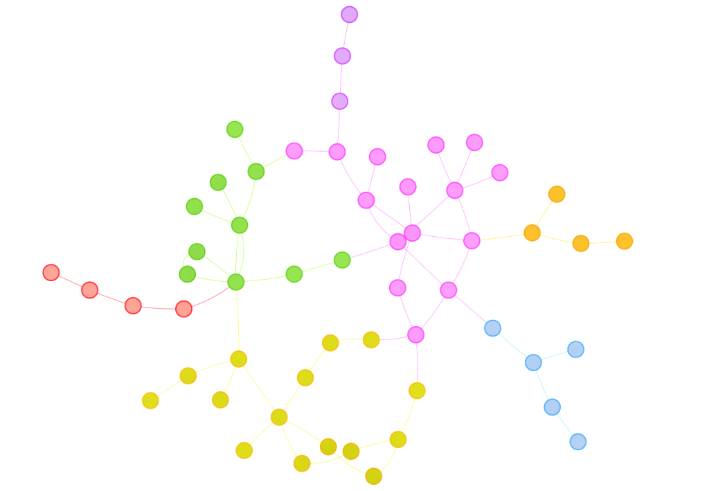
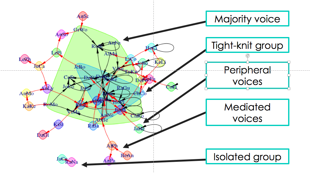
On the surface, the visualizations are fairly easy to interpret. Students who have discussed with one another are linked by arrows, with the head of the arrow pointing in the direction of communication. Strong connections between students are linked by wide lines, and communities of students are surrounded by colored shapes. The visualizations provide a snapshot of what’s happening between the students in the class.

ID_blog_jing_photo1

Data visualization from Jing Qi’s shiny app.

Yet…a snapshot is worth a 1,000 words. My colleague Scott Millspaugh and I interpreted the data from these visualizations in different ways, and both methods are useful to instructors for different reasons.

Scott focused on the nodes of the network, which represent individual students. He noticed that some students had stronger connections than others and in part 2 of this series, I shared some of his methods and strategies for assessing student-level data and using this data to improve the structure of online discussions.

My background is in the social sciences, so I couldn’t help but focus on the societies I saw in the visualizations from Jing’s app. I was particularly concerned when I saw some students interacting strongly with one another and some students isolated from the broader class. In the visualization below, you can see what I’m talking about. There are students on the edges of conversations, outside of groups. There’s even two students who look like they’re only talking to each other.

That’s not ideal. Discussion boards are opportunities for student to empower themselves through their writing, reflect on what they’ve learned, build community and identity, and develop their peer-peer learning skills. Discussions boards can be wonderful. But discussions – whether online or in-person – operate best when diverse voices are included. Students on the periphery aren’t sharing their voices or they are having their voices ignored. As educators, we have a responsibility to work with students both inside and outside of groups to ensure that everyone is included.

“Discussions – whether online or in-person – operate best when diverse voices are included.”

Fortunately, the strategies for increasing student engagement with online discussion boards are very similar to those used in classroom discussions. Here’s nine ways to get students talking to one another on online discussion boards.

  • Instructor prompts: Direct students to one another’s comments. Example? “Hey Bill and Ted, I’m noticing you solved this problem in two different ways. Are there points of commonality between your approaches?”
  • Requiring multiple responses: Consider requiring that students respond to a minimum number of other students before receiving full marks on their assignment.
  • Opening the floor: Revisit the discussion and make sure that multiple views or solutions from the students are invited and encourage. Are your questions clearly communicating to students that conversations are valued and expected.
  • Asking students to role-play: You could assign particular roles to students like facilitator, peacemaker, Devil’s advocate, summarizer, etc. and ask them to post on the discussion board as if they were speaking from their role. You could also ask students to reimagine a scenario from a different perspective.
  • Affinity groups: You could group similar responses together into “themes” and then ask students within each theme to comment on one another’s posts. Or, better yet, have the students group the responses into themes and explained why they grouped them that way. (This is a great activity to bridge in-class and online discussions.)
  • Think-pair-share: Ask students to think about what they plan to post on the discussion board, then share that idea with the student sitting next to them. Give a few minutes for students to discuss their responses and help each other, then invite the students to share what they learned on the discussion board.
  • Fishbowls: Using anonymized discussions (perhaps discussions from previous iterations of a course), ask students to comment on the quality of responses they see. Do they notice areas where communication succeed or where it needs improvement? This kind of activity often spurs student groups to self-correct themselves and include more voices in their discussions.
  • Assigning small groups: One of the problems with discussion boards in larger classes is that students simply can’t respond to everyone, and there’s little chance they’ll get a response back to their own post. Break down those gaps by assigning small groups, where students know who their correspondents are. With discussion data, it’s relatively easy to form these small groups in a way that will ensure more students are included in conversations. An instructor could pick some students for the group from well-established communities in the course and some students from the peripheral voices.
  • Jigsaws: If you have existing small groups in your course, it might be time to mix-and-match them so that students hear from new voices. One of my favorite mix-and-match methods is the jigsaw, where a new group is formed from one representative of each of the existing small groups in class. (So if you have 4 groups of 5 people, you would jigsaw to make 5 new groups, each with 4 people, one person from each group). Each of the representatives will bring their former group’s perspective to the newly formed group.

Phew! A long list of strategies for resetting and jump-starting online discussion boards. I hope you found some of them useful. (And if you did, could you let me know? What strategies do you use in your classroom or online discussions, or what strategies do you think are missing from this list?)

This is what I love about data-driven decision-making. It gives me information I need, then opens up a range of appropriate, potential next-steps. It doesn’t hand me the answer, but it gets me thinking in the right direction. Jing’s app took raw data from the Canvas system and processed it into visualizations I could easily understand. I identified something that I, if I were an instructor in this course, might want to change. I could research and adopt strategies that might enact the change I want to see. And when I’m ready, after those strategies have been employed, I can watch the data change over time and see if my strategies are working. Data is a lamp that lights my way.

I hope you found this series useful, and thank you for reading it. I’m hoping to write more on learning analytics and discussion data in the future, and if you’d like to see me address a topic of interest to you, please let me know. Feel free to get in touch. You can comment here or email me at kes.schroer(at)dartmouth.edu.
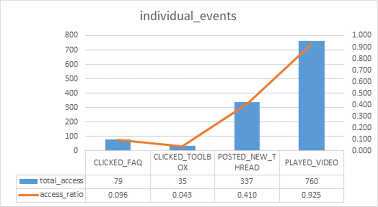
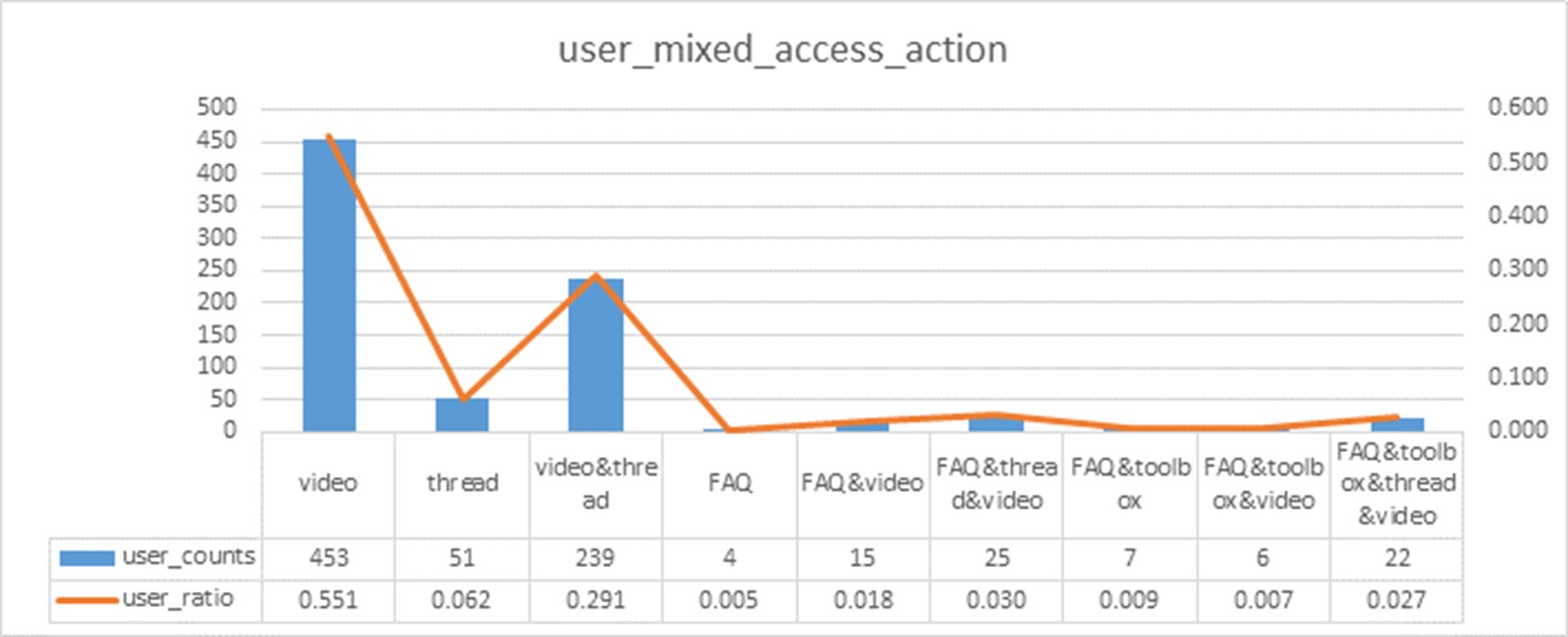
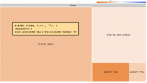
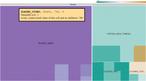
Node-based approaches: using data from online discussion boards, part 2

This is part 2 of a series I’m writing on how data can inform classroom and online discussions. If you’d like some background on this topic, check out part 1.

Jing Qi is one of my colleagues in Dartmouth’s Educational Technologies group. She’s our data master, and with her special skills we can navigate unseen worlds behind the Canvas Learning Management System. This is the system that many Dartmouth instructors use to host their courses and organize their course content. It is an awesome “one-stop-shop” for students to see their calendars, find their readings, submit their assignments, take comprehension quizzes, and contact their instructors. There is also another, sometimes underutilized, function in the Canvas system: discussion boards. These are places where instructors can post prompts and students can respond to one another. But often in online discussion boards, we see students make an initial post and then the conversations peter out.

Jing’s new shiny app helps us understand why certain conversations continue and certain conversations end. Using an easily installed script, we can help an instructor download discussion data directly from their Canvas course. The app makes data visualizations that can help an instructor understand what’s happening on the discussion boards and develop strategies for promoting deeper engagement among their students. Today, I’m writing about one suite of strategies, which I call the “node-based” approach. It’s heavily informed by the ideas of my colleague Scott Millspaugh, who recently presented this online at Canvas Live!

Scott is an instructional designer who works with faculty primarily in Arts & Humanities departments at Dartmouth (and co-facilitator of the Digital Humanities initiative to boot). Scott supports a course in which students are required to post comments on a weekly discussion board and reply to at least one other post. Some students get lots of responses. Some get none. Scott and the course instructor were curious about why.

Using Jing’s app, Scott was able to construct a network of the students in the class and how they respond to one another. The network includes nodes, the places where the connections meet. Each of these nodes represents one student. Scott noticed that one student appeared to have more connections than other students. By checking the “matrix” tab in Jing’s app, Scott was able to confirm his hypothesis. The matrix tab showed each student and how many responses they had received to their posts [[photo 3]]. One student appeared at or near the top in all the discussions – a student we’ll call S33.

Jing Qi's shiny app can help instructors see student patterns in their online discussions. By clicking on the matrix tab, instructors can get a sense of which students have the most popular posts. We examined 3 discussions in this class, and student 33 (S33) received the most (or nearly the most) responses in every discussion.

Jing Qi’s shiny app can help instructors see patterns in how students respond to online discussions. By clicking on the matrix tab, instructors can get a sense of which students have the most popular posts. We examined 3 discussions in this class, and student 33 (S33) received the most (or nearly the most) responses in every discussion.

In S33’s posts, we could detect certain patterns that weren’t present in other students’ posts. S33 wrote short responses, but they were inviting. The student often used subjective language like “I think,” “I feel,” or “I believe.” They asked other students directly what they might think or feel about the post. Conversely, the students in the class with the fewest responses often had the longest posts and tended to use the most academic, objective language. Now, big caveat: there might be other reasons that S33 has popular posts. Maybe the student is friends with many people in the class or seen as a person of influence on campus. But the patterns within the data are suggestive that S33 is doing something other students in the class are not.

The student often used subjective language like “I think,” “I feel,” or “I believe.”

The instructor can use this data to make a decision about using discussion boards. If the instructor wants students to converse with each other, the instructor can set a word limit and encourage students to share their personal thoughts. If the instructor is using the discussion boards to measure student comprehension of the reading material, the instructor might want to recommend a range for the word count and tell the students not to worry about responding to one another. Using data, the instructor can better articulate the goals of the assignments and how to best achieve those goals. In the process, we clear up expectations for the students.

So that’s one way that Jing’s app helps inform classroom and online discussions. In this approach, Scott saw a node in the network that was different than other nodes. He dug in deep to understand why the student at that point in the network was more successful (by one measure of success) than other students. Next week, I’ll talk about an alternative approach to dissecting data from discussion boards. I call it the “composition-based” approach, and it focuses on the students outside of the networks rather than those within it.

In the meantime, feel free to contact me with questions. You can comment here or email me at kes.schroer(at)dartmouth.edu.

Using data from online discussion boards, part 1

I’m the coordinator for Dartmouth’s Learning Fellows Program, a program that places advanced students in classrooms to help facilitate small group activities. Part of my job is to help Learning Fellows troubleshoot when small group activities don’t work as planned. Group work can help students navigate complex ideas, but it’s not easy to maintain dynamic communication between all members of a group. All kinds of communication concerns can arise during group work, from students who dominate conversations to students who don’t know how (or might not want) to participate in conversations. But often, the challenge lies somewhere in the middle of those two extremes. Students start conversations, and then the conversations peter out. A question I often get from our Fellows is “how can I keep momentum going?”

It’s the same problem we often see in online discussion boards. Students answer an initial question, and they might send a few responses to other student posts. But the responses tend to be superficial and there’s hardly ever a response to the response.  There’s not really a lot of “discussing” going on. The discussion boards end up looking more like a collection of student reactions rather than a living conversation.

At Dartmouth, we’re trying to help tackle that problem with data. Our instructional designer Jing Qi has built an awesome new app that can filter key data from online discussion boards, then present a summary of that data in easily interpreted visualizations. Instructors (or coordinators like me!) can use the visualizations to help decide how to most effectively use discussions in their courses, and how they might be able to keep students talking to one another.

Let me back up just one step and say a little about why discussions are important. We know that intuitively. Discussions help students learn to communicate their ideas, to evaluate ideas, and to apply their skills to new contexts. But perhaps the reason I value discussions so highly – and group work more generally – is that discussions allow students to envision their future communities (behind a paywall). In discussions – whether in-class or online – students learn how they want to act in a community, and what kinds of communities they might be seeking. If we’re interested in training responsible, conscientious citizens, we need to provide our students with opportunities to act within communities. Discussions offer these opportunities.

“Discussions allow students to envision their future communities.”

Jing Qi’s learning analytics app can help us understanding how communities are forming in classroom discussions and online discussion boards. Below is a sample visualization from her app. Don’t be alarmed! Once you input a simple data file, the visualization builds itself. It takes into account which students are posting and responding to one another and the length of their responses (we’ll come back to this in a later post). The visualization automatically calculates the connections between the students and shows each student as a four letter code. Connections are shown in arrows, where black arrows show intergroup connections and red arrows show intragroup connections. No arrow means there’s no connection between the students. Colored shapes surround the groups with the strongest communities.

Data visualization from Jing Qi's shiny app.

Data visualization from Jing Qi’s shiny app.

If we digest this visualization a little bit, we can see several kinds of communities emerging from the discussion data. There’s a big green shape that surrounds the students I like to call the “majority voice.” It contains most of the students in the course. The other, small community in the blue shape I like to call the “tight-knit group.” These are students who frequently respond to one another, and they are a subset of the majority voice. Maybe they are friends, play on a sports team together, or have previously taken a course together. I can also see a few smaller communities in this visualization. Some are just individuals, located on the periphery of the majority voice and occasionally interacting with those students. Some are mediated voices, where students communicate with a student on the periphery who then communicates with the majority voice. And some communities are just two students, talking only with each other.

Communities detected in Jing Qi's shiny app.

Communities detected in Jing Qi’s shiny app.

Let’s assume we want to change this scenario so that more students are interacting with one another. Maybe we want to include more of those voices on the periphery or break up the “tight-knit group.” Maybe we want to bring those isolated, two-student groups into the fold, because they might have very interesting and unusual ideas to contribute to the discussion. There’s a couple of strategies we could use to change the discussion dynamics. One strategy is “node-based,” and focused on the influence of the students in the center of the groups. Another is “composition-based,” which mixes and matches groups to encourage more diversity. Both strategies have their time and place.

My colleagues and I were fortunate enough to present on these strategies at a recent Canvas Live! presentation, where we were joined by members of Northwestern’s learning analytics team. In case you missed the session, I’m also going to post some of our take-aways on this blog. The next post will be on the “node-based” strategies and will feature some ideas from my colleague-in-arms Scott Millspaugh. He’s an instructional designer for Dartmouth’s Arts and Humanities division and one of the co-facilitators for our Digital Humanities initiative. Like me, he’s fascinating by the potential of data to transform the way instructors can make decisions about their courses. The last post in this series will feature some “composition-based” strategies, based on my own experiences with Dartmouth’s Learning Fellows. They’ve been important and insightful voices on our campus, reframing the way we think about discussions and community. I’m excited (and honored) to share their ideas with you. Look for our “node-based” approach this time next week, and our “community-based” approach soon to follow.

In the meantime, feel free to contact me with questions! Please use the comment box below!

Using a motion chart to illustrate page view activities over time

motionchart2A motion chart is a dynamic chart to explore several indicators over time.

In this blog, we will demonstrate how to use a motion chart to illustrate student page view activities over time, in an attempt to examine whether there is a pattern between indicators, such as cumulative_page_views and a given date. The chart used in this blog was built with user-in-a-course-level participation data that Canvas (Learning Management System) collects: The data was harvested using the API endpoint that Canvas provides: /api/v1/courses/:course_id/analytics/users/:student_id/activity. An example of using a ruby script to gather student page view activity data is available at: github/jingmayer/garden

First, let’s prepare the data set and include the following fields:

  • datetime: The date and time when a student accessed a Canvas course
  • user: The unique user_id for a student
  • pageview_id: The unique identifier for the data set, which is composed of an user_id and the hour of the day when a page view record was created by the user.
  • cumulative_page_views: The accumulated/aggregated count of page views for a student on a given date
  • daily_page_views: The actual daily count of page views for a student on a given date
  • total_activity_time: The total activity time that a student spent in a course when the time the data was pulled

After the data is prepared, you can build a motion chart using the data in R with googleVis package.

You may switch the options for x-axis, y-axis, color and size to observe the page view activities from a different perspective. For instance, you may switch the Color option from ‘datetime’ to ‘user’ to observe the page_view activities for the same users over time.

In our example, the y-axis corresponds to the incremental page_views accumulated for an individual up to a given date, the x-axis denotes daily page_views, and the size of each point indicates the total_activity_time (in seconds) that an individual spent in the course. Each point corresponds to an unique pageview_id, which contains two parts: The user and the hour of the day the record was created.

For instance, I would like to identify some self-motivated participants in a course, as I was playing the motion chart, I noticed that user ‘5105899’ had accessed the course and views many pages on a number of days. The screenshot of a motion chart below demonstrates: The point, marked as ‘510589911’, represents user ‘5105899’ viewed 10 pages at 11:00am on Oct.1, 2016, and by 11:00am on Oct.1, the user ‘5105899’ viewed 394 pages in total. The information shows that user ‘510589’ (the greenish points) accessed the course and viewed a number of pages on Oct.1, 2016 (circled in green).  The user ‘510589’ generated the highest number of cumulative_page_views compare to his/her peers who also accessed the course on that day. motionchartFurthermore, I am curious to see what the page view activities for self-motivated participants, such as user ‘5105899’, look like over time, did they access the course on a regular basis? Did they spend similar amount of time in the course? You may switch the motion graph type (iconType: Bubble, Bar and Line) to gain a different perspective on the same set of data.

motionchart2Reference:

Using network analysis to visualize online discussion interaction

In this blog, we will talk about using a user script to harvest Canvas discussion data, loading the data to a Rstudio Shiny app that employs network analyses to analyze and visualize student discussion interactions. Instructors may leverage the visualizations to make an informed a decision on discussion facilitation and student group arrangements.

DT1 DT2

A user script is a script that runs in a Web browser to add some functionality to a web page. The user script we are going to use is to add a ‘get discussion data’ feature on a Canvas course discussion page. To use a user script you need to first install a user script manager. For Firefox, the best choice is Greasemonkey. For Chrome: Tampermonkey. Once you’ve installed a user script manager, click on the get discussion data user script, and click on the Install button. The script is then installed and will run in a Canvas course site it applies to.

Open a Canvas course that contains discussion activities, click on the ‘Discussions’ navigation tab, scroll down to the bottom of the discussion page, click on the ‘Get Discussion Entries’ tab, select “Generate one file with interactions”, and save the data in a csv file format.

If you open the file in a text editor, it should appear like the following format:

from,to,weight,group
Stu1,Stu2,511,one
…….,…….,398,one
…….,…….,484,one
Stu2,Stu1,66,two
…….,…….,680,two
…….,…….,691,two

Each of the four column headers refers to:
reply_author – from, initial_entry_author – to, reply_word_count – weight, topic_id – group

Open the networkgraph app, load the csv file to the app. The discussion data is now presented in directed weighted network diagrams.

  • The community detection: edge.betweeness.community algorithm is used to detect groups that consist of densely connected nodes with fewer connections across groups.
  • The degree of a node: In-degree and out-degree are used to measure the direct ties for each node. Each node represents a student, and the size of an node corresponds to the quantity of interactions associated with the node.
  • The weight of a directed edge: The directed connection corresponds to the direction of an immediate interaction, and the thickness of a link corresponds to the length of an interaction.
  • The degree of a node (size of an orange circle) corresponds to the quantity of interactions associated with the node. You may adjust the size of nodes using the slider (control widget).
  • The weight of an edge (thickness of a directed link) represents the length of an interaction, in this case, it corresponds to the word count of a reply message. You may adjust the thickness of links using the weight control widget.
  • “edge.betweeness.community algorithm” – an approach to community detection in social network is applied to detect groups that consist of densely connected nodes with fewer connections across groups.
  • You can select a group to examine student discussion interactions within the network.
  • You can select an individual student and examine his/her discussion activities in relationship to overall discussion interactions.

The app has additional features besides the network diagrams that instructors can leverage.

    • Data_Summary:
      • You can search by a student name and locate all interactions associated with the student.
      • You can sort the data by the weight (the word count) of an interaction.
      • You can use the Plot feature to examine the weight of an edge or the degree of a node for a student in relation to his/her peers.
    • Matrix:
      • You can search by a student name and find out the total number of interactions and the total word counts of all the interactions associated with the student.
      • You can sort the data by the number of interactions or total word counts to identify the most ‘influential’ or ‘active’ nodes.
      • You can also download the matrix for further statistical analysis.

matrix