

Over the past year, we have done an extensive exploration for learning data associated with student discussion participation, the duration of online course access and quiz performance. But we had struggled with providing instructors with visualizations that clearly represent 4 or more dimensions of student learning data. The descriptive graphs generated in our custom analytics app are somewhat segmented, and not cohesive enough that allows our instructors to examine all aspects of student activities with single clicks.
Being inspired by the power of Google Charts with R, we built a Shiny app using R that merges student activity and performance data, and produces bubble charts that visualize learning data set with 4 dimensions. The first two dimensions are visualized as coordinates, the 3rd as color and the 4th as size.
- x-axis denotes the duration of activity (in seconds) that students spent in an LMS course
- y-axis represents quiz performance or running total score (in percentage)
- color represents groups
- radius of a bubble corresponds to the number of discussion participation (in order to compare two directional discussion activity between providing feedback to peers and receiving comments from peers, we added another dimension to the chart)
Chart one: the radius of a bubble corresponds to the number of comments received by a student.
 Chart two: the radius of a bubble corresponds to the number of feedback provided by a student to his/her peers.
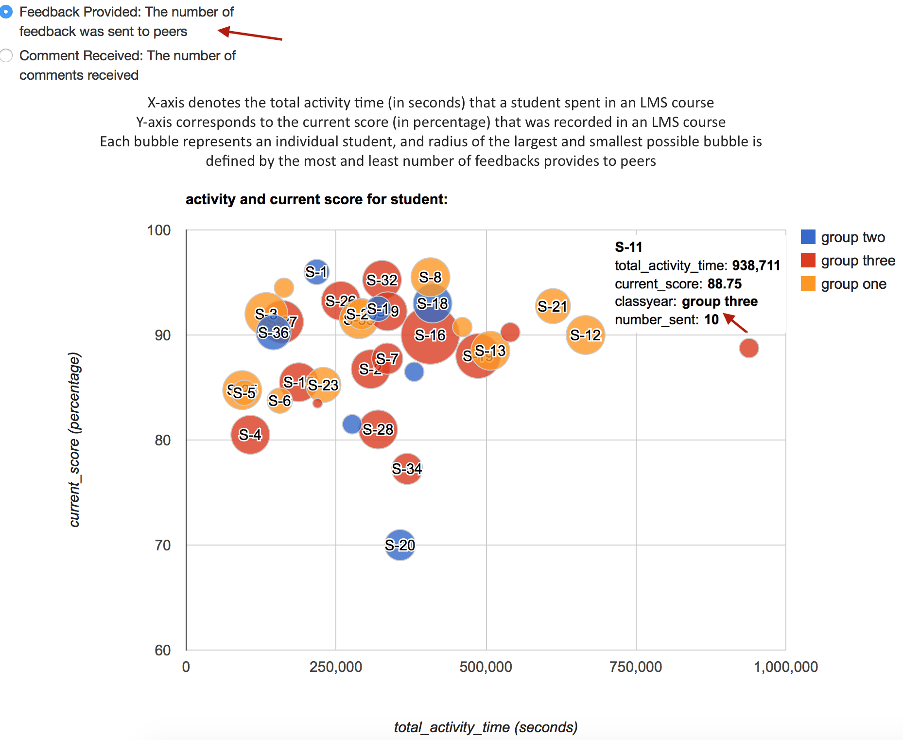
References:
https://rdrr.io/github/jburos/GoogleVis/man/gvisBubbleChart.html
https://cran.r-project.org/web/packages/googleVis/vignettes/googleVis_examples.html
https://www.coursera.org/lecture/data-products/shiny-2-2-CtLAp