Exhibition Exchange

Another part of this Matariki exchange has been the exchange of exhibits between Dartmouth College and the University of Otago. As I write this post, the University of Otago Printer in Residence exhibit is going up at Dartmouth College.

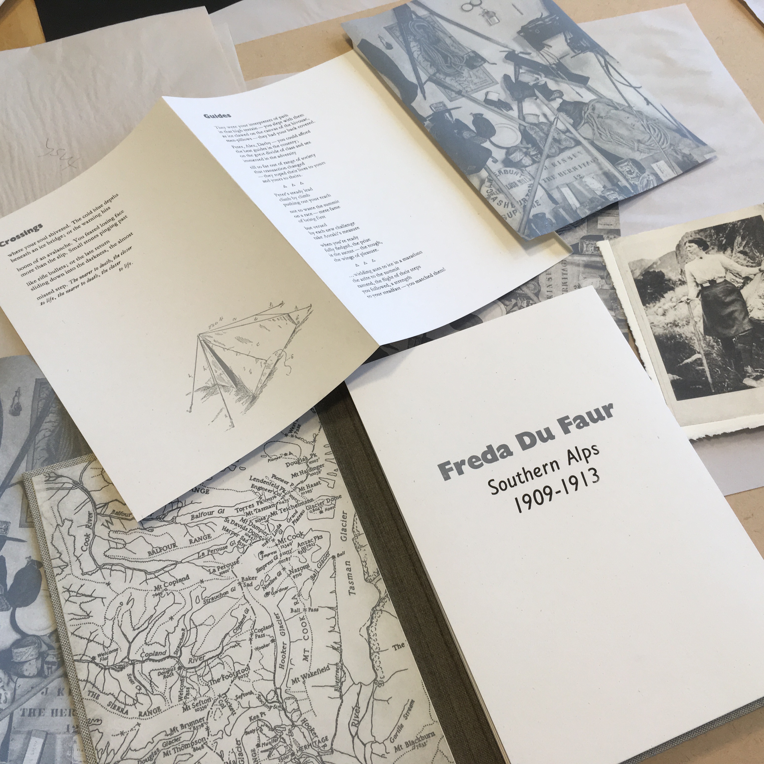
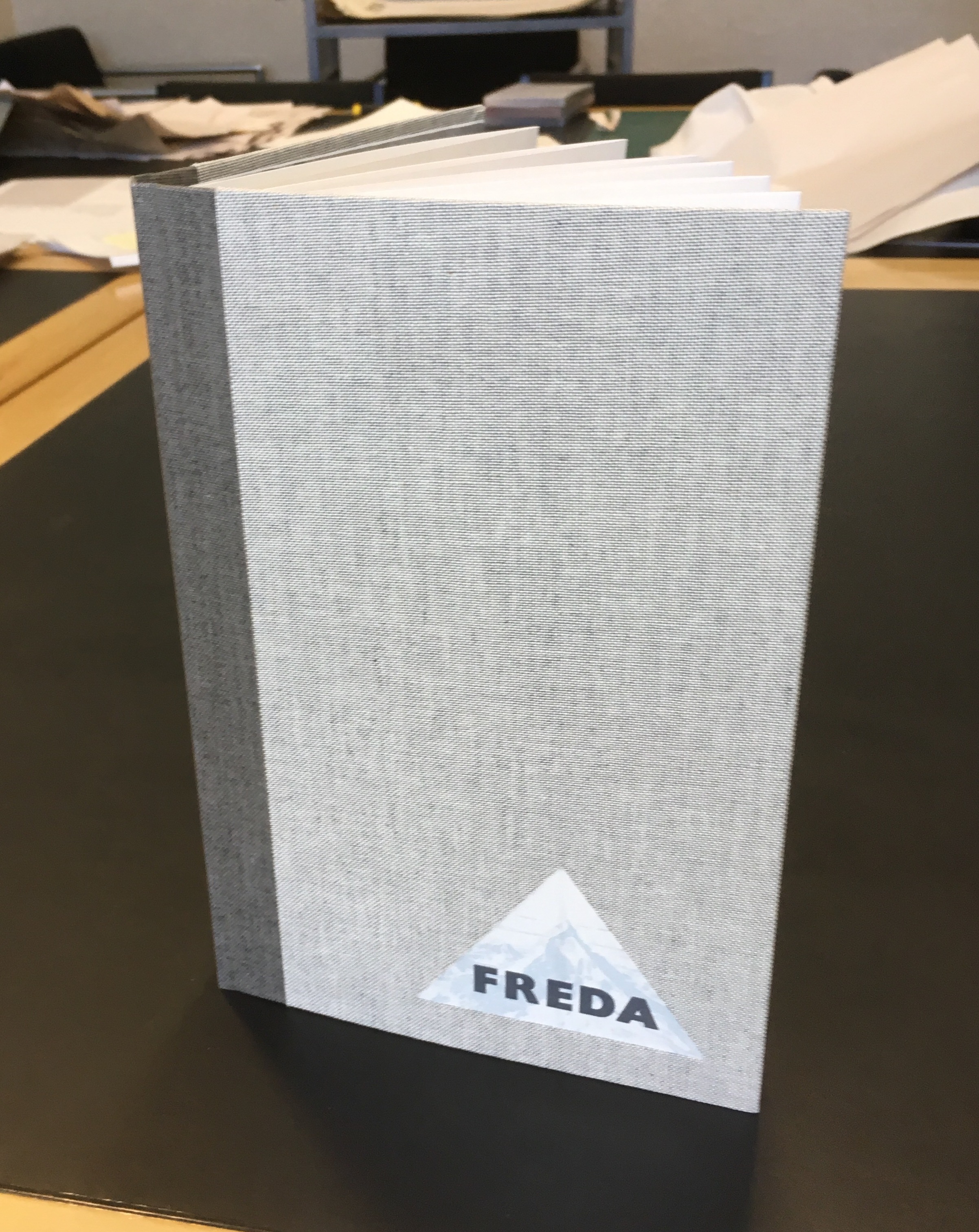
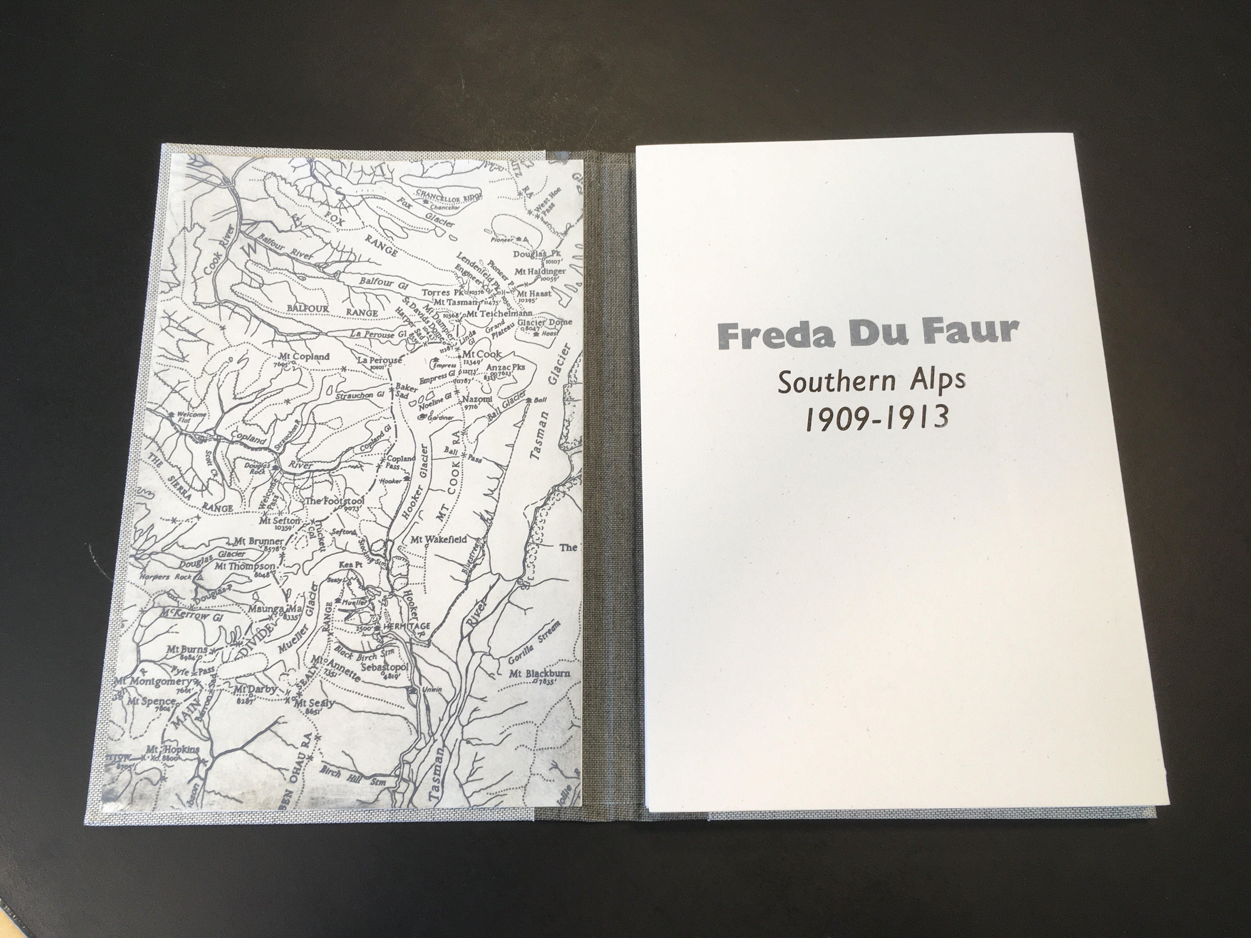
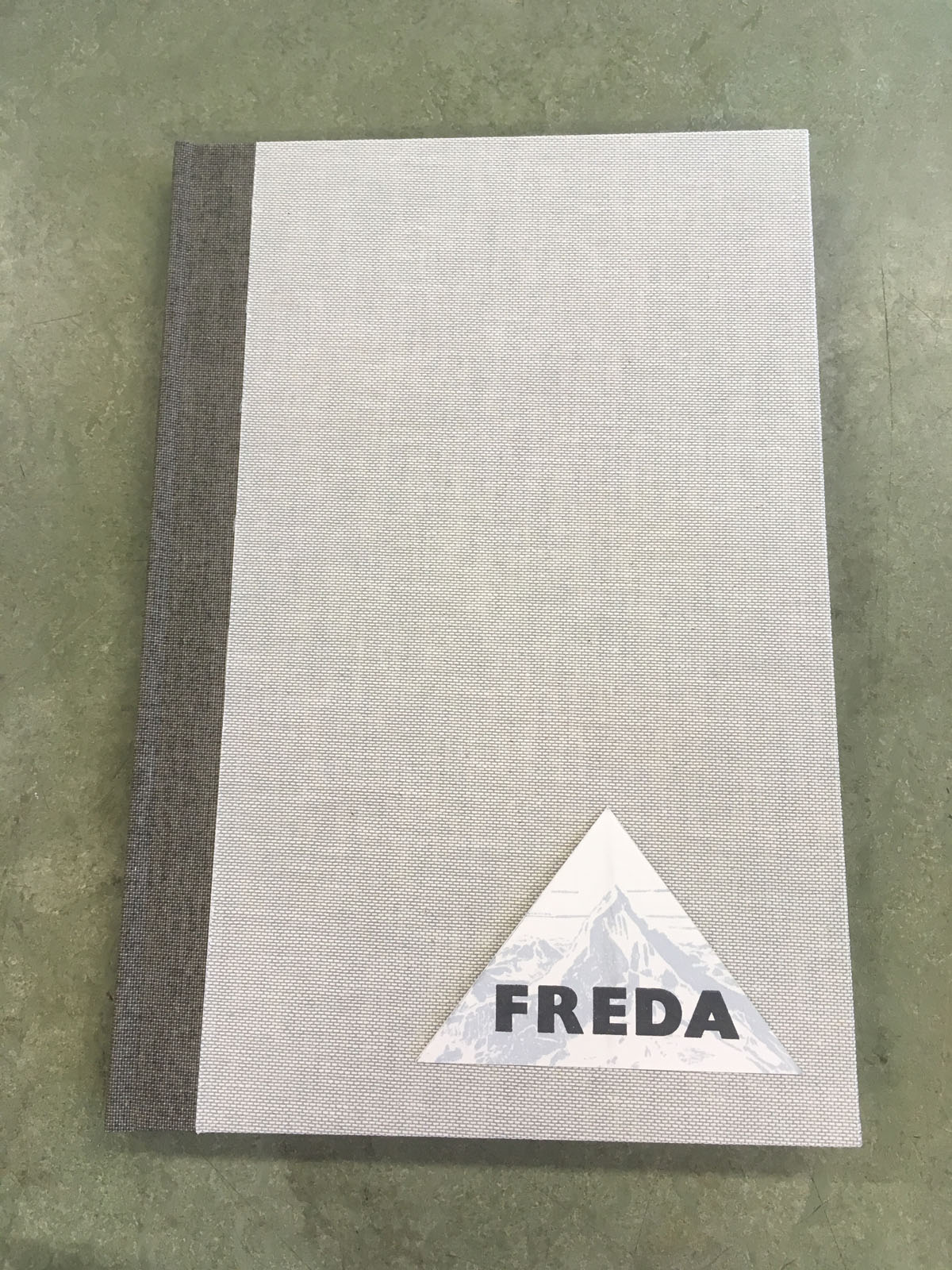
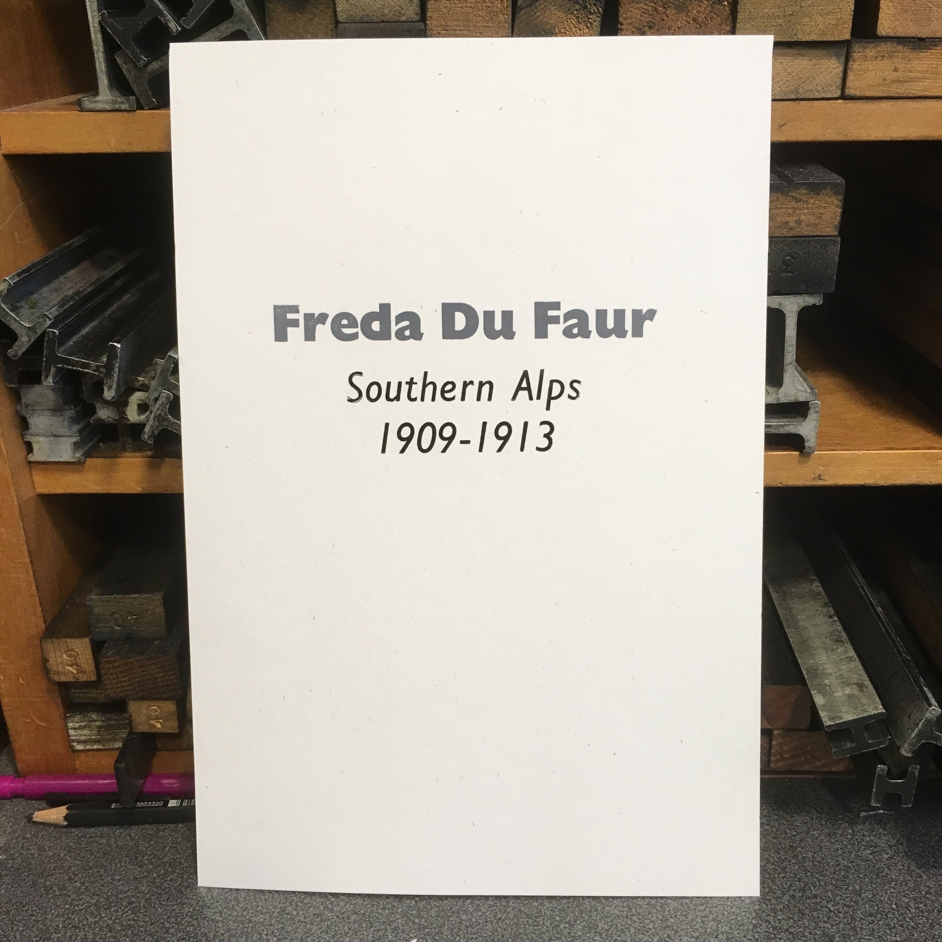
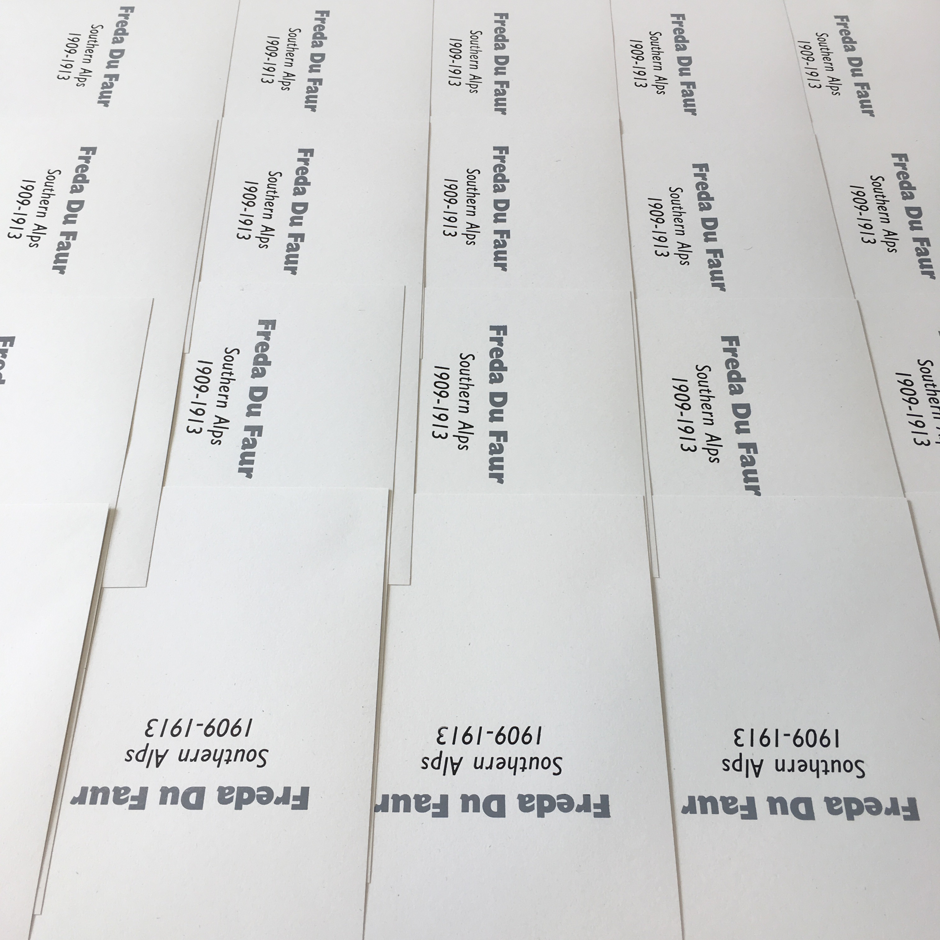
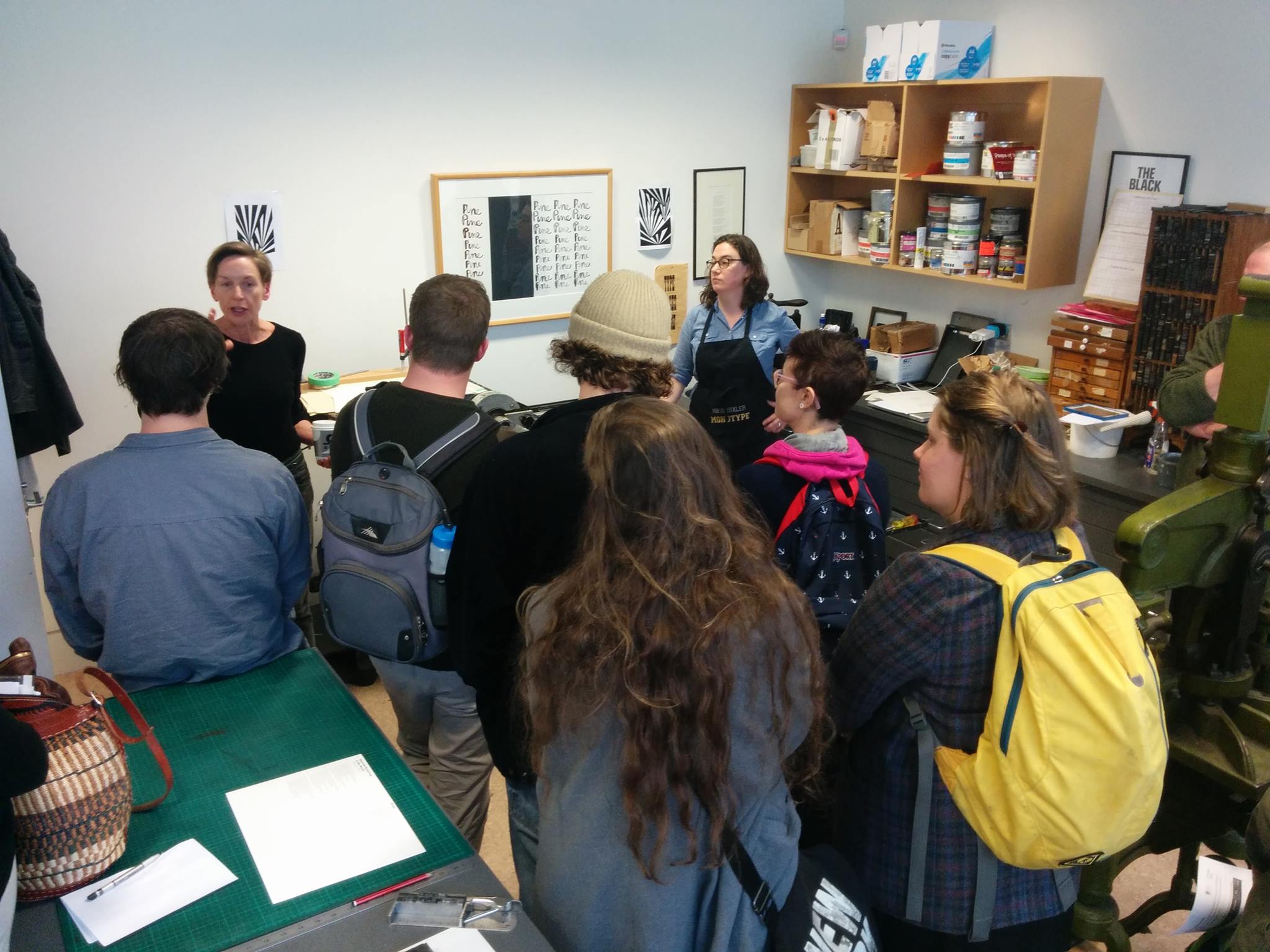
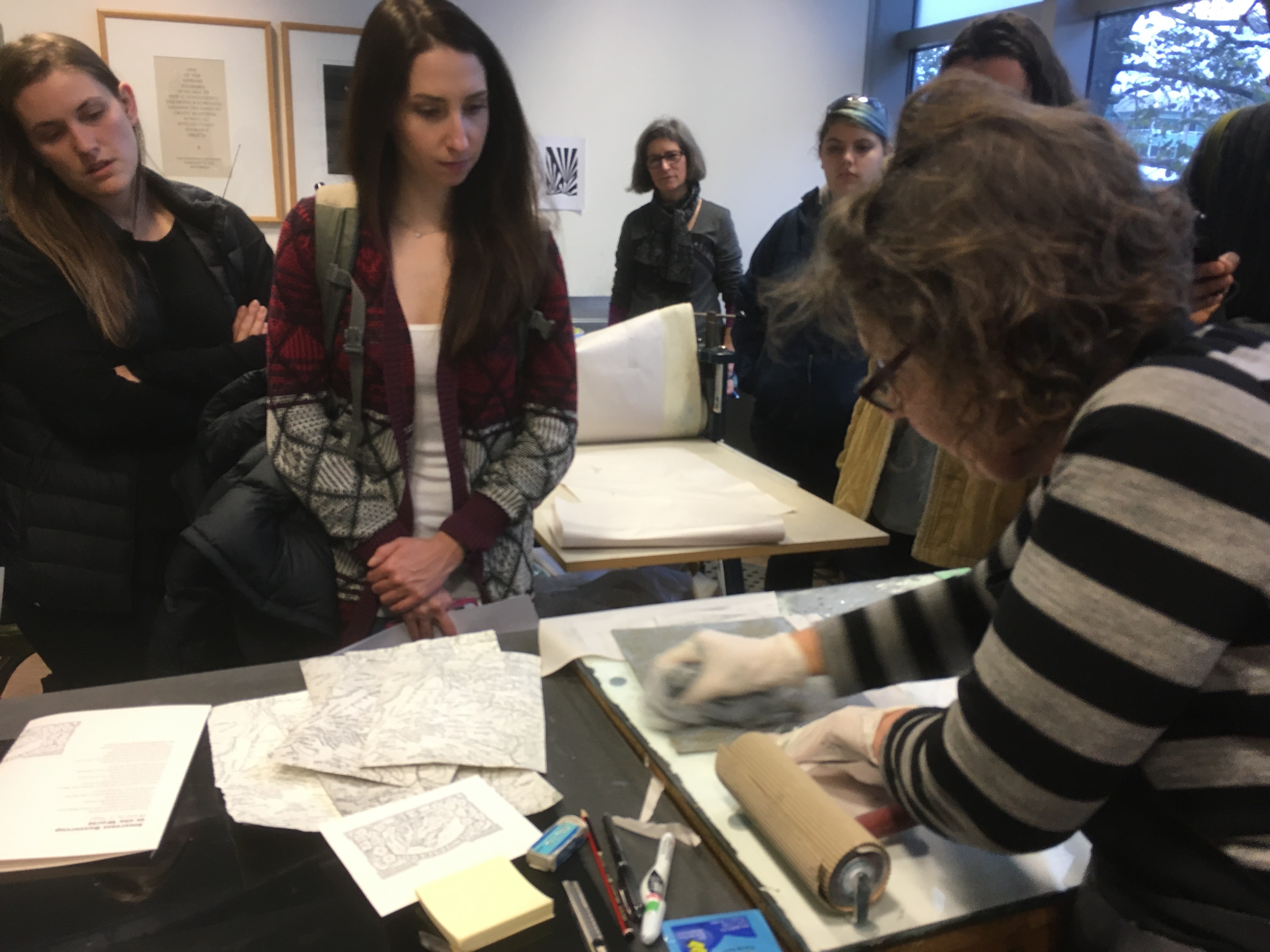
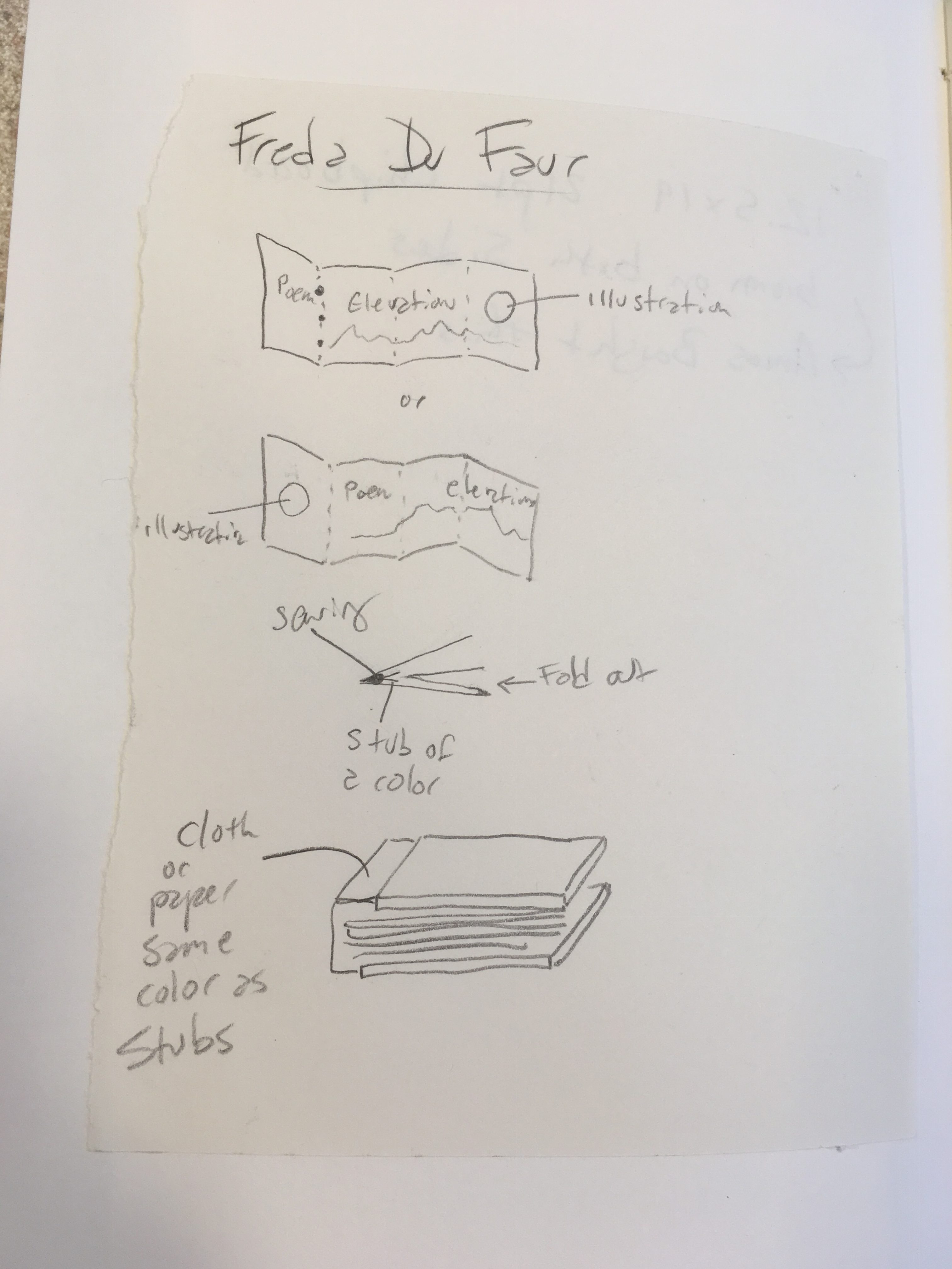
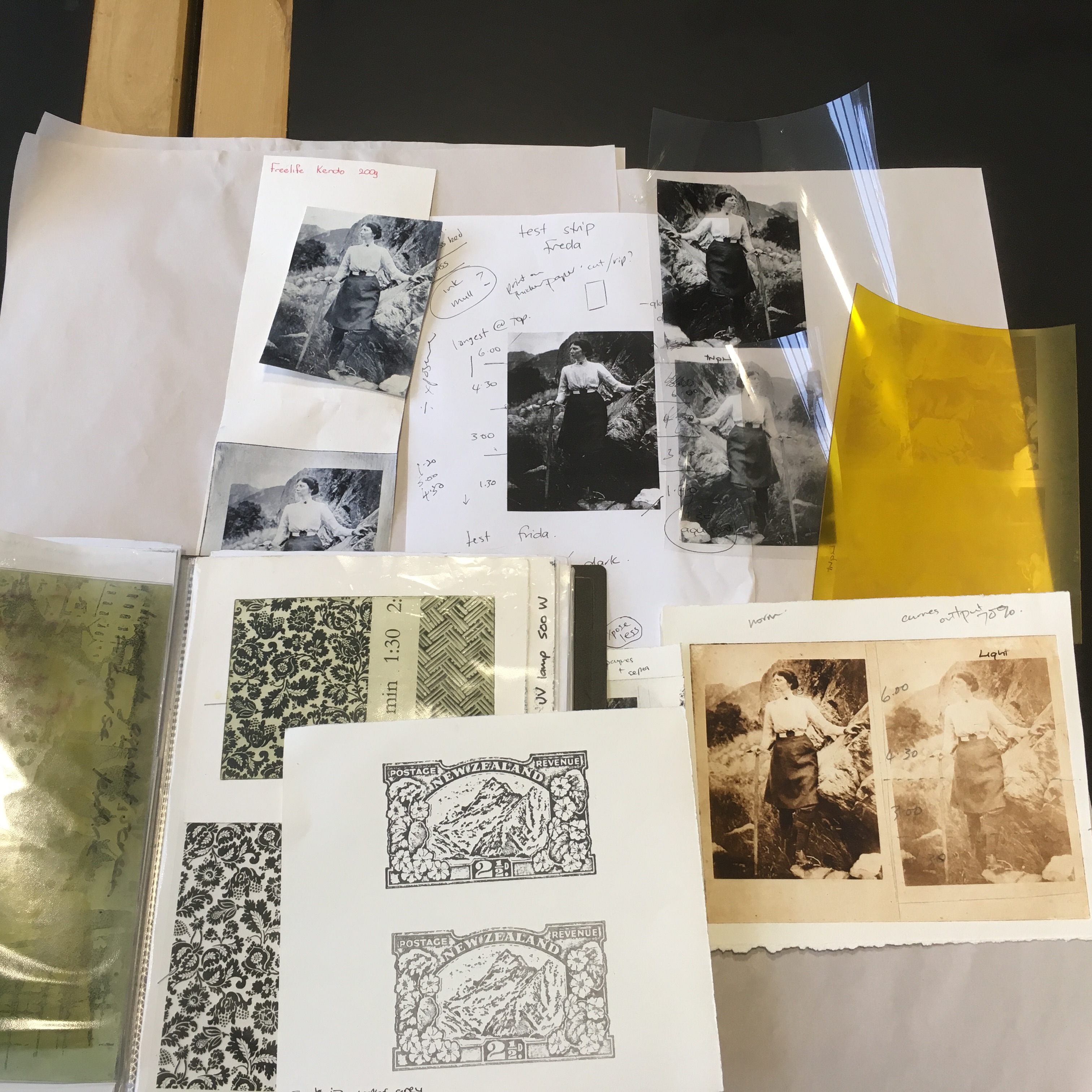
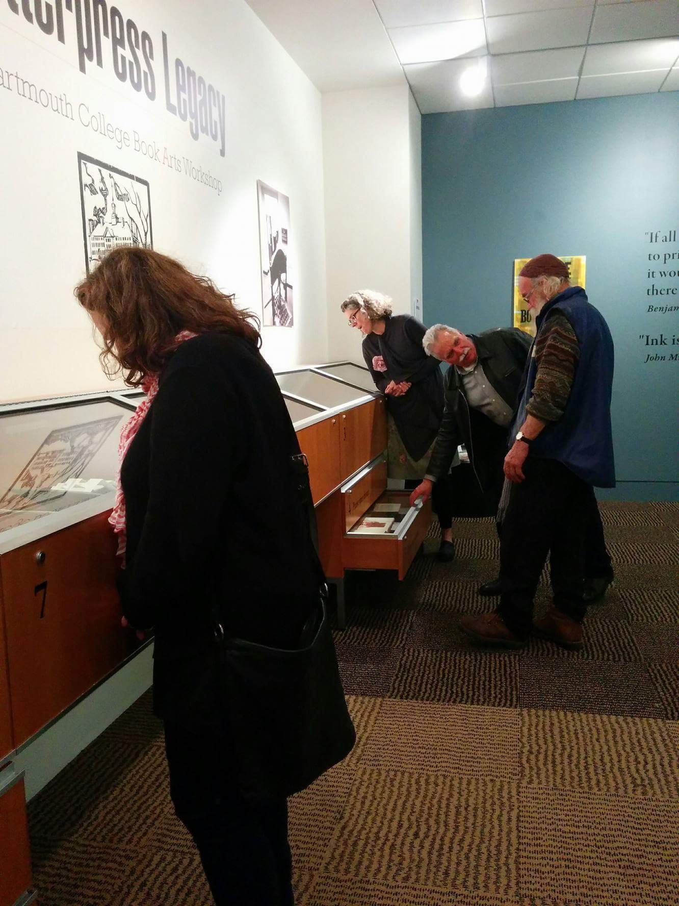
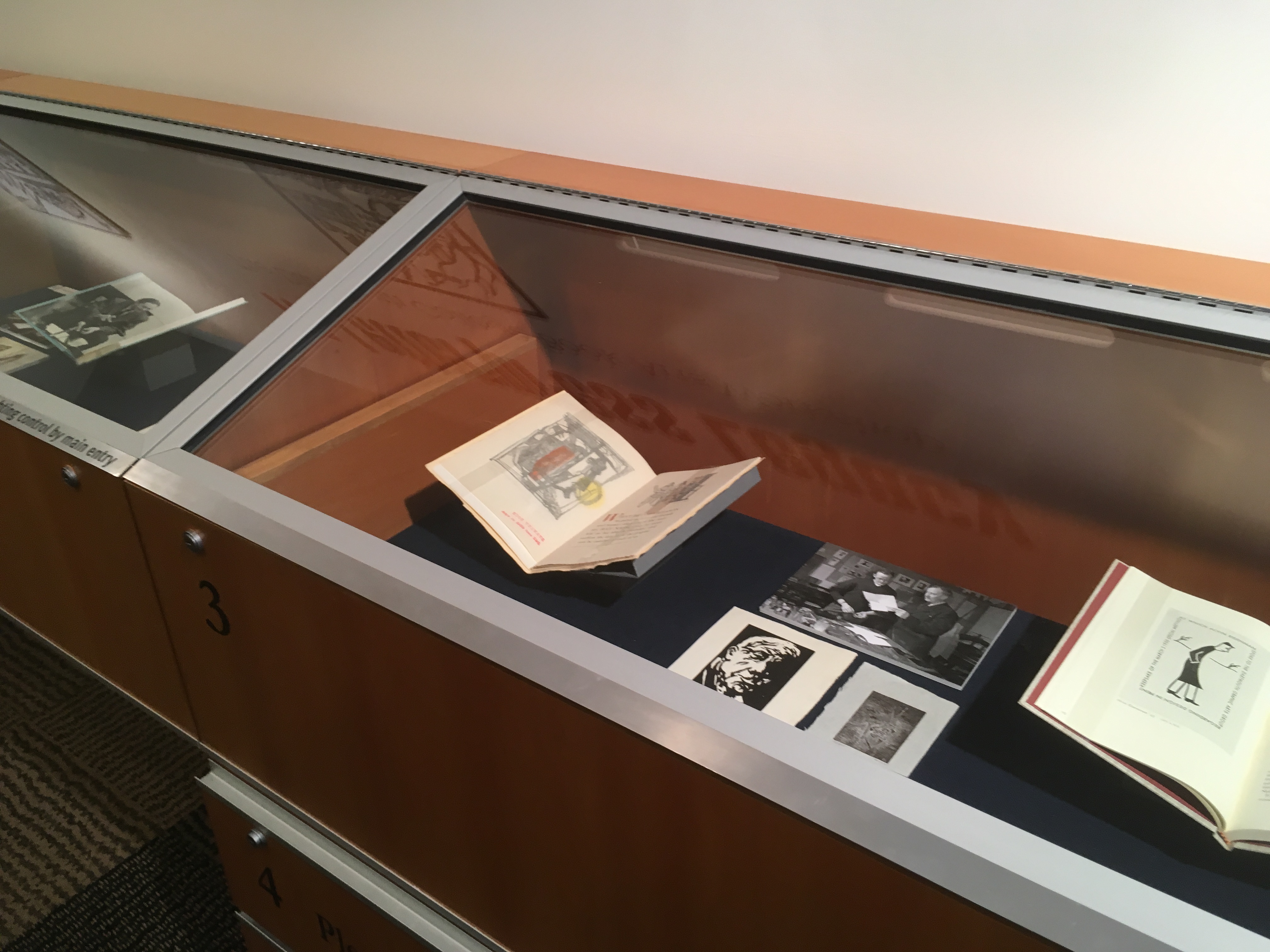
While I was in Dunedin the Dartmouth College Book Arts Workshop exhibit focusing on the  25th anniversary its opening  went up. It is called “A Letterpress Legacy”. It was interesting to see how Donald and Romilly worked with the materials and information from our 25th anniversary exhibit, that we displayed in March of 2014. The exhibit shows a lot of different projects printed and bound by students and community members throughout the years at the Book Arts Workshop. SOme projects were done as part of a curricular class, some in workshops and some just for fun and interest. Donald and Romilly tracked down and emailed students and recent alums and from long ago to learn about their experiences in the Book Arts Workshop (and Graphic Arts Workshop before 1970). The results were exhibit captions with intriguing backstories and fascinating personal accounts to go with the items that people have made over the years.

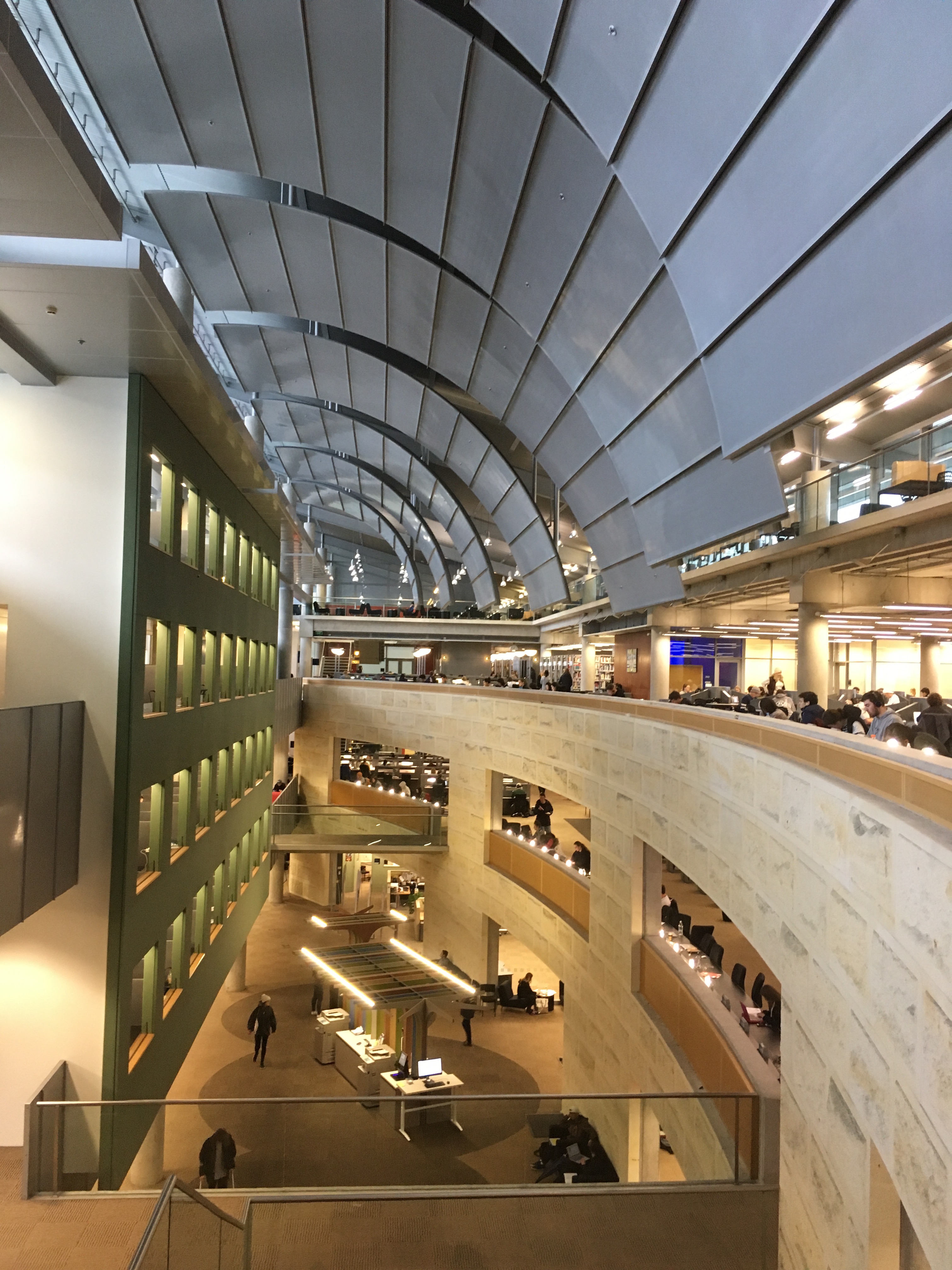
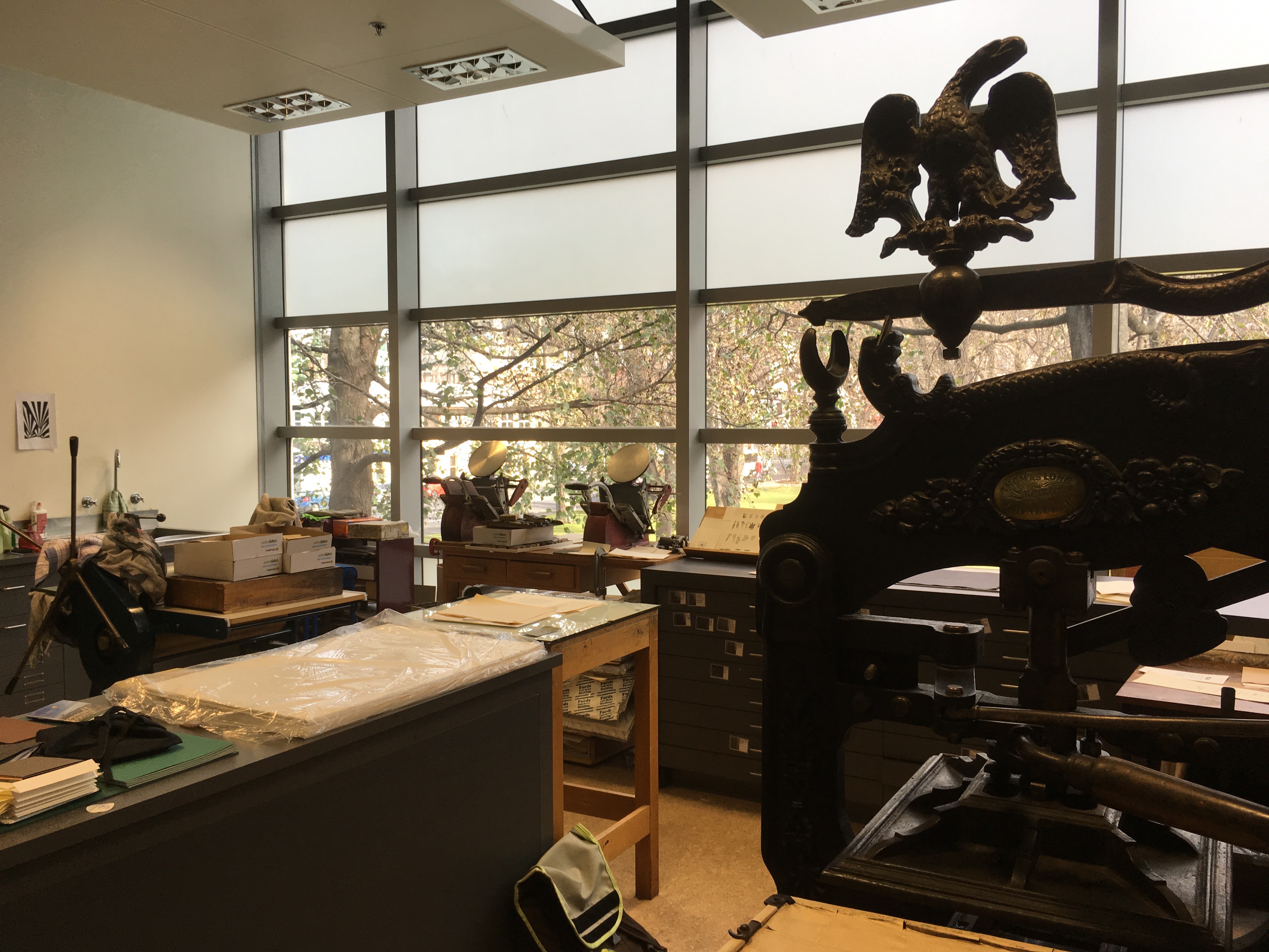
The exhibit space is a very different kind of space than our space at Dartmouth. Our space is very grand and public—very prominently located in Baker Library’s main hall. But because it’s a very public space it can be difficult to linger over text. The University of Otago’s Special Collection space however is a bit quieter. It is still a public space in the Central Library and everyone is encouraged to visit, but it is more removed from the main entry and thourough fares of the library. It is also somewhat enclosed. This makes it a contemplative space, where spending time with items on display and accompanying text is easy to do.


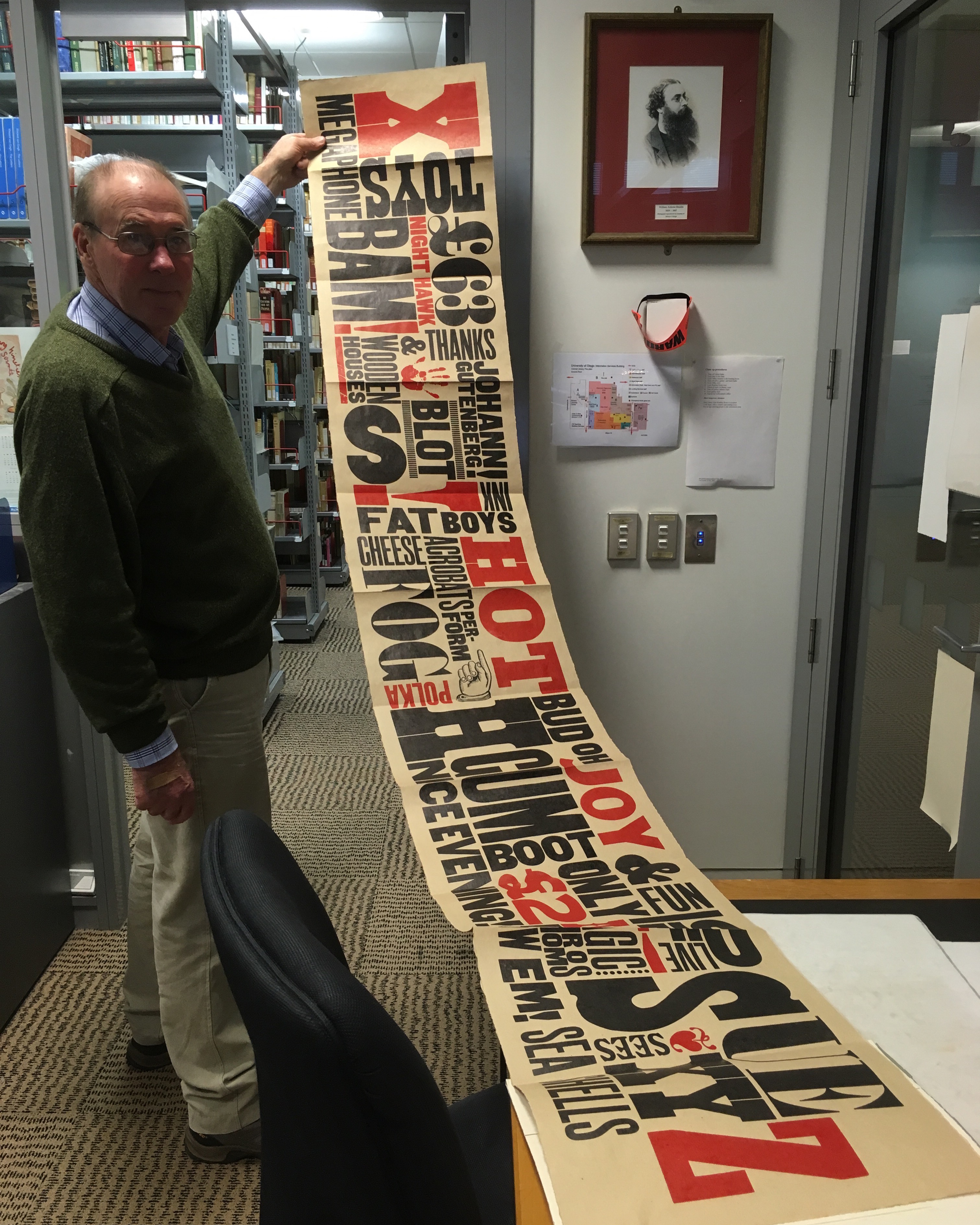
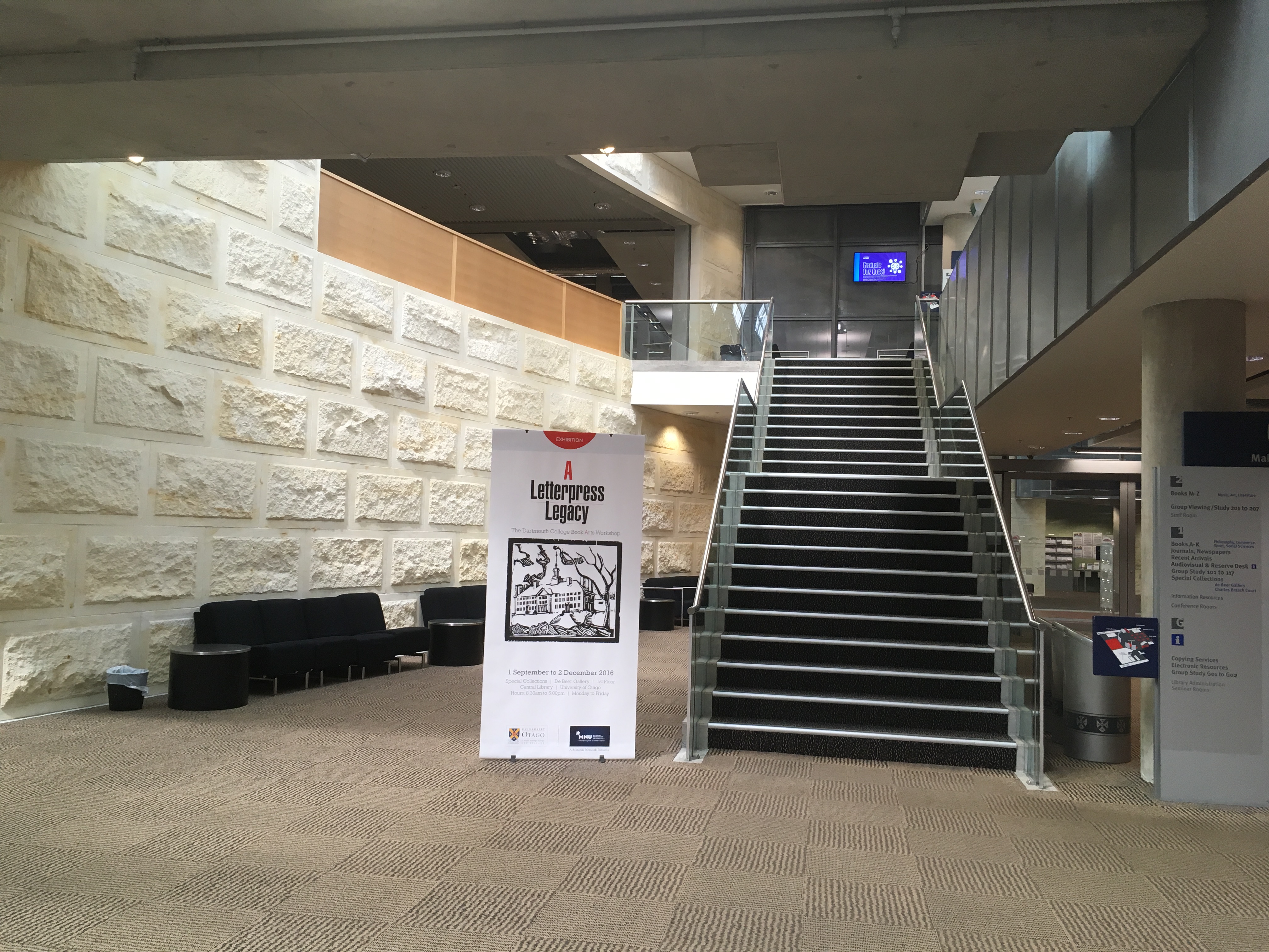
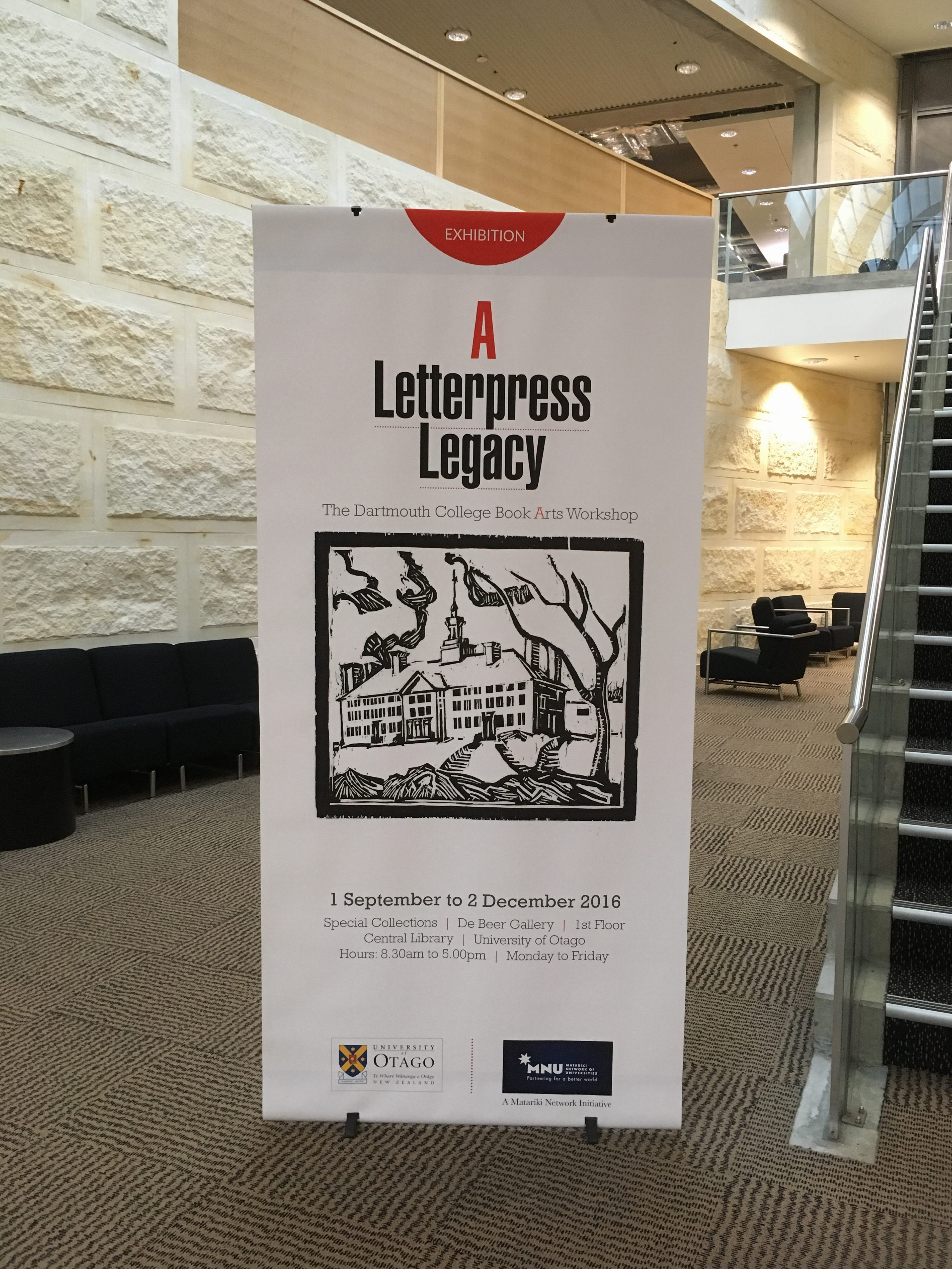
This is the large poster/banner leading viewers up the stairs in the library to Special Collections and the exhibit. The image is from an old woodcut of Dartmouth Hall that someone (presumably a student) made years ago. I wish we knew who did it, but it makes for a great image for advertising the exhibit.

IMG_1247IMG_1146


Putting up the big banner in the exhibit.

IMG_1149IMG_1162

IMG_1168

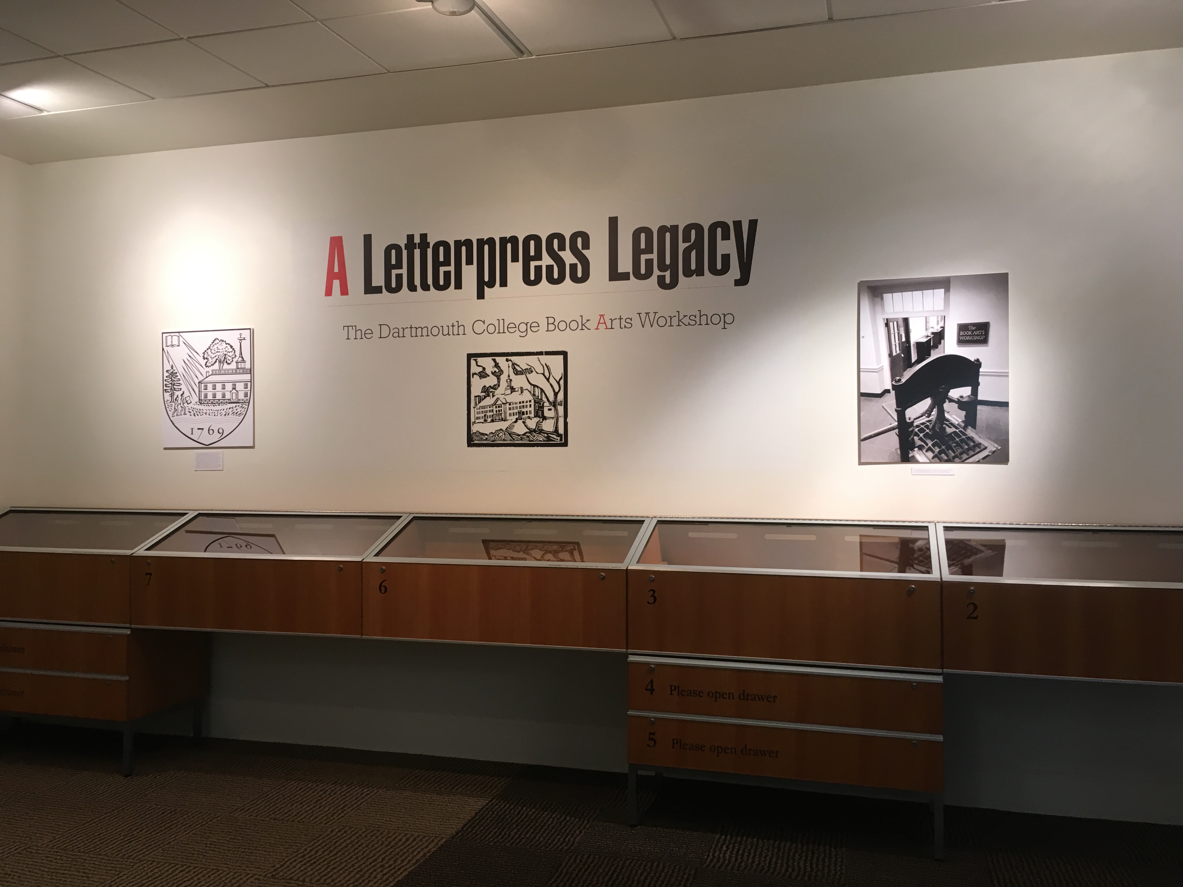
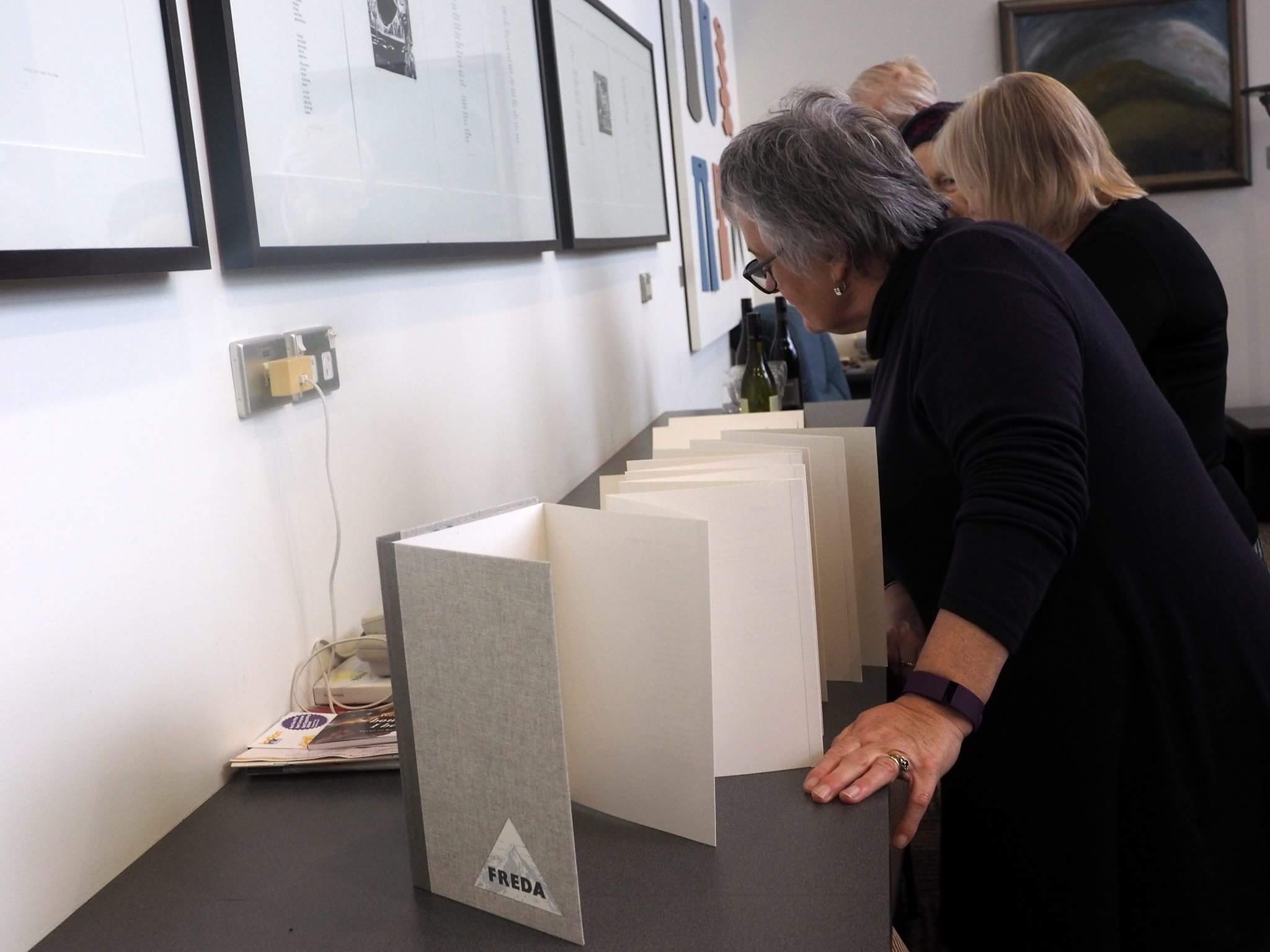
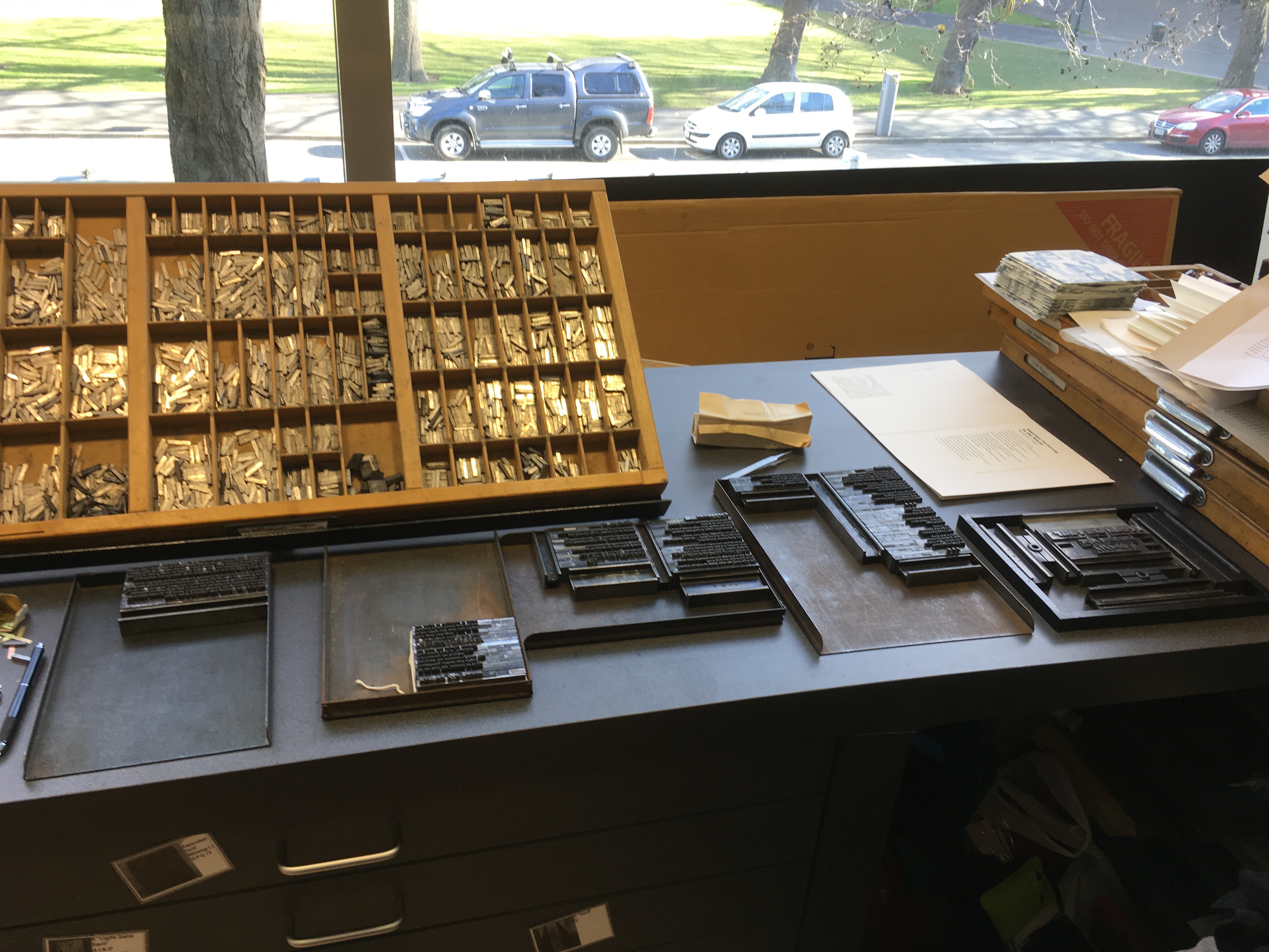
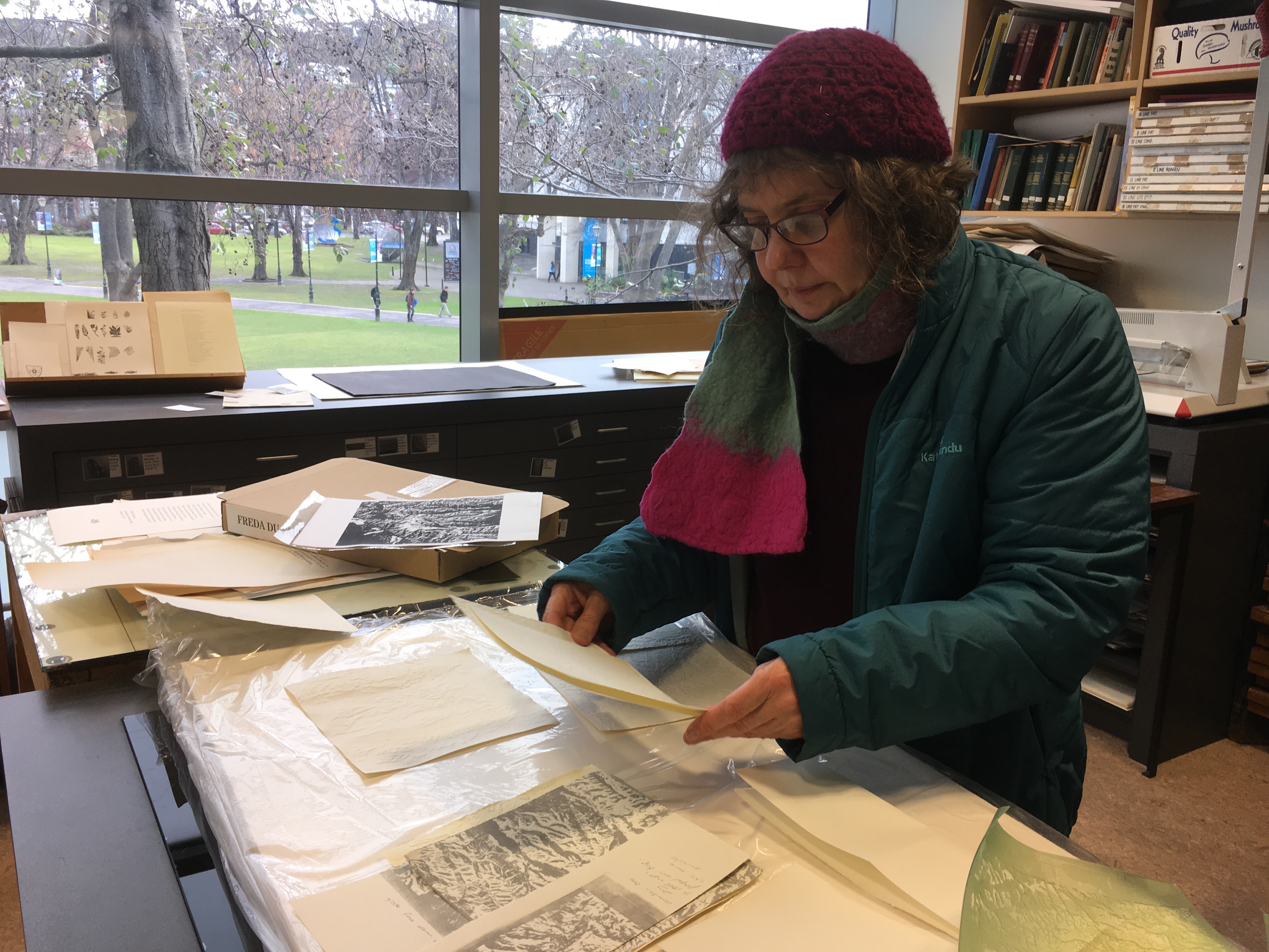
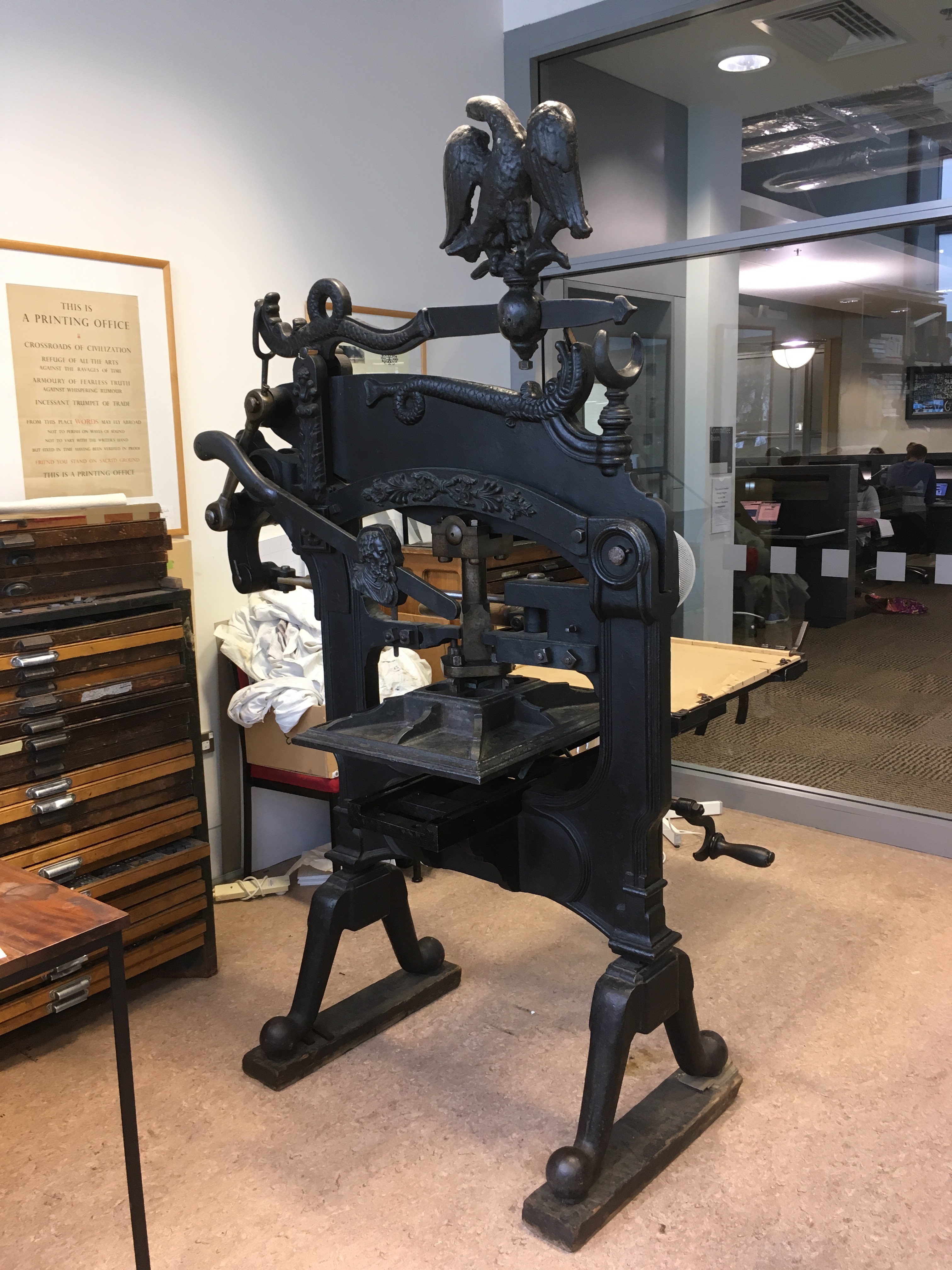
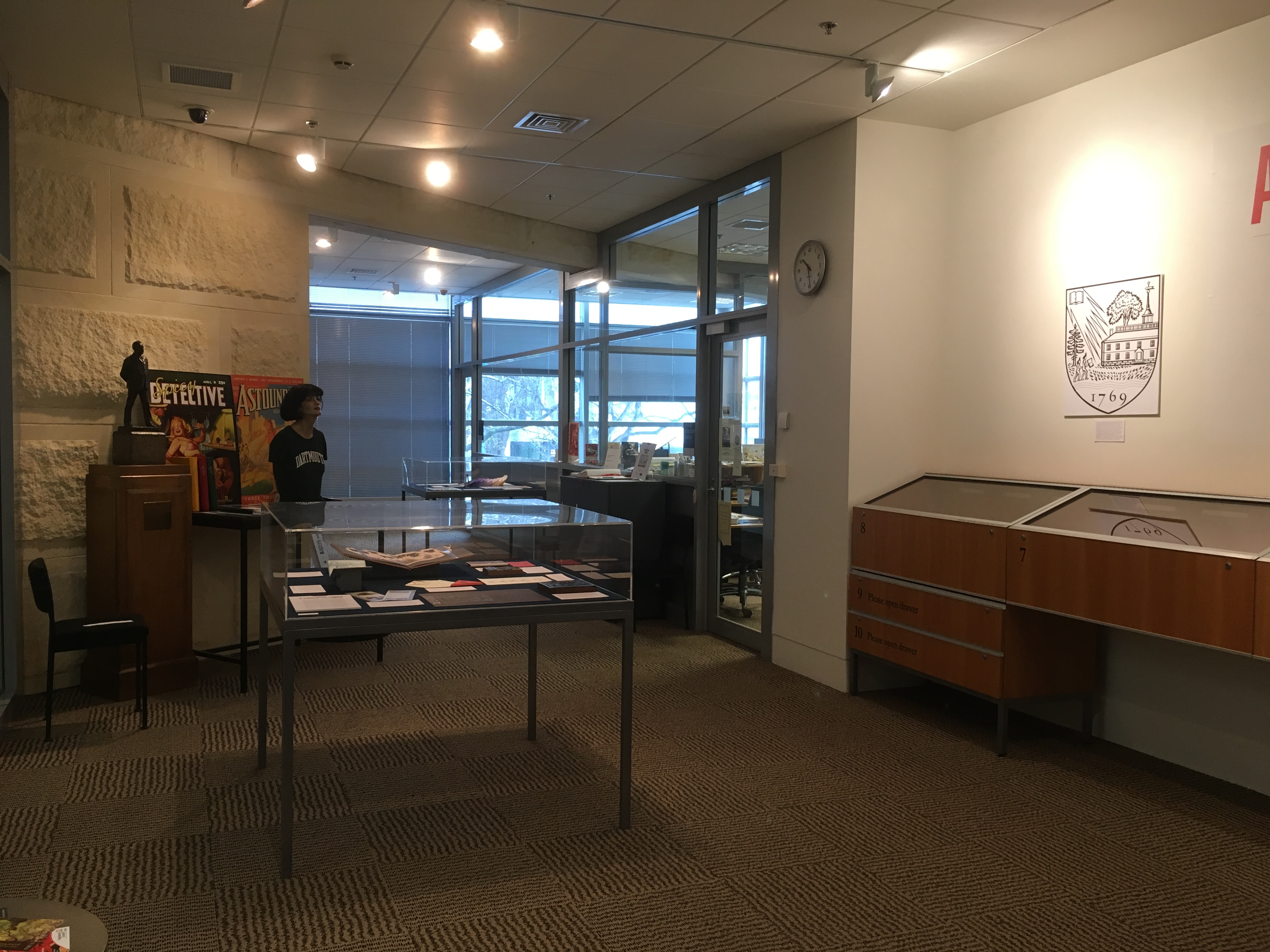
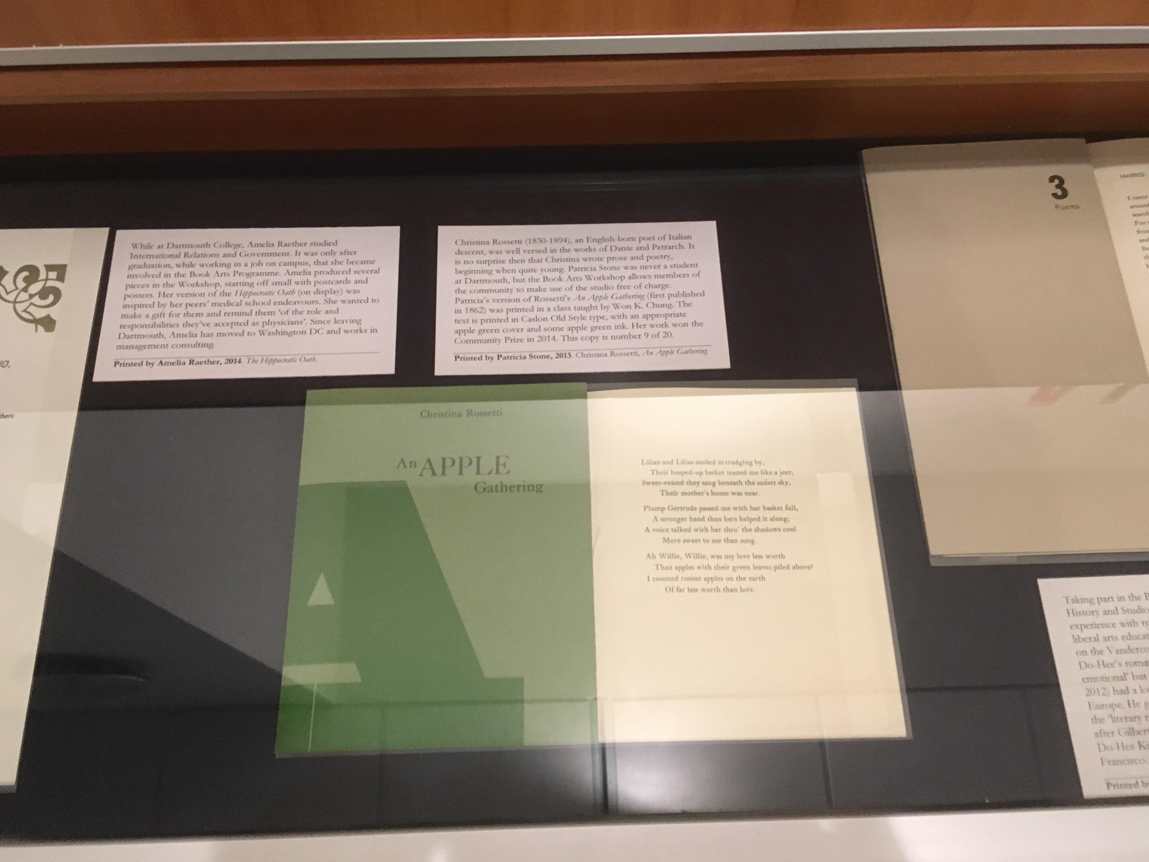
Along with the nice deep cases, there are drawers viewers can pull open to find more items on display.

IMG_1231IMG_1193


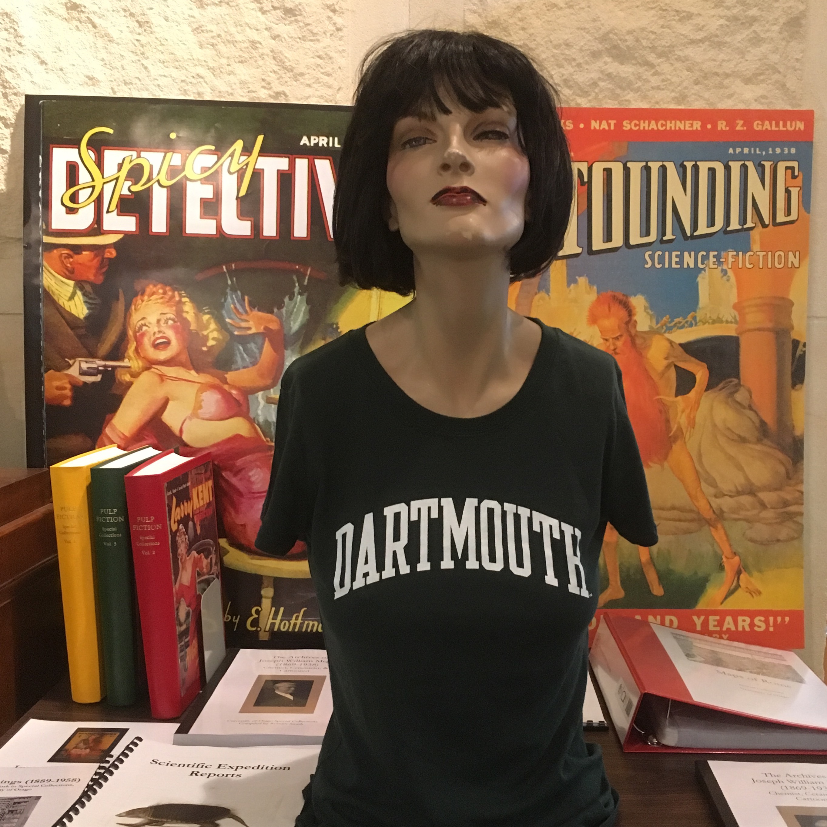
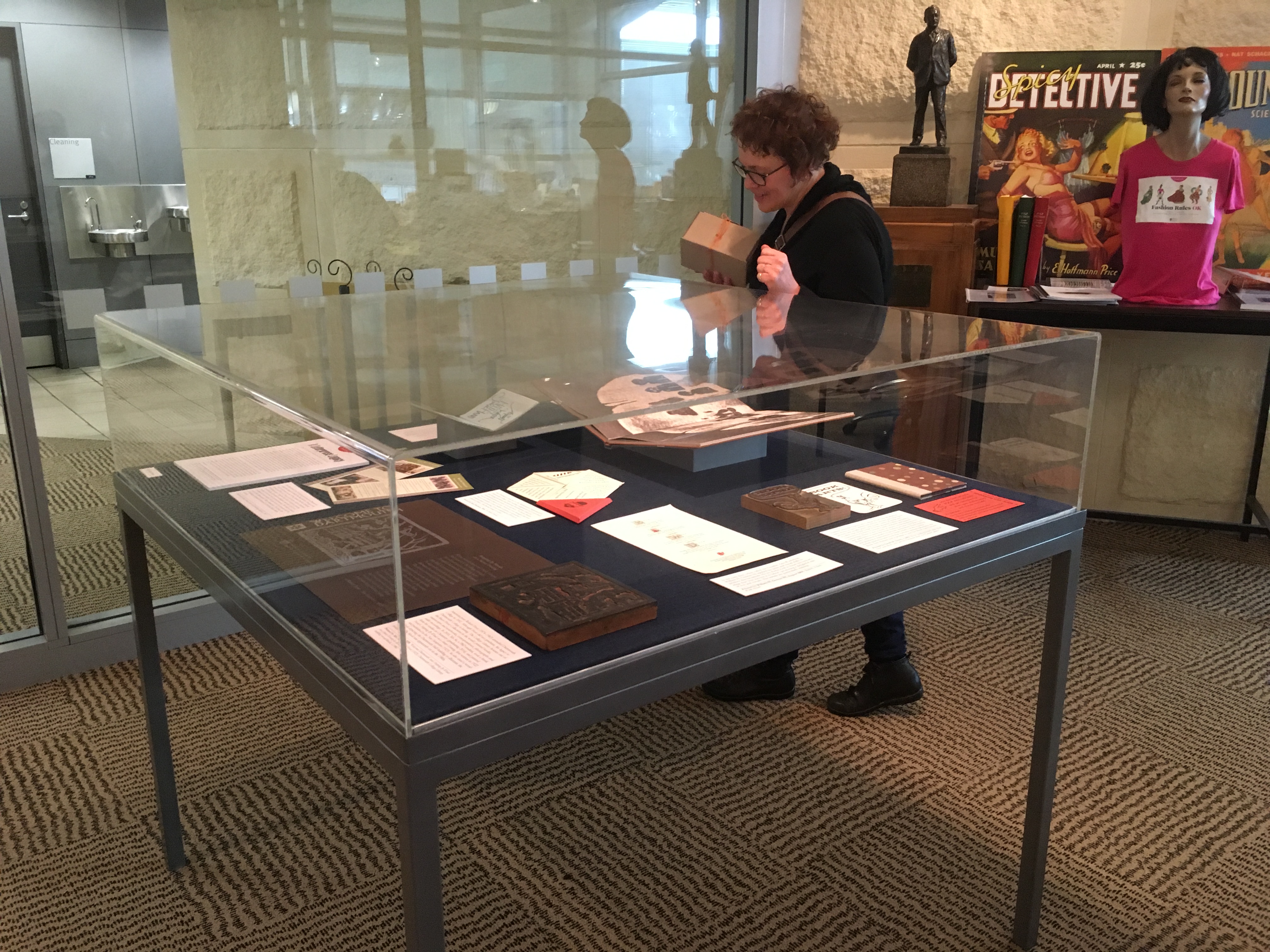
This is the view of the exhibition space and Special Collections as you walk in the door. Notice the manikin on the table to the left. She is left over from an exhibit about fashion and now is a fixture in the space. We decided she needed a Dartmouth t shirt.

IMG_1675IMG_1372

IMG_1169IMG_1173

IMG_1191IMG_1223

IMG_1167 IMG_1166

IMG_1359IMG_1192

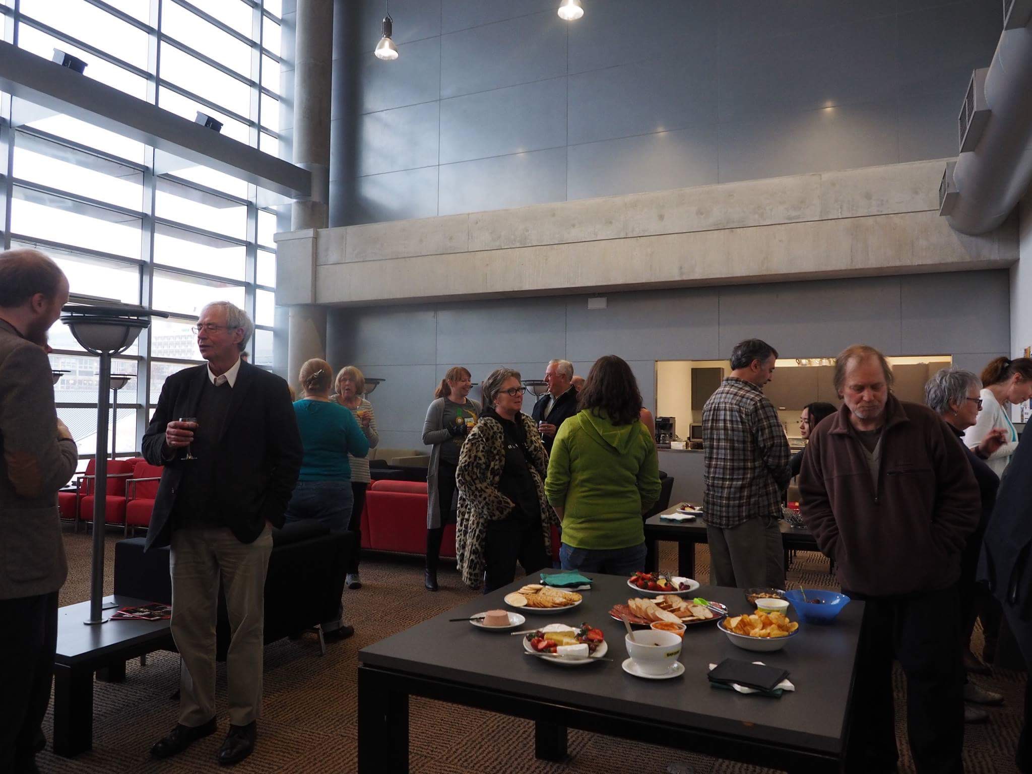
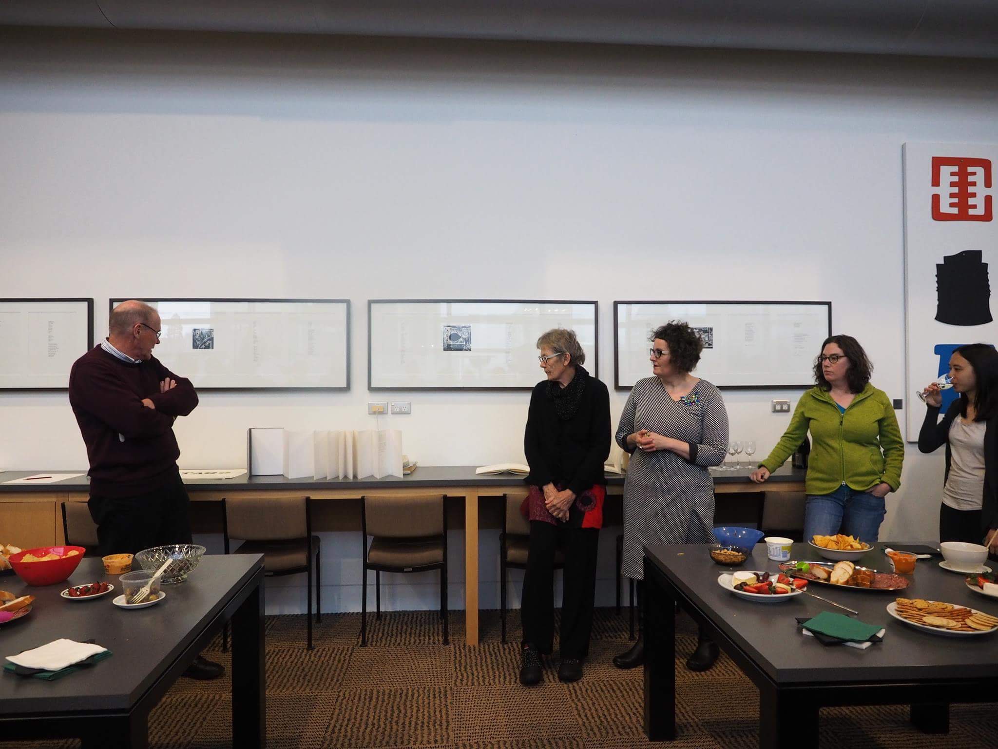
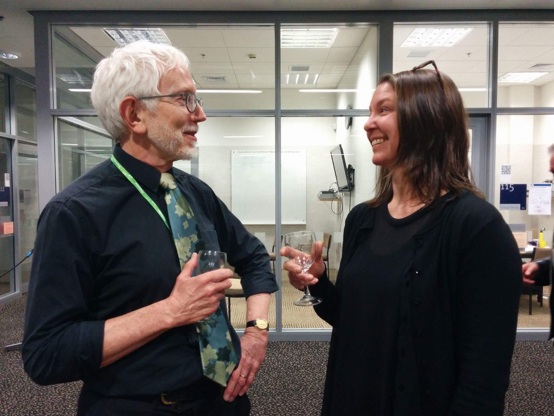
Of course the opening reception for the show was yet another opportunity for speeches. Looks like I’m talking to myself here, but I swear there were people there listening.

IMG_1228

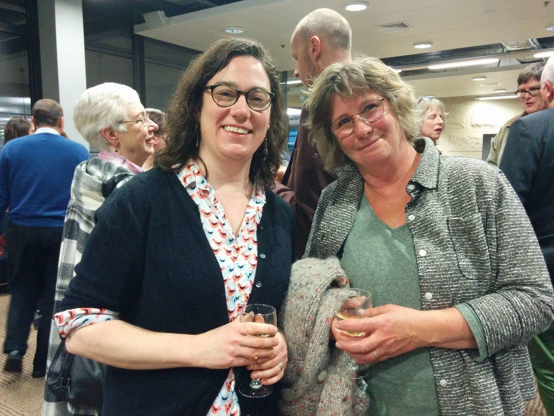
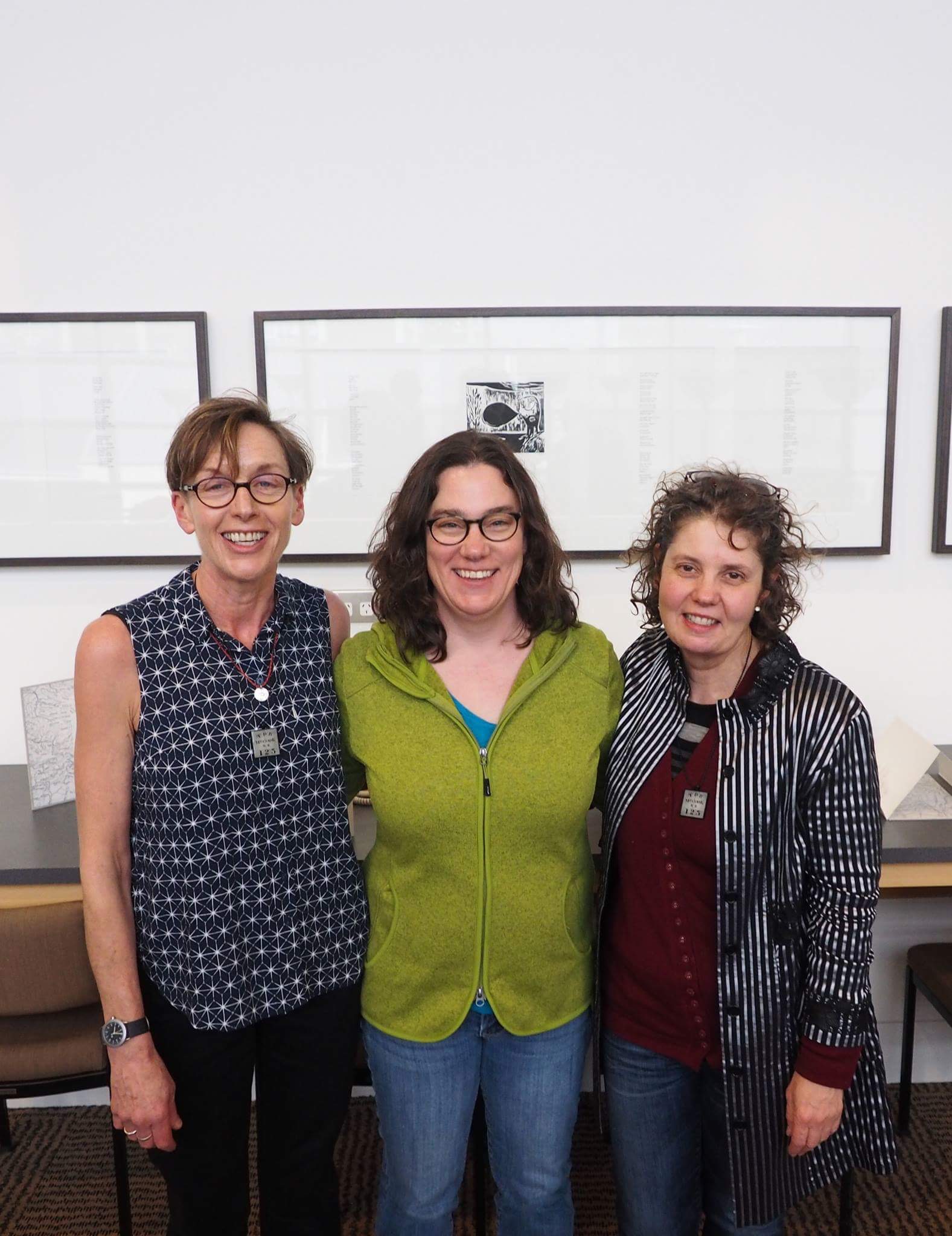
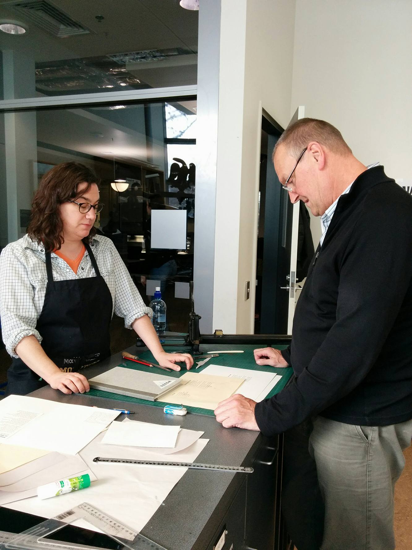
The reception was well attended by some of my favorite people. Here is Lyle Hanton the head of the chemistry department and an avid book collector. Enjoying a glass of wine with Lyle is Romilly Smith, Donald’s assistant in Special Collections. She is a bookbinder as well as fabulous exhibit designer and researcher.

IMG_1230

I even ran into Marion Mertens, who worked—a few years before me—at the same conservation lab where I worked as a book conservator back in Massachusetts. Funny to have to go all the way to New Zealand to meet her!

IMG_1226


Wayzgoose!

To celebrate the completion of our book we had a wayzgoose. According to Wikipedia (I know I should use better sources), “a wayzgoose was at one time an entertainment given by a master printer to his workmen each year on or about St Bartholomew’s Day (24 August). It marked the traditional end of summer and the start of the season of working by candlelight. Later, the word came to refer to an annual outing and dinner for the staff of a printing works or the printers on a newspaper.” A wayzgoose is also a celebration for the completion of a big project—kind of like an opening reception for an exhibit. Our wayzgoose was held in the afternoon with nice wine and nibbles in the beautiful library staff room. Here are some photos.

IMG_1668

IMG_1670

Of course there were more opportunity for speeches—including from me.

IMG_1665

I was so happy to meet and talk with Margery Blackman, author of the book “Dorothy Theomin of Olveston” Dorothy Theomin was a prominent Dunedin resident and climber of mountains. She made regular excursions to the Southern Alps and Mt Cook around the same time Freda Du Faur did.

IMG_1669

Are here’s the three collaborators! Rhian, me and Lynn.

IMG_1671

Printing Done

Printing the text and images for our book is now done! Lynn and I finished up on Wednesday late afternoon and then went right over to the Cook (Captain Cook’s Hotel—pub) for schitzel and blue cod.

IMG_1189IMG_1182 IMG_1184 IMG_1183IMG_1185 IMG_1186 IMG_1199

Now the book is with Don Tobin and the gang at University Binders.

IMG_1205 IMG_1207

We have quite a bit of cleaning up to do, but in the mean time I’m sneaking in a bit of fun with the wood type and maybe some printer’s cuts and ornaments. Definitely spending some time with the Columbian Press!

IMG_1239 IMG_1236 IMG_1324 IMG_1235

IMG_1363

We had a great tour with Chris Smith at the Anatomy Museum, which is part of the Medical School at University of Otago. He showed us some boxes he found in the collection full of printing plates from medical journals. I suggested I try printing one of them to see what he had. This is the result. So very cool with so much potential for future projects! I think Lynn will take these images and do something fantastic with them soon.

IMG_1365

Inking

There have been a few aspects to this project that have been tricky. Working in a new place far from home, collaborating with new people  and using unfamiliar equipment are a few things that caused a bit of anxiety—and excitement before I arrived here. A few weeks before I set out, I was looking at photos of the Otakou Press room and the equipment. I looked at them before, but somehow I had missed the fact that the Vandercook #4 had no rollers. I emailed Donald to ask about the press. He confirmed that the rollers and inking system had been removed a while ago and that many printers he knew preferred hand inking for better control. My anxiety increased.

I’ve used a number of different models of Vandercooks and done a lot of tricky printing, but I haven’t hand inked blocks of text in small type. The prints I’ve hand inked  before were usually with larger than 12 point type and with designs that were a somewhat loose or that made use of imperfections. It would have probably been a good idea to design our book in a similar way, so there wouldn’t be too much pressure to be precise with the inking. However, Rhian’s poems and Freda Du Faur’s story didn’t seem to lend themselves well to wild typographic or inking experiments.

So onward I went, determined to get this right and not embarrass myself. And now I’m telling you all about my trials and errors. So much for not embarrassing myself I guess.

IMG_0670IMG_0990

In an earlier post I mentioned that the titles of the poems would be gray, while the poems themselves would be black. “What a great idea!” I said at the time. “Why not make twice as much work for myself!” Usually each color in a print is printed separately. I often have students wanting to take a “short cut” by hand inking separate colors in one run. I always tell them they’ll be sorry and it’ll end up making more work as they try to be super careful with their inking. For some reason all that left my head when starting to print this project. With the time crunch I felt like printing both colors at the same time would be better. Here’s a video of how that went.

Using roller bearers—strips of type high metal or wood—to support the roller as it goes over the type would have helped me have much more even inking. That would have been great if I was using a roller wide enough to be supported outside the paper area. But with the smaller rollers (and the one I ended up using was still pretty big) and the large paper area, there was no way to avoid making marks on the paper if I used roller bearers. I thought about putting them in for inking and taking them out for printing, but that would have been too fiddley. So no roller bearers.

The roller I’m using in the video is one I brought from Dartmouth. At first it was working great and it’s lighter than the one already in the print room. Eventually though, I realized it wasn’t working so well after all. Seemed like the rubber was too slick and maybe glazed, so the ink wasn’t distributing well. When I switched to the heavy, freshly covered one—nice fresh rubber—it was much better.

Still, wiping the black ink off the titles was slow and way too fussy. It was also impossible to clean the black all the way off (or to ink so carefully as to avoid the title type all together. So eventually I smartened up and printed the black and gray separately—like I knew I should have from the beginning! This didn’t make the process go any quicker, or slower really—just less irritating and more successful.

I didn’t get any video of me inking up the poems in black, but here’s the titles being inked.

I also changed a bit of my technique in that I charged the roller (got more ink on the roller)more often. I found that many passes in different directions—around 4 passes with maybe extra attention on problem areas—with thinner layers of ink worked best. By the last poems the inking was looking great!

Here’s a couple of the early attempts

IMG_1014IMG_1059

An one of the later ones.

IMG_1141

IMG_1129

The whole process was a good experience. I certainly learned a lot and managed to print the text for 120 books.

Paparazzi

Donald has been telling everyone about our project. This means we’ve had lots of curious visitors.

We’ve even had the local tv news come in to film a spot about the project! It’s not a bad explanation of the project, but it’s not super flattering of me—too much direct light, chins and whining about hand inking! (there will be more about that later). I know Donald and I said much more interesting and smarter things than what got into the video—and Lynn too! Oh well, it was exciting to suddenly be Dunedin famous! Here’s the link:

http://www.dunedintv.co.nz/news/joint-project-inks

The next day the ODT (Otago Daily Times) came in—so we were in the newspaper! This time the photographer was nice enough to photograph us from above—much better. I was also happy to have Lynn more included this time. Too bad Rhian wasn’t there!

https://www.odt.co.nz/news/dunedin/project-follows-spirit-du-faur

Hopefully that’s it for the paparazzi.


Finding the Right Image

While I’ve been setting and printing the text for the book, Lynn has been busy with working with photos, maps and other visual material for us to include in the book.

It’s tricky finding just the right images, as well as the right size and color. The subject and text don’t call for the kind of layering and playful treatment we both tend to do in our own work, but we’re learning a lot reigning it in! It’s good for me to see that I can successfully (so far) work on a project that’s not centered around humor.

Also, because of our time constraints, we’re having to be very decisive very quickly. It can be a bit nerve racking at times and poor Donald or Rhian sometime walk in right in the middle of one of our moments of waffling and fretting. Sometimes bringing us snacks helps.

IMG_1086

Lynn is amazing with the solar plates she’s been making. She tests sizes with transparencies on our mock up of the book. She tests exposure times  and makes multiple plates to make sure she gets JUST the right image.

10 IMG_1073

She’s using a few different kinds of plates. Some are similar (or maybe the same) as the polymer plates we use for letterpress/relief printing. Some are greener and more flexible.

The plates are created by placing a transparency (a negative to create a relief plate and a positive to create an intaglio plate) over a light sensitive sheet of plastic. Then the transparency and plate is exposed to UV light. Everywhere that doesn’t get hit with UV light is the washed out with water, leaving a plate with either a raised surface where the image is or a groove where the image is (depending on whether you were aiming for a relief or intaglio process).

Here are some of the transparencies, tools and resultant prints1 IMG_1046

We really liked this map that Rhian worked with before, but the image wasn’t crisp or in high enough contrast to make a good plate of it.                       2 IMG_1045

Then Lynn found this map of Mt Cook and the Southern Alps. It worked perfectly!

2a IMG_0992

She printed the plate as an intaglio—meaning she covered the plate in ink, so the ink would get into the grooves of the image. This is actually a picture of her working on a plate other than the map, but you get the idea.

5 21 IMG_0676

Then she wiped the excess ink away—leaving a just enough to give the map the look of dirt and age—and ran the plate through the etching press with dampened paper. It came out great! And about 160 times too! The map is the front paste down for the book.

This is how Lynn exposes the plates. It’s a huge, very strong light bulb. In this photo she’s re-exposing a plate after washing it out. This hardens the plate and keeps it from breaking down during the printing process.

3 IMG_1047

Here’s an intaglio plate, inked up, wiped and ready to print. This is a plate from a photo that will be the back paste down for the book.

4 21a IMG_1043

Here’s a few plates and a registration set up on the press.

4 22 IMG_0675

Just can’t get enough of all the stacks of prints. Just look at all those Fredas! They were also printed as intaglios.

6 IMG_1048 7 IMG_1022

A few more prints. The book is going to be great!

11 IMG_10429 IMG_1051


Setting, Proofing and Plotting

With the structure of the book settled, the cover materials decided and the labels printed it was time to work out the pages more fully. Before coming up with the dimensions for the book, I set the poem (there are eleven of them) with the longest line length:IMG_0628

and the poem with the most lines:

IMG_0649

This helped me figure how what page dimensions would fit the poems best. I also considered the size of the sheet of paper we would be working with, so we could use as much of the sheet without wasting paper.

Our paper was delivered to the University Bindery and Don cut it up to the press sheet size we needed. Needless to say, I was excited when he let me use the huge guillotine to cut some of the paper myself!

15a IMG_0666

Now to setting type! I set myself up so I could keep an eye on all the people, birds and traffic outside while I worked.

1 IMG_0631

My choice for the body type was pretty much made for me. I wanted to be able to have a lot of text set at once so I could move through the printing quickly, and not have to keep breaking down type to set the next bit. In order to do this I would need a lot of type. The type Otakou Press has the most of is 12 point Garamond. Perfect. That’s what I set those first poems with and now it was time to set more. I tried out a few different versions with other type and colors for the titles of the poems.

2 IMG_0648

In the end I decided—with Lynn and Rhian agreeing—the 18pt Gill Sans Extra Heavy in gray worked best. (here’s that picture again)

IMG_0628

I like the variation from all Garamond and the more modern touch it lends the design. At first I was looking for something less heavy and fat, but we didn’t have exactly what I was looking for. Printing it in gray ink knocks the big type back a bit so it’s not so over powering. I think this is what’s fun (in a slightly twisted way perhaps) when hand setting type—I don’t always have on hand exactly what I want, so I have to get more creative and resourceful to make what I do have work.

So I went about setting six of the poems and proofing them.

4 2209274E-4311-4B18-AA5C-2E4A515CC0DB

Here’s a couple views of the work space.

5 IMG_06585a IMG_0988

I printed some of the proofs on this press.

4a IMG_0644

It’s a sweet little press. I feel like it gets eclipsed by the big dramatic Columbian Press. I’m probably anthropomorphizing too much again.

Don came back in the next day with a mock up of the cover with the pages/accordion inside.

16 13987208_10154403945070917_437428900_o(1)

We tweaked the design a bit to make sure the hinges between press sheets would be at the spine edge of the book. I’ve had success with them at the front of a book before, but that was with thinner paper. This one is definitely better with the hinges at the back.

Here’s the cover that Don made.

17 IMG_0650

Since we need to have the whole edition bound before the wayzgoose (celebration at the end of a printing job) on September 7th, we decided it was a good idea if the bindery could get at least the first 3 press sheets soon, so they could start gluing them together. This meant that—with our design—the title page, colophon and introduction about Freda and poems would have to be set and printed right away. I usually like to print the title page and colophon last, but not this time!

So I had to work out a design for the title page. Again, I didn’t have exactly what I thought I wanted for type. I tried out a few things.

6 IMG_0671

In the end we all liked this the best.

7 IMG_0672

It was some fussy two color hand inking (more about that later).

8 IMG_0949

But I printed 160 of them. We need an edition of 120, but it’s always good to have extras—just in case. I’m a bit extra worried, so I wanted a lot of extra!

9 IMG_0680

Sometimes the coolest stuff that comes from printing is the clean up.

14 a IMG_0673

This is what happened when I was cleaning off the roller.

So along with all my setting, proofing and printing—and Lynn’s plate making, mixing inks and  printing—we’ve had a lot of visitors. Some fans of the Otakou Press and the Printer in Residence program have been stopping by to say hello and see what we’re doing. We’ve also had classes from the University as well as the Polytechnic stop in to talk with us about the project.

23 14002605_10154406768725917_1578338181_o

Rhian, Lynn (taking the picture) and I spoke with this writing class (Lynn’s taking the picture).

25 IMG_0985

Lynn showed a science and communication class how she makes and prints the solar plates she’s working with.

These visits have been fun. Word is definitely getting out, thanks to Donald. We even had the local news come in and interview us (more about that later too) and the newspaper! I guess we’re big news in Dunedin!


Working Hard

I’ve mentioned the paper for the project and a bit about the structure of the book, but not in detail. Originally I thought a series of one-sheet books in an enclosure would be interesting. Maybe one book per poem (when I thought there would be 4-6 poems). But eventually I realized that was an idea I was interested in with my own personal work and it didn’t make sense for this project.

IMG_0622

Then I considered many variations of binding structures. Our book has to do with the Southern Alps, so I wanted to do something that alluded to a mountain range. I tried a number of ideas…

IMG_0623IMG_0624

and made a bunch of models.

IMG_0948

Mostly they all seemed a bit forced and over designed. Then there was this to think about—this is a fairly large edition of 120 that will be bound by the University binders while I’m still here in New Zealand—so keeping it simple is very important. So I went back to a structure I used recently. It’s a simple accordion in a case—attached on one board.

IMG_0625

This will be pretty simple to print (so she says)—no need to worry about imposition and little printing back to back. So that’s appealing when time is short. But what makes the accordion structure so appealing for this project is that it refers to the shape of a range of mountains and allows for a bit more variation in image making techniques for Lynn’s work.IMG_0663 IMG_0667

So that’s the plan. Lynn has been making plates galore. There will be a photo of Freda in the front, so she’s been working hard to make a big edition of prints.

IMG_0530IMG_0604 IMG_0602

Rhian, Lynn and I have been getting together in the studio pretty often to talk about ideas, adjust work in progress and generally enjoy our collaboration.

IMG_0542

I met with Don Tobin at the University Bindery and picked out some cloth for the cover.

IMG_0523

We decided to inset the title label, but that meant I had to decide quickly what that label would look like and where it would go. I remembered the printers cuts of Mt Cook that John Holmes brought out when he came in.

IMG_0594

I tested some different colors for the mountain and the type over it. We all agreed that grays and icy blues made sense for Mt Cook and also the black and white photos of Freda and her excursions.

IMG_0535

The book has a longer title than just “Freda”, but it seemed like a good idea to have just her name over printed over the mountain. So here’s the label and the cloth colors. Now Don and Romilly at the bindery can get started making the cases for the book.

IMG_0597

Getting to Work

Some views of the University of Otago Central Library are very dramatic. It was built in 2001 and still looks brand new. It's also always filled with students. On the left are study spaces nicknamed "Celebrity Squares".
Built in 2001, the University of Otago Central Library still looks brand new and very dramatic from certain angles. It’s always filled with students. On the left are study spaces nicknamed “Celebrity Squares”.

It's been great to finally met everyone I've been emailing and planning with for so long. Here Donald Kerr shows me an amazing book by Tara McLeod, a past Printer in Residence.
It’s been great to finally meet everyone I’ve been emailing and planning with for so long. Here Donald Kerr shows me an amazing book by Tara McLeod, a past Printer in Residence.
Lynn Taylor, the artist who is creating the images for the project met me in the press room on the first day.
Lynn brought a slew of ideas and tests for images of Mount Cook, Freda Du Faur and all kinds of other things that would add to the project.
One issue we had right away was finding a paper that would work with the text, structure and printing metthods we would both use. Originally I chose a light weight Zerkall—but that was when I had a totally different idea for the project involving one-sheet fold books. Now the plan is to make an accordion book in a case. Lynn had in mind some etchings for the images. We needed a thicker paper now.
One issue we had right away was finding a paper that would work with the text, binding structure and printing methods we would both use. Originally I chose a light weight Zerkall—but that was when I had a totally different idea for the project involving one-sheet fold books. Over time the plan changed to an accordion book in a case. Lynn had in mind some etchings for the images. We needed a thicker paper now.
Off we went, Lynn and I, to see Kaya at Southern Paper and check if he had something more suitable. I was happy to have a chance to see more of the amazing landscape around Dunedin.

IMG_0456IMG_0468

IMG_0458

We pulled into what I thought was a gas station, when I realized it was the paper store. What a cool space!
Kaya helped us find the perfect paper—200 gsm Freelife Kendo. It's not a paper I'm familiar with, but it's similar to French's Speckletone in the U.S.. It's a cream color with flecks—nice for a story that takes place around 1910. The thickness was good for at least attaching Lynn's etchings, if not for printing the etchings themselves.
Kaya helped us find the perfect paper—200 gsm Freelife Kendo. It’s not a paper I’m familiar with, but it’s similar to French’s Speckletone in the U.S.. It’s a cream color with flecks—nice for a story that takes place around 1910. The thickness was good for at least attaching Lynn’s etchings, if not for printing the etchings themselves.
On the way back from picking out paper, Lynn took me by a few interesting spots like this street art.
On the way back from picking out paper, Lynn took me by a few interesting spots like this bit of street art.
And more scenery
And more scenery
We stopped by the Hocken Library, which holds a huge collection of New Zealand artifacts, history and art. Here is a part of Violet Faigen's piece, "Concertina", haning in the library.
We stopped by the Hocken Library, which holds a huge collection of New Zealand artifacts, history and art. Here is a part of Violet Faigen’s piece, “Concertina”, hanging in the library.
IMG_0486
These are all altered, folded books.


Finally Here!

Well, after about a year and a half of planning, I’m finally here in Dunedin! It’s a great city with beautiful hills all around—right down to the water (which I haven’t been to yet).

Here’s a few pictures from the trip over and the first couple days.

The Southern Alps looking a bit like crumpled paper.
Flying in to Dunedin
Flying into Dunedin
Wandering around the first night and getting pretty lost, I looked up and saw the silhouette of the Columbian Press in the Bibliographic Room.
Inside the Bibliographic Room. Not a bad place to spend the next month.
Another angle of the Bibliographic Room.
The Columbian hand press
Lots of wood type to play with.
Really big wood type with my business card for scale.
A view of one the hills from the Dunedin Botanical Gardens.
More hills.
More hills.