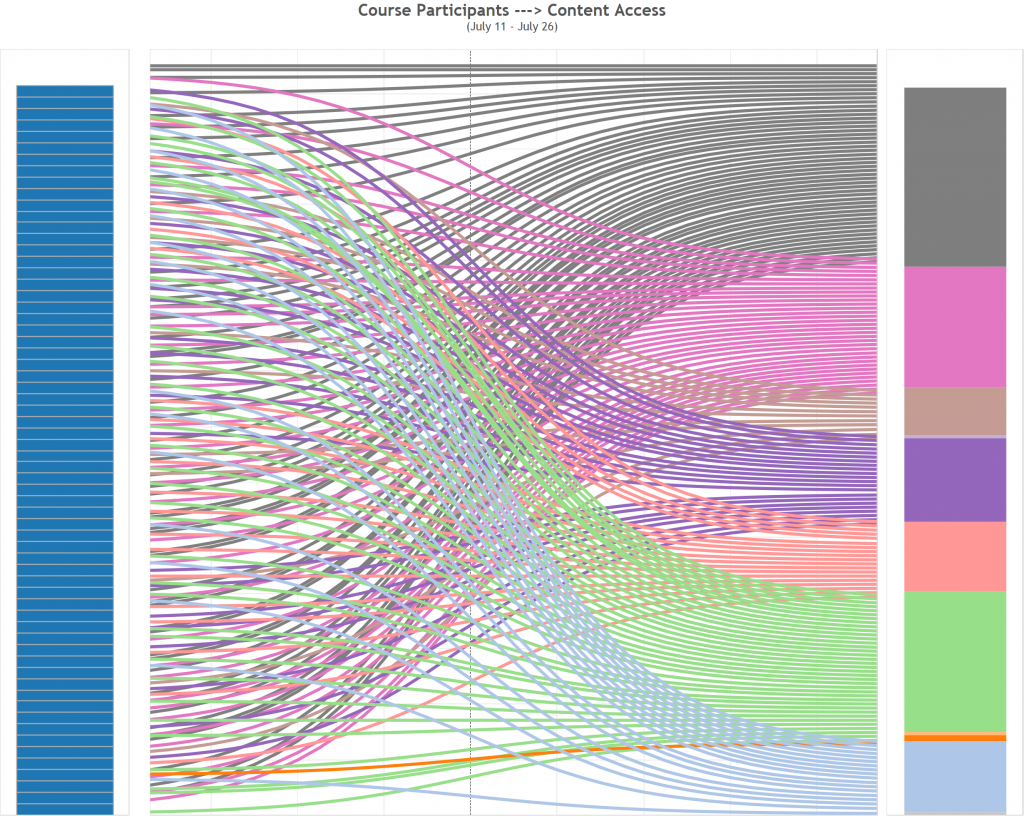
A Sankey diagram is commonly used to visualize the relationships and flows between multiple elements. Being inspired by the blogs on Sankey Charts in Tableau, I made an attempt to build one using student page_views data that was gathered in a MOOC course. The diagram shows course participants content access flow and potentially suggests certain patterns.
 The diagram was built with two data points that are included in a page_view object:
- user_id: a course participant that clicked on a course object(page, tab, menu, link, etc.)
- content type: the type of a content object that an user clicked on
Steps:
- preparing the data file: user_id, content_type, RowType (‘original’ or ‘duplicates’)
- create a new field [ToPad] based on ‘RowType’:
if [RowType]=='original' then 1 else 49 end
- create a new Bin of Size 1 called [Padded]
- create a third function [t]:
(index()-25)/4
- build functions that will show our data at the right points vertically when we build the Sankey, these are identical:
[Rank 1] = RUNNING_SUM(COUNTD(user_id))/TOTAL(COUNTD(user_id))
[Rank 2] = RUNNING_SUM(COUNTD(user_id))/TOTAL(COUNTD(user_id))
- start with a sigmoid function – the basis of the Viz (that gives the curve) [sigmoid]:
1/(1+EXP(1)^-[t])
- create the curve [Curve]:
[Rank 1]+(([Rank 2] - [Rank 1])*[Sigmoid])
Resources: http://www.theinformationlab.co.uk/2015/03/04/sankey-charts-in-tableau/

