

Animated visualizations can effectively bring graphs to life and translate data into actionable insights. There are a number of open source tools that we can leverage to create interactive animated graphs. Below is an example that I generated using fabricated data, R gganimate package and Plotly’s R graphing library.
Please note, the data used to create the animated charts was artificially generated, and merely for the purpose of demonstrating the use of animated visualizations to present learning activities over time. Therefore, the meaning of results is irrelevant in this context.
Scenario One: Below is an example of using animated line chart to examine user interactivity with online training modules over a period of time. A growing number of employers are turning to online training for employees’ professional development, as online courses allow employees to learn at their own pace and at a time that’s convenient for them. The plot in below, which displays learner interactions with a variety of content over time, helps course designers evaluate the efficacy of online training modules and make informed decisions on design improvement.

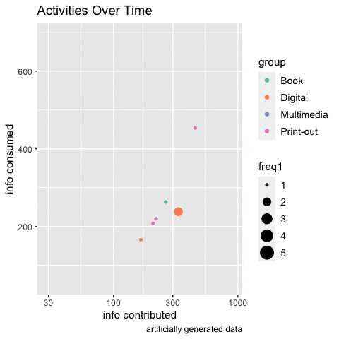
Scenario Two: Participants were put into three groups and each group was provided access to the same materials in three distinct formats respectively, i.e., digital, multimedia and paper print-out. Below is a snapshot of the animated scatter plot, which demonstrates how participants interacted during the course of eight-week study.

You can use the Gapminder data that comes with gapminder package to experiment the R code and generate an animated plot, save it in gif file format:

Animate Graphs in R: Make Gorgeous Animated Plots with gganimate