Data visualization in Treemaps

Treemap is a visual representation of a data tree, where each node is displayed as a rectangle, sized and colored according to values that you assign. Size and color dimensions correspond to node value relative to all other nodes in the graph. (https://developers.google.com/chart/interactive/docs/gallery/treemap)

When your data has a nested/tree relationship, a treemap can be an efficient way of presenting your data. The reason being is that when the color and size dimensions are correlated within a data tree, one can often easily identify patterns that would be difficult to spot otherwise. “A second advantage of using interactive treemaps is that, by construction, they make efficient use of space. As a result, they can legibly display many items simultaneously.” (https://en.wikipedia.org/wiki/Treemapping)

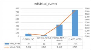
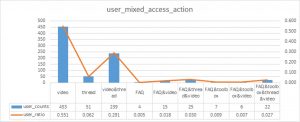
For instance, we can use two charts to present two sets of data that have a ‘tree’ or hierarchical relationship.

chart one – parent nodes chart two – child nodes
chart1 chart2

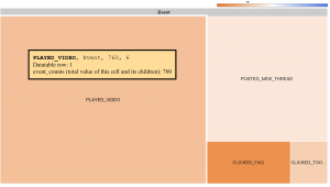
We can combine the two sets data and use treemap to visualize the data tree in nested rectangles.

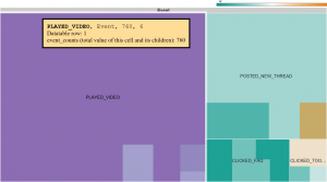
Below, I include two treemap visualizations for the same data tree. In comparison to treemap one, treemap two makes elements highlight when moused over, and set specific colors for certain elements to use when this occurs.

treemap one – nested treemap two – hightlights
chart3 treemap2

This above treemap graph allows me to more easily spot a pattern than using the two bar charts to identify:

  • Among the users who posted discussion threads, they are likely to watch videos as well
  • Among the users who clicked on FAQ, they tend to participate other activities as well

Another more complex example is available at https://jqi.host.dartmouth.edu/1176treemap.html

  • The root level represents the level of completion status relative to all the nodes
  • The first nested nodes correspond to individual participants who went through certain percentage of the course modules
  • the second nested nodes correspond to the individual pageview activities

Community-based approaches: using data from online discussion boards, part 3

This is part 3 of a series I’m writing on how data can inform classroom and online discussions. If you’d like some background on this topic, check out part 1, and if you’d like to see a different way to encounter the discussion data, check out part 2.

Like many instructional design teams, our team at Dartmouth is skilled at solving problems from multiple approaches. We don’t believe in a one-size-fits-all approach to education. Recently, we’ve had a chance to contrast, complement, and balance our approaches to an important educational tool: online discussion boards.

We were spurred by a new app developed by our colleague Jing Qi. It’s for use in the Canvas Learning Management system, the system we use at Dartmouth to help manage the course content for our students and instructors. One of the features of this system is online discussion boards, where students can answer instructor prompts and interact with one another’s ideas. Jing built a custom script that instructors – or the instructional designers, on the instructor’s behalf – can install on the Canvas discussion boards. The script prepares a data file of every student response, its word length, who it was to, and who it was from. The script can then be loaded into a freely available shiny app (also built by Jing) that visualizes the communication connections between the students.

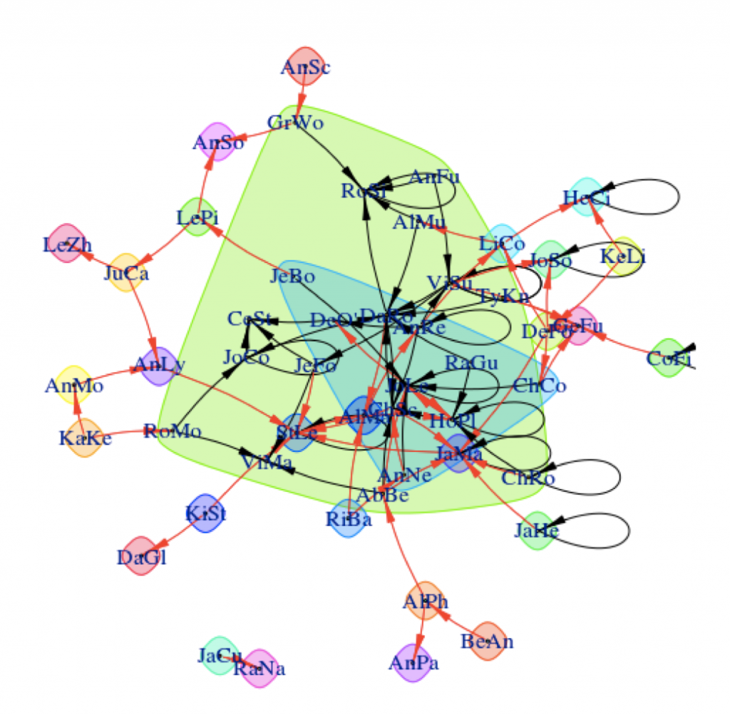
On the surface, the visualizations are fairly easy to interpret. Students who have discussed with one another are linked by arrows, with the head of the arrow pointing in the direction of communication. Strong connections between students are linked by wide lines, and communities of students are surrounded by colored shapes. The visualizations provide a snapshot of what’s happening between the students in the class.
ID_blog_jing_photo1

Data visualization from Jing Qi’s shiny app.

Yet…a snapshot is worth a 1,000 words. My colleague Scott Millspaugh and I interpreted the data from these visualizations in different ways, and both methods are useful to instructors for different reasons.

Scott focused on the nodes of the network, which represent individual students. He noticed that some students had stronger connections than others and in part 2 of this series, I shared some of his methods and strategies for assessing student-level data and using this data to improve the structure of online discussions.

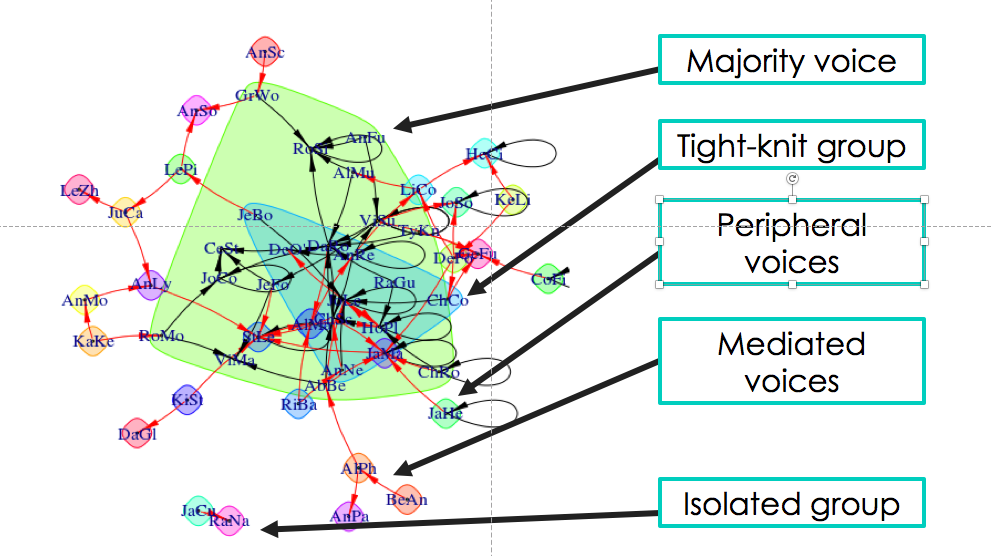
My background is in the social sciences, so I couldn’t help but focus on the societies I saw in the visualizations from Jing’s app. I was particularly concerned when I saw some students interacting strongly with one another and some students isolated from the broader class. In the visualization below, you can see what I’m talking about. There are students on the edges of conversations, outside of groups. There’s even two students who look like they’re only talking to each other.

That’s not ideal. Discussion boards are opportunities for student to empower themselves through their writing, reflect on what they’ve learned, build community and identity, and develop their peer-peer learning skills. Discussions boards can be wonderful. But discussions – whether online or in-person – operate best when diverse voices are included. Students on the periphery aren’t sharing their voices or they are having their voices ignored. As educators, we have a responsibility to work with students both inside and outside of groups to ensure that everyone is included.

“Discussions – whether online or in-person – operate best when diverse voices are included.”

Fortunately, the strategies for increasing student engagement with online discussion boards are very similar to those used in classroom discussions. Here’s nine ways to get students talking to one another on online discussion boards.

  • Instructor prompts: Direct students to one another’s comments. Example? “Hey Bill and Ted, I’m noticing you solved this problem in two different ways. Are there points of commonality between your approaches?”
  • Requiring multiple responses: Consider requiring that students respond to a minimum number of other students before receiving full marks on their assignment.
  • Opening the floor: Revisit the discussion and make sure that multiple views or solutions from the students are invited and encourage. Are your questions clearly communicating to students that conversations are valued and expected.
  • Asking students to role-play: You could assign particular roles to students like facilitator, peacemaker, Devil’s advocate, summarizer, etc. and ask them to post on the discussion board as if they were speaking from their role. You could also ask students to reimagine a scenario from a different perspective.
  • Affinity groups: You could group similar responses together into “themes” and then ask students within each theme to comment on one another’s posts. Or, better yet, have the students group the responses into themes and explained why they grouped them that way. (This is a great activity to bridge in-class and online discussions.)
  • Think-pair-share: Ask students to think about what they plan to post on the discussion board, then share that idea with the student sitting next to them. Give a few minutes for students to discuss their responses and help each other, then invite the students to share what they learned on the discussion board.
  • Fishbowls: Using anonymized discussions (perhaps discussions from previous iterations of a course), ask students to comment on the quality of responses they see. Do they notice areas where communication succeed or where it needs improvement? This kind of activity often spurs student groups to self-correct themselves and include more voices in their discussions.
  • Assigning small groups: One of the problems with discussion boards in larger classes is that students simply can’t respond to everyone, and there’s little chance they’ll get a response back to their own post. Break down those gaps by assigning small groups, where students know who their correspondents are. With discussion data, it’s relatively easy to form these small groups in a way that will ensure more students are included in conversations. An instructor could pick some students for the group from well-established communities in the course and some students from the peripheral voices.
  • Jigsaws: If you have existing small groups in your course, it might be time to mix-and-match them so that students hear from new voices. One of my favorite mix-and-match methods is the jigsaw, where a new group is formed from one representative of each of the existing small groups in class. (So if you have 4 groups of 5 people, you would jigsaw to make 5 new groups, each with 4 people, one person from each group). Each of the representatives will bring their former group’s perspective to the newly formed group.

Phew! A long list of strategies for resetting and jump-starting online discussion boards. I hope you found some of them useful. (And if you did, could you let me know? What strategies do you use in your classroom or online discussions, or what strategies do you think are missing from this list?)

This is what I love about data-driven decision-making. It gives me information I need, then opens up a range of appropriate, potential next-steps. It doesn’t hand me the answer, but it gets me thinking in the right direction. Jing’s app took raw data from the Canvas system and processed it into visualizations I could easily understand. I identified something that I, if I were an instructor in this course, might want to change. I could research and adopt strategies that might enact the change I want to see. And when I’m ready, after those strategies have been employed, I can watch the data change over time and see if my strategies are working. Data is a lamp that lights my way.

I hope you found this series useful, and thank you for reading it. I’m hoping to write more on learning analytics and discussion data in the future, and if you’d like to see me address a topic of interest to you, please let me know. Feel free to get in touch. You can comment here or email me at kes.schroer(at)dartmouth.edu.
Node-based approaches: using data from online discussion boards, part 2

This is part 2 of a series I’m writing on how data can inform classroom and online discussions. If you’d like some background on this topic, check out part 1.

Jing Qi is one of my colleagues in Dartmouth’s Educational Technologies group. She’s our data master, and with her special skills we can navigate unseen worlds behind the Canvas Learning Management System. This is the system that many Dartmouth instructors use to host their courses and organize their course content. It is an awesome “one-stop-shop” for students to see their calendars, find their readings, submit their assignments, take comprehension quizzes, and contact their instructors. There is also another, sometimes underutilized, function in the Canvas system: discussion boards. These are places where instructors can post prompts and students can respond to one another. But often in online discussion boards, we see students make an initial post and then the conversations peter out.

Jing’s new shiny app helps us understand why certain conversations continue and certain conversations end. Using an easily installed script, we can help an instructor download discussion data directly from their Canvas course. The app makes data visualizations that can help an instructor understand what’s happening on the discussion boards and develop strategies for promoting deeper engagement among their students. Today, I’m writing about one suite of strategies, which I call the “node-based” approach. It’s heavily informed by the ideas of my colleague Scott Millspaugh, who recently presented this online at Canvas Live!

Scott is an instructional designer who works with faculty primarily in Arts & Humanities departments at Dartmouth (and co-facilitator of the Digital Humanities initiative to boot). Scott supports a course in which students are required to post comments on a weekly discussion board and reply to at least one other post. Some students get lots of responses. Some get none. Scott and the course instructor were curious about why.

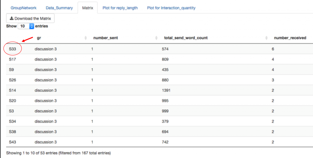
Using Jing’s app, Scott was able to construct a network of the students in the class and how they respond to one another. The network includes nodes, the places where the connections meet. Each of these nodes represents one student. Scott noticed that one student appeared to have more connections than other students. By checking the “matrix” tab in Jing’s app, Scott was able to confirm his hypothesis. The matrix tab showed each student and how many responses they had received to their posts [[photo 3]]. One student appeared at or near the top in all the discussions – a student we’ll call S33.

Jing Qi's shiny app can help instructors see student patterns in their online discussions. By clicking on the matrix tab, instructors can get a sense of which students have the most popular posts. We examined 3 discussions in this class, and student 33 (S33) received the most (or nearly the most) responses in every discussion.

Jing Qi’s shiny app can help instructors see patterns in how students respond to online discussions. By clicking on the matrix tab, instructors can get a sense of which students have the most popular posts. We examined 3 discussions in this class, and student 33 (S33) received the most (or nearly the most) responses in every discussion.

In S33’s posts, we could detect certain patterns that weren’t present in other students’ posts. S33 wrote short responses, but they were inviting. The student often used subjective language like “I think,” “I feel,” or “I believe.” They asked other students directly what they might think or feel about the post. Conversely, the students in the class with the fewest responses often had the longest posts and tended to use the most academic, objective language. Now, big caveat: there might be other reasons that S33 has popular posts. Maybe the student is friends with many people in the class or seen as a person of influence on campus. But the patterns within the data are suggestive that S33 is doing something other students in the class are not.

The student often used subjective language like “I think,” “I feel,” or “I believe.”

The instructor can use this data to make a decision about using discussion boards. If the instructor wants students to converse with each other, the instructor can set a word limit and encourage students to share their personal thoughts. If the instructor is using the discussion boards to measure student comprehension of the reading material, the instructor might want to recommend a range for the word count and tell the students not to worry about responding to one another. Using data, the instructor can better articulate the goals of the assignments and how to best achieve those goals. In the process, we clear up expectations for the students.

So that’s one way that Jing’s app helps inform classroom and online discussions. In this approach, Scott saw a node in the network that was different than other nodes. He dug in deep to understand why the student at that point in the network was more successful (by one measure of success) than other students. Next week, I’ll talk about an alternative approach to dissecting data from discussion boards. I call it the “composition-based” approach, and it focuses on the students outside of the networks rather than those within it.

In the meantime, feel free to contact me with questions. You can comment here or email me at kes.schroer(at)dartmouth.edu.
Using data from online discussion boards, part 1

I’m the coordinator for Dartmouth’s Learning Fellows Program, a program that places advanced students in classrooms to help facilitate small group activities. Part of my job is to help Learning Fellows troubleshoot when small group activities don’t work as planned. Group work can help students navigate complex ideas, but it’s not easy to maintain dynamic communication between all members of a group. All kinds of communication concerns can arise during group work, from students who dominate conversations to students who don’t know how (or might not want) to participate in conversations. But often, the challenge lies somewhere in the middle of those two extremes. Students start conversations, and then the conversations peter out. A question I often get from our Fellows is “how can I keep momentum going?”

It’s the same problem we often see in online discussion boards. Students answer an initial question, and they might send a few responses to other student posts. But the responses tend to be superficial and there’s hardly ever a response to the response.  There’s not really a lot of “discussing” going on. The discussion boards end up looking more like a collection of student reactions rather than a living conversation.

At Dartmouth, we’re trying to help tackle that problem with data. Our instructional designer Jing Qi has built an awesome new app that can filter key data from online discussion boards, then present a summary of that data in easily interpreted visualizations. Instructors (or coordinators like me!) can use the visualizations to help decide how to most effectively use discussions in their courses, and how they might be able to keep students talking to one another.

Let me back up just one step and say a little about why discussions are important. We know that intuitively. Discussions help students learn to communicate their ideas, to evaluate ideas, and to apply their skills to new contexts. But perhaps the reason I value discussions so highly – and group work more generally – is that discussions allow students to envision their future communities (behind a paywall). In discussions – whether in-class or online – students learn how they want to act in a community, and what kinds of communities they might be seeking. If we’re interested in training responsible, conscientious citizens, we need to provide our students with opportunities to act within communities. Discussions offer these opportunities.

“Discussions allow students to envision their future communities.”

Jing Qi’s learning analytics app can help us understanding how communities are forming in classroom discussions and online discussion boards. Below is a sample visualization from her app. Don’t be alarmed! Once you input a simple data file, the visualization builds itself. It takes into account which students are posting and responding to one another and the length of their responses (we’ll come back to this in a later post). The visualization automatically calculates the connections between the students and shows each student as a four letter code. Connections are shown in arrows, where black arrows show intergroup connections and red arrows show intragroup connections. No arrow means there’s no connection between the students. Colored shapes surround the groups with the strongest communities.

Data visualization from Jing Qi's shiny app.

Data visualization from Jing Qi’s shiny app.

If we digest this visualization a little bit, we can see several kinds of communities emerging from the discussion data. There’s a big green shape that surrounds the students I like to call the “majority voice.” It contains most of the students in the course. The other, small community in the blue shape I like to call the “tight-knit group.” These are students who frequently respond to one another, and they are a subset of the majority voice. Maybe they are friends, play on a sports team together, or have previously taken a course together. I can also see a few smaller communities in this visualization. Some are just individuals, located on the periphery of the majority voice and occasionally interacting with those students. Some are mediated voices, where students communicate with a student on the periphery who then communicates with the majority voice. And some communities are just two students, talking only with each other.

Communities detected in Jing Qi's shiny app.

Communities detected in Jing Qi’s shiny app.

Let’s assume we want to change this scenario so that more students are interacting with one another. Maybe we want to include more of those voices on the periphery or break up the “tight-knit group.” Maybe we want to bring those isolated, two-student groups into the fold, because they might have very interesting and unusual ideas to contribute to the discussion. There’s a couple of strategies we could use to change the discussion dynamics. One strategy is “node-based,” and focused on the influence of the students in the center of the groups. Another is “composition-based,” which mixes and matches groups to encourage more diversity. Both strategies have their time and place.

My colleagues and I were fortunate enough to present on these strategies at a recent Canvas Live! presentation, where we were joined by members of Northwestern’s learning analytics team. In case you missed the session, I’m also going to post some of our take-aways on this blog. The next post will be on the “node-based” strategies and will feature some ideas from my colleague-in-arms Scott Millspaugh. He’s an instructional designer for Dartmouth’s Arts and Humanities division and one of the co-facilitators for our Digital Humanities initiative. Like me, he’s fascinating by the potential of data to transform the way instructors can make decisions about their courses. The last post in this series will feature some “composition-based” strategies, based on my own experiences with Dartmouth’s Learning Fellows. They’ve been important and insightful voices on our campus, reframing the way we think about discussions and community. I’m excited (and honored) to share their ideas with you. Look for our “node-based” approach this time next week, and our “community-based” approach soon to follow.

In the meantime, feel free to contact me with questions! Please use the comment box below!