Canvas quiz statistics can help faculty understand how students perform on quiz items and help them choose quiz items that are highly correlated with overall student performance (high discriminating quiz items). The important statistics to analyze for each quiz item are its difficulty level and the correlation between the right/wrong attempts on a given quiz item and the total quiz scores (the point-biserial correlation coefficient).
Let’s look at the item statistics in detail. Suppose that a faculty administered a quiz that contains 10 multiple choice quiz type items, and nine students took the quiz.
|
item 1 |
item 2 |
item 3 |
item 4 |
item 5 |
item 6 |
item 7 |
item 8 |
item 9 |
item 10 |
Student Total Score |
| student-1 |
1 |
1 |
1 |
1 |
1 |
1 |
1 |
1 |
0 |
1 |
9 |
| student-2 |
1 |
1 |
1 |
1 |
1 |
1 |
1 |
0 |
1 |
0 |
8 |
| student-3 |
1 |
1 |
1 |
1 |
1 |
1 |
0 |
1 |
0 |
0 |
7 |
| student-4 |
1 |
1 |
1 |
1 |
1 |
0 |
1 |
0 |
1 |
0 |
7 |
| student-5 |
1 |
1 |
1 |
1 |
1 |
1 |
0 |
1 |
0 |
0 |
7 |
| student-6 |
1 |
1 |
1 |
0 |
1 |
0 |
0 |
0 |
0 |
0 |
4 |
| student-7 |
1 |
1 |
0 |
1 |
0 |
1 |
0 |
0 |
0 |
0 |
4 |
| student-8 |
1 |
0 |
1 |
0 |
1 |
0 |
0 |
0 |
0 |
0 |
3 |
| student-9 |
0 |
1 |
1 |
0 |
0 |
0 |
0 |
0 |
0 |
0 |
2 |
|
item 1 |
item 2 |
item 3 |
item 4 |
item 5 |
item 6 |
item 7 |
item 8 |
item 9 |
item 10 |
| difficulty index |
0.89 |
0.89 |
0.89 |
0.67 |
0.78 |
0.56 |
0.33 |
0.33 |
0.22 |
0.11 |
| point-biserial |
0.46 |
0.29 |
0.12 |
0.73 |
0.49 |
0.49 |
0.59 |
0.46 |
0.26 |
0.4 |
The sample data used in this blog is from http://www.eddata.com/resources/publications/EDS_Point_Biserial.pdf
The quiz items are presented in the sequence of its difficulty level from 0 to 1 (difficulty index=#correct attempts/#total attempts). The higher the difficulty index is, the easier the quiz item should be. The higher the point-biserial value is, the higher the item is correlated to the total scores.
- Application: Identifying quiz items with high point-biserial value
A large positive point-biserial value indicates that students with high scores on the overall test are highly likely to get the item right and that students who receive low scores on the overall test will tend to answer the item incorrectly. A low point-biserial value implies that there is not much correlation between a student answering the item correctly and the overall quiz score. For example, students who answer the item wrong might answer correctly on other more difficult quiz items and end up scoring higher on the test overall than might be predicted by the item in question. Therefore, items with low point-biserial values need further examination. Our sample data suggest that Item 3 deserves closer look, as its point-biserial value is the lowest (0.12) among other quiz items. Even though student-7 did not correctly answer an easy quiz item 3, the student correctly responded to more difficult quiz items, Items 4 and 6. If we can assume that the student did not make a guess on item 4 and 6, and that student-7 indeed understood item 4 and 6, item 3 should be treated as problematic item.
If a faculty is interested in creating an efficient shorter quiz, we can help the faculty gather previous quiz submissions and use the point-biserial value as reference to select the high discriminating quiz items, which are those with the high point-biserial correlation coefficient. Meanwhile, we need to take the difficulty index of each quiz item into consideration to ensure a balanced quiz which is neither too difficult nor too easy (http://jalt.org/test/bro_12.htm).
- Implication: Providing individualized support
The sample data suggest that item 4 is a high discriminating quiz item that may be used to predict students performance on the overall quiz. Its high point-biserial value (0.73) implies that if a student gets this quiz item right, the student is likely to answer other quiz items correctly and get a high overall score; If a student responds to this quiz item wrong, the student may find it difficult to answer correctly to subsequent quiz items. Therefore, faculty can use the information (responded incorrectly to the quiz item) to identify ‘weaker’ students, and guide them to proper materials/practices that facilitate their understanding on the content that quiz item 4 is designed to measure.
|
difficulty index |
point-biserial correlation |
| item 1 |
0.89 |
0.46 |
| item 2 |
0.89 |
0.29 |
| item 3 |
0.89 |
0.12 |
| item 4 |
0.67 |
0.73 |
| item 5 |
0.78 |
0.49 |
| item 6 |
0.56 |
0.49 |
| item 7 |
0.33 |
0.59 |
| item 8 |
0.33 |
0.46 |
| item 9 |
0.22 |
0.26 |
| item 10 |
0.11 |
0.4 |
From Theory to Practice
In this study, we leveraged the point-biserial value to identify quizzes that contain highly discriminating question items. Furthermore, we examined the relationship between students’ activities and outcomes on these quizzes and their final exam performance. We explored the possibility of predicting unsatisfactory student performance using quiz data early on during the term in order to pursue timely interventions. We describe a procedure applicable to other courses.
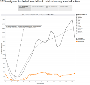
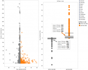
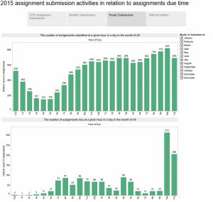
The particular course we analyzed contains three weekly quizzes, each consisting mostly of multiple choice question items. Students are asked to watch videos in preparation for class, interspersed with these quiz questions. We analyzed student performance on these quizzes through three instances of the course: Spring 2013, Spring 2014 and Spring 2015. In Spring 2015 course, optional practice questions were added to some quizzes; these optional questions are graded but bear no point value.
| Courses |
number of students |
| SP13 |
50 |
| SP14 |
81 |
| SP15 |
73 |
| Grand Total |
204 |
First, we examined the pattern of time-spent on all quizzes in SP13, SP14 and SP15 course respectively. Secondly, we calculated the rpbi for each question item, derived from the results of student first attempt, with the following formula (http://jalt.org/test/bro_12.htm). We identified two quiz questions that contain question items yield a high point-biserial value (rpbi > 0.5). A simple linear regression was performed to examine the correlation between students’ performance on the discriminating question items and their final exam grades. A number of plots on the mean of the response for two-way combinations of factors was drawn to illustrate possible interactions.
Where:
| rpbi = |
point-biserial correlation coefficient |
| Mp = |
the whole-quiz mean for students answering item correctly (i.e., those coded as 1s) |
| Mq = |
the whole-quiz mean for students answering item incorrectly (i.e., those coded as 0s) |
| St = |
standard deviation for the whole quiz |
| p = |
proportion of students answering correctly (i.e., those coded as 1s) |
| q = |
proportion of students answering incorrectly (i.e., those coded as 0s) |
The rpbi point-biserial correlation coefficient derived from students’ first attempts on all quizzes reveal two quizzes which contain question items that yield a high point-biserial value (greater than .5); we’ll label these as “Quiz 1” and “Quiz 2”. Quiz 1 contains four questions worth 1 point each, whereas Quiz 2 contains five questions, worth 1 point each. Note: Original Quiz 2 contains six question items, but one question item grants either half or one point (0.5 or 1). In order to comply with the rpbi point-biserial formula, we took the question item out of the calculation, hence, rpbi point-biserial correlation coefficient for Quiz 2 was derived from only five question items.
The rpbi point-biserial correlation coefficients for the four question items of Quiz 1:
|
item-1 |
item-2 |
item-3 |
item-4 |
| Mp |
2.926829 |
2.842697 |
3.336957 |
3.306931 |
| Mq |
1.222222 |
0.935484 |
1.948718 |
1.861111 |
| St |
1.112651 |
| P |
0.784689 |
0.851675 |
0.440191 |
0.483254 |
| q |
0.215311 |
0.148325 |
0.559809 |
0.516746 |
| rpbi |
0.62972 |
0.609235 |
0.619364 |
0.649354 |
If we can harness these statistics to identify the ‘weaker’ students prior to the final exam, the faculty may be able to guide the students early on to facilitate a mastery of the course content.


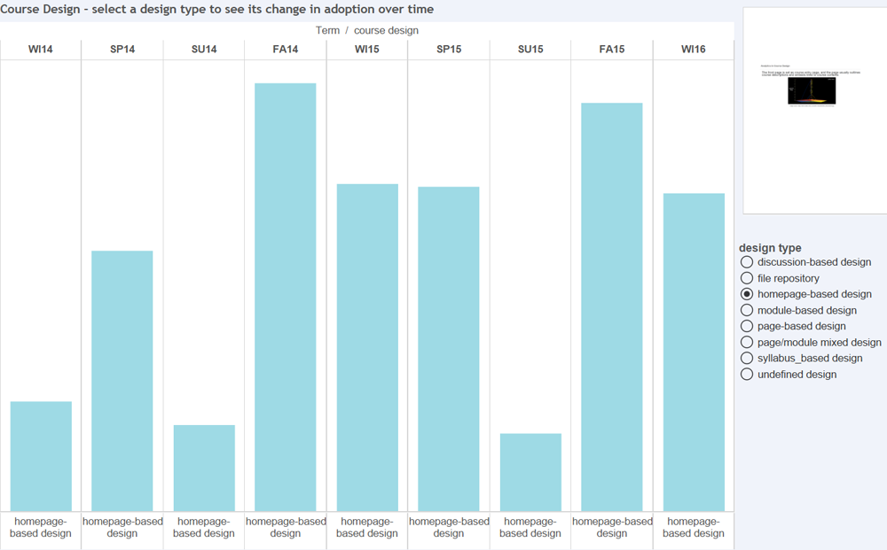
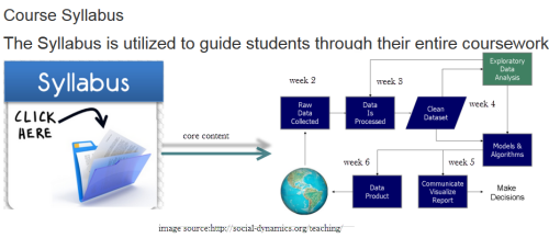
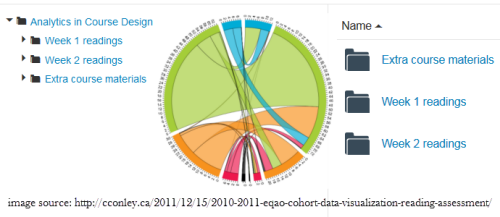
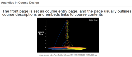 Homepage_based design: This design presents a front page usually including a course outline and links to course activities. This page could be a wiki page or the Syllabus tool. Other navigation links are typically hidden from student view.
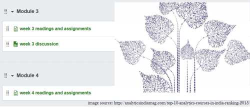
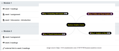 Module_based design: The design utilizes the Module tool to outline the sequence of course content and course activities. The Pages link is usually disabled from student view.
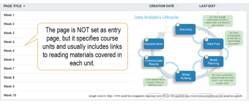 Page_based design: This design uses the Page tool to list the sequence and structure of course activities. Course files are usually embedded and linked in the content pages. Students use the content pages to guide their coursework. The course instructor can also use Pages as a wiki collaboration tool, setting specific student access for each page.
 Page/Module_mixed design: This design utilizes both Page and Module tool to construct course outline and guide students through their coursework. Both Pages and Modules navigation tabs are enabled to allow student access.
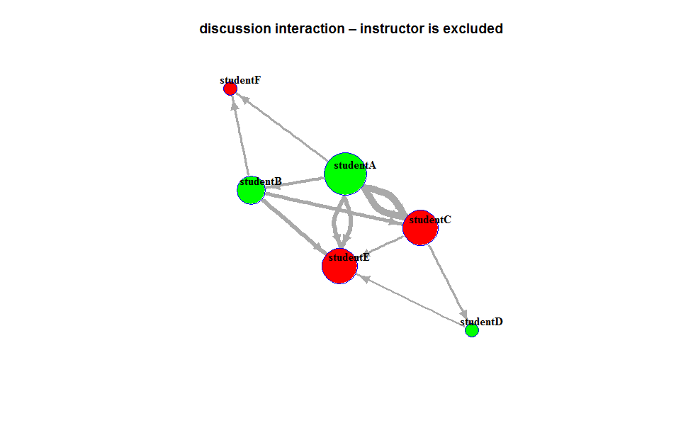
 Discussion_based design: The Discussion tool is utilized to facilitate communication before or after face-to-face classes. Page and Module tools are usually not used in this design.