Sankey diagram and content design (R givsSankey)

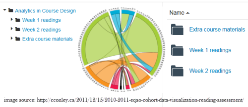
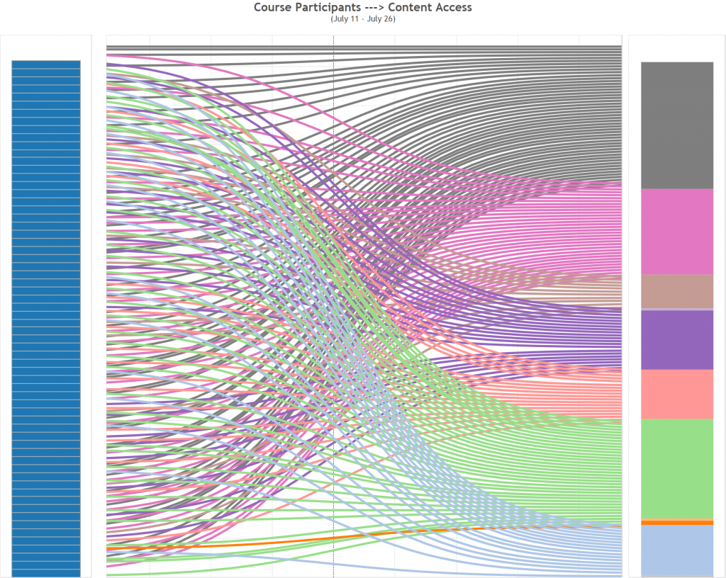
In previous blog, I mentioned about the application of Sankey diagram in course design, and included an example of course access flow chart that was built in Tableau.

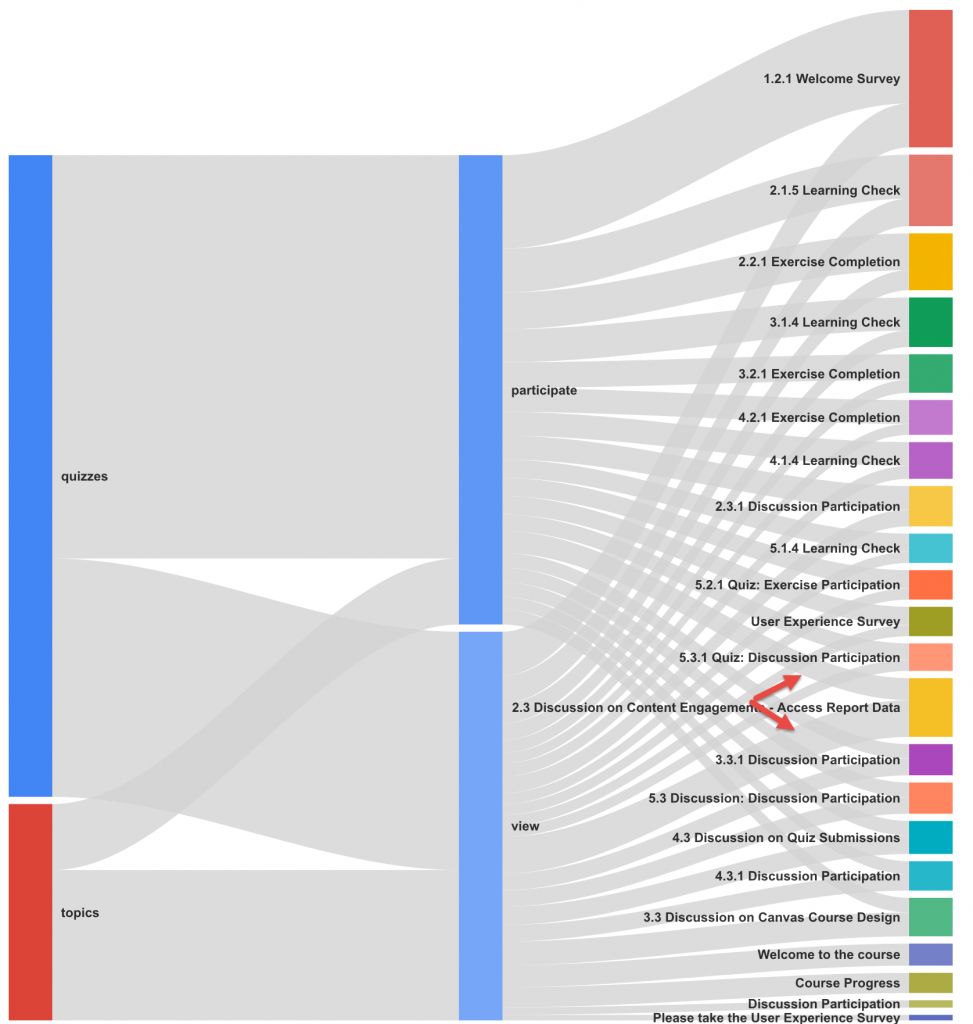
In this blog, I built an user flow diagram in R using givsSankey package to visualize student action (participate or view) on assignments, for instance, quizzes and discussions.

In a self-paced open online course, I would like to find out the disparity in number of attempts between previewing a quiz and taking the quiz (clicked on submit button); And the difference in action between reviewing discussion threads and participating a discussion.

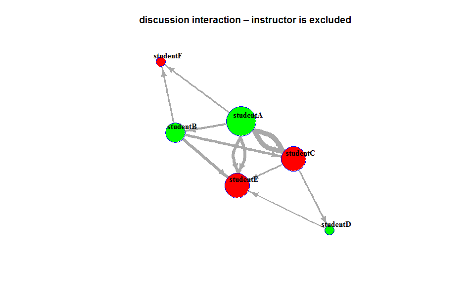
Student content access raw data was gathered and used to build a visualization. Below is the visualization of student actions on quizzes and discussions presented in a Sankey chart. The chart was built in R using givsSankey package.

Chart 1: The width of grey line indicates the total count of students who participated or viewed an object. The length of quizzes and topics bar represents the total count of students who took an action on the object. The length of each bar on the right denotes the total count of students who either participated or viewed the item.

The visualization suggests that for discussion topic-“Content Engagement” (where the red arrows point), students tend to click through a discussion page rather than posting or replying a thread, which prompted me to examine the topic description and rephrase it.

participation

To build a graph like this, first, we need to prepare a file contains the elements that you would like to examine. In this example, I gathered user page_view data in an open online course that include the following fields, and saved it in a csv file format:

  • UserID is the unique student id.
  • Category includes the content and feature that a student viewed, like announcements, assignments, grades, home, modules, quizzes, roster, topics, and wiki.
  • Class includes classification for each Category like announcement, assignment, attachment, discussion_topic, quizzes/quiz, etc.
  • Title is the name of the content.

You must install the packages in R before use them, and you only need to do it once:
install.packages(googleVis)
install.packages(sqldf)
#Require/Call the packages
library(googleVis)
library(sqldf)
#Load the file
pageview=read.csv(“pageview.csv”, header=TRUE)
#Manipulate the data
Sankey <- sqldf(“select Category, Action, count(UserID) as Weight from pageview where (Class not in (”) and Category in (‘quizzes’,’topics’)) group by 1,2
UNION ALL
select Action, title, count(UserID) as Weight from edge where (Class not in (”) and Category in (‘quizzes’,’topics’)) group by 1,2″)
#Draw the diagram
plot(gvisSankey(Sankey, from=”Action”, to=”Category”, weight=”Weight”,
options=list(height=700, width=650,
sankey=”{
link:{color:{fill: ‘lightgray’, fillOpacity: 0.7}},
node:{nodePadding: 5, label:{fontSize: 9}, interactivity: true, width: 30},
}”)
)
)

Sankey diagram and course design (Tableau)

A Sankey diagram is commonly used to visualize the relationships and flows between multiple elements. Being inspired by the blogs on Sankey Charts in Tableau, I made an attempt to build one using student page_views data that was gathered in a MOOC course. The diagram shows course participants content access flow and potentially suggests certain patterns.

User-ContentThe diagram was built with two data points that are included in a page_view object:

  • user_id: a course participant that clicked on a course object(page, tab, menu, link, etc.)
  • content type: the type of a content object that an user clicked on

Steps:

  1. preparing the data file: user_id, content_type, RowType (‘original’ or ‘duplicates’)
  2. create a new field [ToPad] based on ‘RowType’:
    if [RowType]=='original' then 1 else 49 end
  3. create a new Bin of Size 1 called [Padded]
  4. create a third function [t]:
    (index()-25)/4
  5. build functions that will show our data at the right points vertically when we build the Sankey, these are identical:
    [Rank 1] = RUNNING_SUM(COUNTD(user_id))/TOTAL(COUNTD(user_id))
    [Rank 2] = RUNNING_SUM(COUNTD(user_id))/TOTAL(COUNTD(user_id))
  6. start with a sigmoid function – the basis of the Viz (that gives the curve) [sigmoid]:
    1/(1+EXP(1)^-[t])
  7. create the curve [Curve]:
    [Rank 1]+(([Rank 2] - [Rank 1])*[Sigmoid])

Resources: http://www.theinformationlab.co.uk/2015/03/04/sankey-charts-in-tableau/

Leveraging Quiz Submissions Data to Inform Quiz Design

The visualization of quiz submission data can help faculty make an informed decision on quiz design. For instance, the analysis of quiz submission data can inform faculty of the difficulty level of quizzes. Faculty can use the information to select a set of quizzes that are neither too difficult nor too easy. Faculty can also use the information to select quizzes that are best for pre and post assessment. If quizzes are set to allow multiple attempts, we can leverage quiz attempts data to identify students who might struggle with a given topic.

Graph 1 shows the number of attempts that students took to get a full score for a given quiz. The graph indicates that it took all students only one attempt to get a perfect score for Quiz_2. In comparison, it took quite a few students two, three, or even four attempts to achieve a full score for Quiz_1. This type of visualization allows faculty to identify the most difficult quiz (Quiz.1) and an easier quiz (Quiz.2). Quiz.3 appears to be neither too difficult nor too easy.

graph 1: Attempt_1 to Attempt_4 sectors represent the attempt(s) that students took to get a full score (attempt sector). Quiz.1 to Quiz.3 sector represent the quizzes (quiz sector). The width of quiz sector denotes the number of attempts made to a given quiz. The width of the attempt sector denotes the count of students who made the attempt. The thickness of directional link from a student to a quiz represents the quantity of attempts.

StuQuizAttempt

The graph 2 below is another way to present the information. This visualization allows faculty to identify the students who struggle with a topic. For instance, student 1 seems to have difficulty understanding the content that Quiz.1 and Quiz.5 are designed to assess.

graph 2: S1 and S2 sector represent student one and student two (student sector). Quiz.1 to Quiz.7 sector represent seven quizzes (quiz sector). The width of quiz sector denotes the attempts to a quiz made by all students. The width of the student sector denotes the attempts to all quizzes made by a student. The thickness of directional link from a student to a quiz represents the quantity of attempts.
QuizAttempts

Below includes the sample matrix that I used to generate graph 2 in R. The x-axis represents seven quizzes, and the y-axis represents 12 students who took the quizzes. The value in each cell denotes that number of attempts that a student took to a quiz until got a full score.

Quiz 1 Quiz 2 Quiz 3 Quiz 4 Quiz 5 Quiz 6 Quiz 7
S1 6 1 2 1 4 1 2
S2 1 1 2 2 4 1 3
S3 2 1 2 1 4 1
S4 2 1 2 2 5 1 1
S5 3 1 2 2 3 1 1
S6 2 1 1 1 3 1
S7 2 1 2 2 1 1 1
S8 1 1 2 1 1 1 1
S9 2 2 3 4 1
S10 2 1 2 2 4 1 2
S11 2 1 1 2 3 1 1
S12 2 1 2 2 3 1

R code:
order=c(“S1″,”S2″,”quiz.1″,”quiz.2″,”quiz.3″,”quiz.4″,”quiz.5″,”quiz.6″,”Quiz.7”)
grid.col=c(“aquamarine4”, “cadetblue4”, “dimgrey”, “dimgrey”, “dimgrey”, “dimgrey”, “dimgrey”, “dimgrey”, “dimgrey”)
circos.par(gap.degree=c(rep(2,nrow(mat2)-1),20,rep(2,ncol(mat2)-1),20))
chordDiagram(mat2,column.col=1:7,grid.col=grid.col)
circos.clear()

The application of chord diagrams in examining Canvas course engagements

We sometimes get questions from faculty related to student engagements concerning Canvas course content access, such as

  • “How do students engage in my Canvas course?”;
  • “Do students tend to download or preview course files?”;
  • “How often do my students check their submissions for comments?”

From a course design perspective, visualization of Canvas content access may help us identify effective Canvas course design strategies that utilize various Canvas features to facilitate student engagements.

The following chord diagram (graph 1) illustrates how much students are accessing different features in a Canvas course. The quantities represent the number of clicks on a given course element by each student.

graph 1: There are the “student sectors”, labeled S1, S2, …, S6, that represent six students. Canvas course content and features are called “content sectors”, which include categories such as announcements, assignments, discussions, and pages sectors. The width of content sector tracks represents the total clicks on a content made by all students. The width of the student sector track denotes the quantity of clicks by a student. The thickness of directional links represents the quantity of clicks.

SingleCrsContentAccess2
A Chord Diagram is commonly used to represent relations between elements(https://cran.r-project.org/web/packages/circlize/vignettes/visualize_relations_by_chord_diagram.pdf). The data format used in the above example is an adjacency matrix. The value represents the number of clicks on a given course element by each student.

announcement assignments discussions file_previews file_download file_tab gradebook submissions pages
S-1 42 39 29 0 20 19 17 16 3
S-2 80 74 60 40 28 24 22 21 5
S-3 62 59 47 34 28 27 25 23 3
S-4 50 46 34 0 27 25 23 22 3
S-5 58 55 48 33 24 23 21 20 4
S-6 67 63 50 0 36 26 23 22 8

The R circlize package allows us to draw a chord diagram without much scripting in R. After an adjacency matrix is created (you may download the example data to practice), and the “circlize” package is installed in R, follow the steps to generate a basic chord diagram:

  1. import the csv file to R — mat <- read.csv(“file directory”,header=T, row.names=1)
  2. convert the csv to matrix — mat <- as.matrix(mat)
  3. set the gaps between sectors — circos.par(gap.degree=c(rep(2,nrow(mat)-1),20,rep(2,ncol(mat)-1),20))
  4. customize order of the sectors (optional) — order=c(“S1″,”S2″,”S3″,”S4″,”S5″,”S6″,”announcement”,”assignments”,”discussions”,”file_previews”,”file_download”,”file_tab”,”gradebook”,”submissions”,”pages”)
  5. define R color for the sectors (optional) — grid.col=c(“aquamarine4”, “cadetblue4”, “darkolivegreen4”, “deepskyblue4”, “firebrick4”, “deepskyblue4”, “dimgrey”, “dimgrey”, “dimgrey”, “dimgrey”, “dimgrey”, “dimgrey”, “dimgrey”, “dimgrey”, “dimgrey”)
  6. draw the chord diagram — chordDiagram(mat, order=order, grid.col=grid.col)
  7. reset the default circos graphical settings — circos.clear()

To customize sector labels:

  1. follow 1 to 5 steps described above
  2. switch step 6 from ‘drawing a basic diagram’ to ‘drawing an empty track’: chordDiagram(mat,directional=1, order=order, grid.col=grid.col, direction.type=c(“diffHeight”,”arrows”),link.arr.type=”big.arrow”,annotationTrack=”grid”,preAllocateTracks=list(track.height=0.3))
  3. go back to the first track and customize sector labels: circos.trackPlotRegion(track.index = 1, panel.fun =function(x, y) {
    xlim =get.cell.meta.data(“xlim”)
    ylim =get.cell.meta.data(“ylim”)
    sector.name =get.cell.meta.data(“sector.index”)
    circos.text(mean(xlim), ylim[1], sector.name, facing = “clockwise”, niceFacing = TRUE, adj =c(0, 0.5))
    }, bg.border = NA)

SingleCrs

Resources:

Canvas course design analytics

By examining the distinct usage of Canvas course tools, the organization of navigation items, and the structure of course content, we categorized Canvas course design strategies into seven models:
CrsDesign2

syllabus
Syllabus_based design: The Syllabus tool is used to list a topical outline of the course content and to communicate to students exactly what will be required of them throughout the course in chronological order. This design facilitates posting course descriptions, class guidelines, weekly reminders and assignments information.
homepage
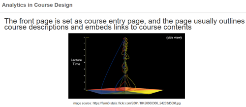
Homepage_based design: This design presents a front page usually including a course outline and links to course activities. This page could be a wiki page or the Syllabus tool. Other navigation links are typically hidden from student view.

This design is useful for courses that have a specific workflow by providing a central page that helps students understand how they can navigate through the course.

module
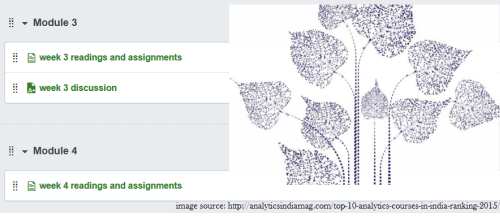
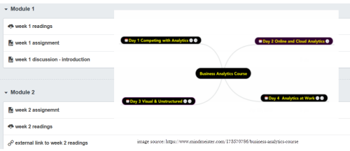
Module_based design: The design utilizes the Module tool to outline the sequence of course content and course activities. The Pages link is usually disabled from student view.

This design is suitable for courses containing sequential activities with possible prerequisites.

page
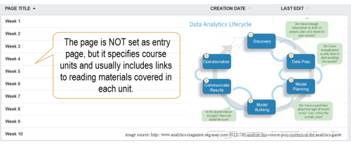
Page_based design: This design uses the Page tool to list the sequence and structure of course activities. Course files are usually embedded and linked in the content pages. Students use the content pages to guide their coursework. The course instructor can also use Pages as a wiki collaboration tool, setting specific student access for each page.

This design facilitates providing descriptions for course content.

page-modulePage/Module_mixed design: This design utilizes both Page and Module tool to construct course outline and guide students through their coursework. Both Pages and Modules navigation tabs are enabled to allow student access.

This design is suitable for courses contain sequential contents, meanwhile allowing flexibility for students to navigate through the course content.

discussionDiscussion_based design: The Discussion tool is utilized to facilitate communication before or after face-to-face classes. Page and Module tools are usually not used in this design.

This design may be appropriate for blended learning, helping students to begin thinking about an upcoming assignment or class discussion, or following up on questions that began in a face-to-face classroom.

file

File repository: This design utilizes the Files tool to share course documents and syllabi with students, The Pages and Modules tools are not used extensively.

This design is suitable for face-to-face classes that use Canvas mostly for provided documents to students.

Building dynamic interaction graphs in Tableau using R

Student online discussion interaction data can be quite rich, it is beneficial to visualize the data in a meaningful way that helps faculty make an informed decision to engage students in online discussions. We can try a dynamic network dashboard to explore the ideas.

In previous blog, I posted a couple of online discussion interaction layouts that were generated in R with igraph package. In this blog, I would like to share another approach that uses R in Tableau to create a dynamic network graph. Please click on the image to view a video clip that shows a dynamic interaction I created in Tableau using R.animationTo build a dynamic network graph in Tableau, in addition to prepare the edge list, we need to get the x/y coordinate for each node. There are multiple way to obtain node x/y coordinate. Inspired by a blog posted by Boran Beran, in which he describes how to generate x/y coordinates in Tableau using R igraph, I decided to try the coding in Tableau to build a dynamic discussion interaction diagram.

Below includes a step-by-step instruction and sample script:

  1. Install Rserve package in R and run Rserve – Rserve(). Make sure to install igraph and plyr package in R as well.
  2. Prepare an edge list that includes the following fields: from (the interaction initiator/sender), to (the receiver), users (the field combines both from and to list), pathorder (1 for users=from, and 2 for users=to), weight (varies and depends on the elements you want to examine or the focus of a question)
  3. Import the file to Tableau
  4. Create a Tableau calculated field (GraphNodes) to generate x/y coordinates and betweenness calling R igraph:
    SCRIPT_STR(“library(igraph); library(plyr);set.seed(123);

    mydf <- data.frame(from=.arg1, to=.arg2, weight=.arg3, Order=.arg4);
    mydf <- aggregate(mydf[,3],mydf[,-3],sum);
    mydf <-mydf[(mydf$Order==’1′) & (!is.na(mydf$to)),];
    mygraph <- graph.data.frame(mydf);
    mygraph <- simplify (mygraph, remove.multiple=F, remove.loops=T);
    coords <- “+[Layout]+”(mygraph);
    c<-cbind(coords, data.frame(users=V(mygraph)$name));
    c<-cbind(c, betweenness(mygraph));
    allusers <- data.frame(users=.arg5);
    c<-join(allusers, c, by = ‘users’);
    paste(c[,2],c[,3],c[,4], sep=’~’)”,ATTR([From]), ATTR([To]),SUM([Weight]),ATTR([Pathorder]), ATTR([User]))
  5. Create calculated fields to extract x and y coordinate from the calculated field ‘GraphNodes’
    X coordinate: FLOAT(LEFT([GraphNodes],FIND([GraphNodes],’~’)-1))
    Y coordinate: FLOAT(LEFT(RIGHT([GraphNodes],LEN([GraphNodes])-FIND([GraphNodes], ‘~’)),FIND(RIGHT([GraphNodes],LEN([GraphNodes])-FIND([GraphNodes], ‘~’)),’~’)-1))
  6. Build a network diagram in Tableau: step-by-step instruction on how to build a network diagram in Tableau.

Resources about Using R in Tableau:

Course Content Access Visualization

Student course access data can potentially help us identify effective course designs. We can leverage student click-stream data generated in LMS to examine the effectiveness of certain course designs.

For instance, the following graph demonstrates student course content access pattern. The course we selected in this example employed a page-based design approach: Each weekly study guide is presented in an individual page layout, reading materials are embedded/linked in the weekly study guide descriptions, and students can also access the reading materials by directly going to the file repository.

When a student accessed a file directly via the file repository, ‘folders’ event was emitted; When a student click on a file embedded in the study guide content page, ‘files’ event was emitted if the student chose to download the file, and ‘file_previews’ was emitted if the student clicked to preview the document.

Graph 1: The nodes with number indicate students – student nodes, the nodes with texts indicate course contents – content nodes. The size of content nodes implies total access to certain content made by students, and the size of student nodes implies the quantity of clicks to all course contents initiated by the student.

12367ContentAccess
Please note that the number associated with each student node was fabricated.

This graph allows faculty to easily identify the student who made fewer content access than others. Also the graph shows that students prefer downloading files instead of previewing them. Students tend to access files embedded in content area (study guide pages) rather than going to the file repository (Files tab) to navigate through course files.

Discussion Interaction Visualization

In previous blog, we talked about applying network visualization to course discussion interaction analysis. This blog demonstrates an example of using the visualization to analyze the impact of instructor involvement on student discussion interactions.

The following two graphs show student to student and instructor to student discussion interactions in two courses respectively. The two courses were offered in the same term under the same program and contain roughly the same number of enrollments. The discussion requirements specified in the two courses are identical. The results suggest that:

  • Less instructor involvement coincides with more student-to-student interaction
  • More instructor involvement coincides with longer student replies
  • More instructor involvement coincides with greater student self-reflection

Graph 1: Each node represents a student who either received at least one feedback or provided at least one reply to another student. The size of each node suggests the quantity of interactions associated with the student. The thickness of each arrow line implies the length of a reply.

png Graph 1 is presented in ‘kamada.kawai’ layout:

5887S-kamada5884S-kamada


The two graphs above show that although course one students were fairly active in discussion activities, comparing to their counterparts in course two, course one students contributed more equally in terms of the length of replies (word counts of the threads) and the number of replies. In contrast, a few students in course two appear to have a greater quantity of the interaction, and yield a few longer replies.

Now, let’s take a look of instructor’s involvement in both courses. The course two instructors’ presence appear to be more evident than course one instructors, and instructors in course two provided more lengthy replies to their students than course one instructors.

Graph 2: the orange node in the middle represents the instructor who provided at least one reply to students. The size of each node suggests the number of replies made to students. The thickness of the arrow line implies the length of a reply.

crs1-2Instructor


The Application of Network Diagram in Discussion Interaction Analysis

Our Canvas discussion data shows that about 20% of courses that are published in Canvas use the Canvas discussion tool. However, little is known as to how students interacted with their peers in Canvas discussions, whether students were actively engaged in discussions, and how instructor involvements shape/facilitate a community of inquiry. To see if network analysis is useful to address some of these questions, we applied network graph approach to visualize discussion interaction data.

For the proof of a concept, we fabricated a small set of discussion interaction data. We converted the discussion data to an edge list. An edge list contains “from” and “to” columns that represent the two nodes connected in a network. Table 1 includes the sample set of discussion interaction data in an edge list form. The values in the first column are discussion feedback providers and the second column includes the feedback receivers.

The Graph 1 was derived from the sample data set and generated in R with the igraph package. Each node represents a discussion participant. The direction/edge arrow indicates a directed interaction from a feedback provider to the feedback receiver – the author of the target thread to which the provider replies. The feedback can be a reply to a new post, or a response to a reply. The size of each node implies the total counts of the directed interactions for the node. The graph reveals interesting elements related to students’ discussion engagement. For instance, we can quickly see that studentA tended to respond to most of his peers, but did not get much feedback from his peers at all. In contrast, studentE received responses from many of his peers, but only initiated one thread to the instructor. Maybe the initial thread that studentE posted was so interesting or debatable that grabbed the attention of other students. studentF appears to be less interactive than his peers, and provided no feedback to peer postings.

Graph 1:The size of each node implies the count/degree of the directed interactions for the node

Rplot01To further explore the relationship between online discussion behavior and classwork performance, we experimented to add student grades as node attributes. We also added the word count of a reply as weight to each directed interaction.

To experiment with the nodes’ attributes in our analysis, we fabricated students’ grades, assigning them either an above median or below median value. We also added a weight for each unique interaction by counting the number of academic words by excluding English Stopwords in the thread. Graph 2 was generated by adding the weight values and the nodes’ attributes.

Graph 2: The color green means a performance above the median, and red denotes a performance below median. The size of each node represents the amount of the two-way interactions for the node. The thickness of the arrow line implies the number of academic words in each interaction.

plotWeightedWith the same edge list, we can apply different igraph layouts to an interaction visualization. For instance, the following three graphs were derived from the same set of data, the circle layout gives us an overview of the students who either provided at least one feedback to their peers, or received at least one reply from their peers. The kamada-kawai layout allows us to quickly identify the students who are less interactive. The sphere layout helps us see the reply threads that contain the most words.circle

kawaisphere

Table 1 includes a sample set of discussion interaction data in an edge list form. The values in the first column are discussion feedback providers and the second column includes the feedback receivers. Table 2 is the edgelist with associated edge values, the weight for each unique interaction, which was used to created a weighted network. Table 3 is the nodes’ attributes representing student performance, above median-Above or below median-Below respectively.

Table1:

discussion feedback provider discussion feedback receiver
studentA studentB
studentA studentC
studentA studentE
studentB studentF
studentB studentC
studentB studentE
studentC studentD
studentC studentE
studentD studentE
studentE instructorA
studentA studentF
studentA studentC
studentA studentE
instructorA studentE

Table 2 – nodes’ attributes:

ID performance
studentA above
studentB above
studentC below
studentD above
studentE below
studentF below

Table 3 – a weighted edgelist:

provider receiver weight
studentA studentB 12
studentA studentC 30
studentA studentE 20
studentB studentF 9
studentB studentC 16
studentB studentE 18
studentC studentD 10
studentC studentE 11
studentD studentE 7
studentA studentF 10
studentA studentC 30
studentA studentE 20

install.packages(“igraph”)
library(igraph)
#load the edge list and nodes to R
nodes links

Resources: http://kateto.net/network-visualization

2015 Assignments Submission Activity

Would you like to know when Dartmouth students are likely to submit their assignments via Canvas, and whether the activity is related to the time and date when the assignment is due? If so, how does the assignment due times affect students’ submission activities? If you are interested in learning about the assignment submission facts, please click on the image below to view the 2015 assignment submission analytics.

These results were derived from 2015 course, course assignment info and submission data. Graded discussions, online quizzes and any assignments that have an ‘online’ submission type were included in the analysis. The assignment that does not have an ‘online’ submission type or a due date/time associated with was excluded from the analysis.

AssignmentSubmissionsAfter a few outliers were identified and removed, the median submission time before due date is 30 minutes and the median submission time past due is 1.2 hours. The ‘withoutoutlier’ charts also show that the number of before due submissions is much greater than the total number of past due submissions and the variation in past due submission hour is wider than before due submission hour. All of which imply that majority Dartmouth students tend to submit assignments more often before than past the due time and the likelihood assignment submission time is 30 minutes prior to assignment due time.boxplot

Taking all four terms in the year of 2015 into consideration, the evening period from 8 pm to 10 pm is a popular time for assignment submissions, and 10 pm is the peak assignment due time (when assignments are due). Some months show some variability. For instance, in November, there is a peak submission time at 11 pm coupled with a 11 pm peak assignment due time. in April, 11 am arises to be another peak time for assignment submissions in addition to the popular evening submission hours. Faculty might consider these behaviors when choosing due times.

AssignmentSubmissions

The chart below reveals that a number of assignments contain due date/time that were set between midnight and 8am Eastern time, which prompted some students staying up overnight in order to submit the assignments right around due time. Even though the hourly submission chart reveals that there are variability in median submission time for all submissions at a given submission hour, we can conclude that students tend to submit assignments 30 minutes prior to assignment due time more often than past assignment due time. Therefore, we need to suggest faculty to be mindful when choosing assignment due time.
duetimeat7