Application of user path flow visualization

The Course Users Flow report is a graphical representation of the paths a course user took through a course site, from the landing page to the various pages, and where along their paths they exited the course site. The Course Users Flow report allows us to examine course user navigation flow patterns within a course site, and further to analyze the efficacy of a course site design. (https://support.google.com/analytics/answer/1709395)

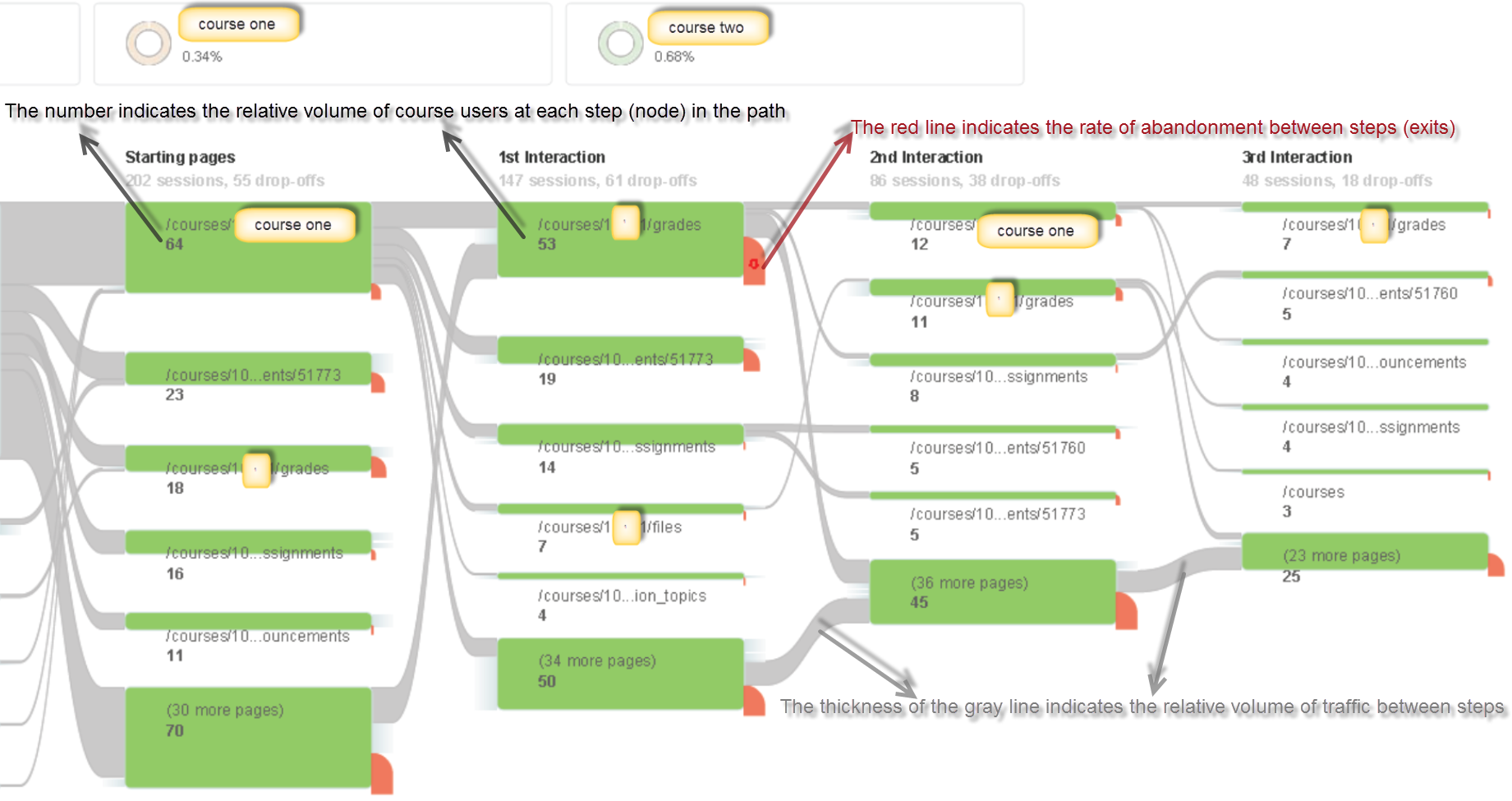
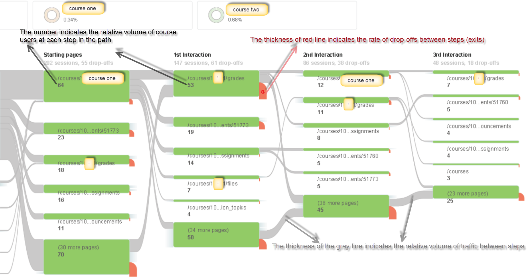
We attempt to use the user flow report to examine how Canvas facilitates students final exam preparation. The following two course user flow charts illustrates navigation traffic patterns in two Canvas courses that adopted distinct design approaches:

  • Course one primarily uses Canvas native Files and Assignments feature to deliver course materials, publish weekly homework, and collect student assignment submissions;

UserPath1

  • Course two utilizes homepage to distribute weekly lecture notes and exam study guide materials, links classroom lecture video recording via echo360 integration and organizes class discussion via an external tool – Piazza.

UserPath2

The course one user flow chart shows that checking course grade was the most popular path; while the user flow report for course two suggests that reviewing the class lecture video recording was the primary purpose of logging into the course site. From the level of engagement point of view, course two students were most engaged in taking final exam and reviewing the lecture captures, and in contrast,  course one students were more engaged in checking their grades and taking the exam than accessing course files.

The application of quiz statistics

This blog is a continuation of the previous blog:

In previous blog, we introduced the method to calculate the point-biserial value from students’ quiz submissions that were derived from three instances of the same course. The same course was offered in three consecutive terms: Spring 2013, Spring 2014 and Spring 2015. In the following texts, the three courses will be noted as SP13, SP14, SP15 respectively.

In this blog, we intend to demonstrate an application of the quiz statistics.

    • The point-biserial correlation coefficient derived from students’ first attempts on all quizzes reveal two quizzes that contain question items yield a high point-biserial value (greater than .5); we’ll label these as “Quiz 1” and “Quiz 2”. Quiz 1 contains four questions worth 1 point each, whereas Quiz 2 contains five questions, worth 1 point each. The point-biserial correlation coefficient measures how well a single question can tell the difference (or discriminate) between students who do well on an exam and those who do not.
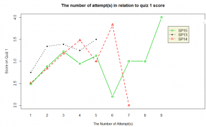
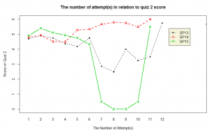
    • In general, students participate in repeated practice to get a full score on the quizzes that allow multiple attempts. And quite a small number of students continue practicing after they get a full score. For instance, for Quiz 1, among 46 students who got a perfect score on their first attempt, only one student made second attempt; Among 61 students who got a full score on their second attempt, only 3 students took Quiz 1 the third time. The two quiz1graphs below show the average quiz score in relation to the attempt taken. We observe that after the 4th attempt, student scoring becomes somewhat random, which is quite likely due to fatigue/saturationquiz2.

For the few students who continued practicing after achieved a full score, they probably re-take the quiz for the sake of practice and care less about the score, or they might access the quiz primarily to review the embedded videos.

  • Our further analysis on these two highly discriminating quizzes, Quiz 1 and Quiz 2, in the SP15 course indicates that students, who on their first attempt, receive a score of 1 (out of 4) on Quiz 1 and a score of 3 (out of 5) on Quiz 2, tend to perform poorly on the final exam.
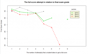
  • There is an inverse relationship between the number of attempts that a student takes to get a full score on the quiz and the student’s final exam grade.fullscore

    Implications:

    • Quizzes 1 and 2 can be used to predict problematic student performance: If a student receives a score of 1 (out of 4) on the identified highly discriminating Quiz 1 and a score of 3 (out of 5) on Quiz 2, the instructor can be notified in order to take additional remedial measures. Early interventions and extra help need to be employed in order for the identified students to make sufficient progress on the subsequent course content.
    • Furthermore, if  a student struggles to receive a full score on the quizzes by the 4th attempt, similar interventions are suggested.

    Recommendations:

    • In order to leverage quiz statistics to predict student course outcomes , we suggest that faculty who employ low-stakes quizzes embed one or two multiple choice question items into these quizzes so as to make them highly discriminating.

Leveraging quiz statistics to inform quiz design

Canvas quiz statistics can help faculty understand how students perform on quiz items and help them choose quiz items that are highly correlated with overall student performance (high discriminating quiz items). The important statistics to analyze for each quiz item are its difficulty level and the correlation between the right/wrong attempts on a given quiz item and the total quiz scores (the point-biserial correlation coefficient).

Let’s look at the item statistics in detail.  Suppose that a faculty administered a quiz that contains 10 multiple choice quiz type items, and nine students took the quiz.

item 1 item 2 item 3 item 4 item 5 item 6 item 7 item 8 item 9 item 10 Student Total Score
student-1 1 1 1 1 1 1 1 1 0 1 9
student-2 1 1 1 1 1 1 1 0 1 0 8
student-3 1 1 1 1 1 1 0 1 0 0 7
student-4 1 1 1 1 1 0 1 0 1 0 7
student-5 1 1 1 1 1 1 0 1 0 0 7
student-6 1 1 1 0 1 0 0 0 0 0 4
student-7 1 1 0 1 0 1 0 0 0 0 4
student-8 1 0 1 0 1 0 0 0 0 0 3
student-9 0 1 1 0 0 0 0 0 0 0 2
item 1 item 2 item 3 item 4 item 5 item 6 item 7 item 8 item 9 item 10
difficulty index 0.89 0.89 0.89 0.67 0.78 0.56 0.33 0.33 0.22 0.11
point-biserial 0.46 0.29 0.12 0.73 0.49 0.49 0.59 0.46 0.26 0.4

The sample data used in this blog is from http://www.eddata.com/resources/publications/EDS_Point_Biserial.pdf

The quiz items are presented in the sequence of its difficulty level from 0 to 1 (difficulty index=#correct attempts/#total attempts). The higher the difficulty index is, the easier the quiz item should be. The higher the point-biserial value is, the higher the item is correlated to the total scores.

  • Application: Identifying quiz items with high point-biserial value

A large positive point-biserial value indicates that students with high scores on the overall test are highly likely to get the item right and that students who receive low scores on the overall test will tend to answer the item incorrectly. A low point-biserial value implies that there is not much correlation between a student answering the item correctly and the overall quiz score. For example, students who answer the item wrong might answer correctly on other more difficult quiz items and end up scoring higher on the test overall than might be predicted by the item in question. Therefore, items with low point-biserial values need further examination. Our sample data suggest that Item 3 deserves closer look, as its point-biserial value is the lowest (0.12) among other quiz items. Even though student-7 did not correctly answer an easy quiz item 3, the student correctly responded to more difficult quiz items, Items 4 and 6. If we can assume that the student did not make a guess on item 4 and 6, and that student-7 indeed understood item 4 and 6, item 3 should be treated as problematic item.

If a faculty is interested in creating an efficient shorter quiz, we can help the faculty gather previous quiz submissions and use the point-biserial value as reference to select the high discriminating quiz items, which are those with the high point-biserial correlation coefficient. Meanwhile, we need to take the difficulty index of each quiz item into consideration to ensure a balanced quiz which is neither too difficult nor too easy (http://jalt.org/test/bro_12.htm).

  • Implication: Providing individualized support

The sample data suggest that item 4 is a high discriminating quiz item that may be used to predict students performance on the overall quiz. Its high point-biserial value (0.73) implies that if a student gets this quiz item right, the student is likely to answer other quiz items correctly and get a high overall score; If a student responds to this quiz item wrong, the student may find it difficult to answer correctly to subsequent quiz items. Therefore, faculty can use the information (responded incorrectly to the quiz item) to identify ‘weaker’ students, and guide them to proper materials/practices that facilitate their understanding on the content that quiz item 4 is designed to measure.

difficulty index point-biserial correlation
item 1 0.89 0.46
item 2 0.89 0.29
item 3 0.89 0.12
item 4 0.67 0.73
item 5 0.78 0.49
item 6 0.56 0.49
item 7 0.33 0.59
item 8 0.33 0.46
item 9 0.22 0.26
item 10 0.11 0.4

From Theory to Practice

In this study, we leveraged the point-biserial value to identify quizzes that contain highly discriminating question items. Furthermore, we examined the relationship between students’ activities and outcomes on these quizzes and their final exam performance.  We explored the possibility of predicting unsatisfactory student performance using quiz data early on during the term in order to pursue timely interventions. We describe a procedure applicable to other courses.

The particular course we analyzed contains three weekly quizzes, each consisting mostly of multiple choice question items. Students are asked to watch videos in preparation for class, interspersed with these quiz questions. We analyzed student performance on these quizzes through three instances of the course: Spring 2013, Spring 2014 and Spring 2015. In Spring 2015 course, optional practice questions were added to some quizzes; these optional questions are graded but bear no point value.

Courses number of students
SP13 50
SP14 81
SP15 73
Grand Total 204

First, we examined the pattern of time-spent on all quizzes in SP13, SP14 and SP15 course respectively. Secondly, we calculated the rpbi for each question item, derived from the results of student first attempt, with the following formula (http://jalt.org/test/bro_12.htm). We identified two quiz questions that contain question items yield a high point-biserial value (rpbi > 0.5). A simple linear regression was performed to examine the correlation between students’ performance on the discriminating question items and their final exam grades. A number of plots on the mean of the response for two-way combinations of factors was drawn to illustrate possible interactions.

Where:

rpbi = point-biserial correlation coefficient
Mp = the whole-quiz mean for students answering item correctly (i.e., those coded as 1s)
Mq = the whole-quiz mean for students answering item incorrectly (i.e., those coded as 0s)
St = standard deviation for the whole quiz
p = proportion of students answering correctly (i.e., those coded as 1s)
q = proportion of students answering incorrectly (i.e., those coded as 0s)

The rpbi point-biserial correlation coefficient derived from students’ first attempts on all quizzes reveal two quizzes which contain question items that yield a high point-biserial value (greater than .5); we’ll label these as “Quiz 1” and “Quiz 2”. Quiz 1 contains four questions worth 1 point each, whereas Quiz 2 contains five questions, worth 1 point each. Note: Original Quiz 2 contains six question items, but one question item grants either half or one point (0.5 or 1). In order to comply with the rpbi point-biserial formula, we took the question item out of the calculation, hence, rpbi point-biserial correlation coefficient for Quiz 2 was derived from only five question items.

The rpbi point-biserial correlation coefficients for the four question items of Quiz 1:

item-1 item-2 item-3 item-4
Mp     2.926829 2.842697 3.336957 3.306931
Mq 1.222222 0.935484 1.948718 1.861111
St 1.112651
P 0.784689 0.851675 0.440191 0.483254
q 0.215311 0.148325 0.559809 0.516746
rpbi 0.62972 0.609235 0.619364 0.649354

If we can harness these statistics to identify the ‘weaker’ students prior to the final exam, the faculty may be able to guide the students early on to facilitate a mastery of the course content.
 

How did our students use Canvas to facilitate their final exam preparation?

Dartmouth has been using Canvas as an extension to F2F class in course materials delivery, quizzes administration and asynchronous discussion/communication. As such, we are particularly interested in learning how our students use Canvas to facilitate their final exam preparation.

We gathered students’ page view activities data in Canvas during final exam period and students’ score on their final exams. Since each course deployed its own grading schema on the final exam, the final exam score was re-scaled by referencing the points possible assigned to the final exam. We examined number of page views made by individual students and the time they spent on each page, since the number of views and time spent are highly correlated, we decided to use one variable in in the further analysis.

The residual plot and QQ-plots suggest the simple linear regression assumption is not satisfied, thus we employed a natural logarithm transformation on the ID variable, and drew lowess line on the scatterplot and identified one point (87%) that might be of interest. In addition, outliers were identified and removed by referencing both leverage and Cook’s distance. Although the log transformation of predictor helped to satisfy the regression assumption, still only less than 1% of the variation could be explained by the model, thus we decided not to introduce the model, but to visualize the results in scatterplot instead.

  • Overall, the range of students’ performance (points received/points possible) on their final exam covers from very low to very high, and quite a few students achieve fair performance on final exam without significant Canvas page view activities.
  • In average, students, who received grades greater than 87% on final assignments/exams, tended to spend more time navigating through Canvas during final exam week.
  • In contrast, the almost horizontal regression curve of students who got less than 88% on their final exam indicates that saturation is reached quickly where reviewing materials during final exam week does not correlated with better performance on final exam. In other words,
  • Navigating through Canvas produces marginal effect on final exam preparation of students, who performed at B- level or lower (grades less than 88%)

The analysis is derived from Canvas page view activities of students who use Canvas as an extension of F2F learning. The data suggest that many students used Canvas to review course materials during final exam week, but we have very limited data shows their study activities beyond Canvas and classroom, while students’ performance on final exam can be significantly affected by their study activities conducted offline and outside classroom. Therefore, it is instrumental to identify new learning behavior taken place in a variety of digital platforms when we try to understand how our students learn.

Canvas use at Geisel and TDI (2014-2015)

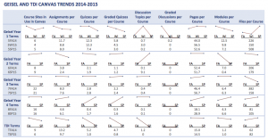
Geisel and TDI implemented Canvas for all required courses starting in the summer of 2014. The graphs below summarize the usage statistics from our initial year with Canvas. Since Geisel and TDI offer different courses each term of the year, we cannot yet spot trends. However, these data and sparklines will serve as starting points for observing changes in Canvas as our our curricula and pedagogies evolve.

Geisel and TDI Canvas Usage Statistics 2014-15

Geisel and TDI Canvas Usage Statistics 2014-15

User Path – Flow Visualization

By Google definition, a flow visualization demonstrates a route, and reveals the actual path as an user explores the possible route.

“Flow reports in Google Analytics illustrate the paths that users take through content. In a single graphic, you can see how users enter, engage, and exit your content. You can also use these reports to troubleshoot your content by finding any unexpected place users exit or loop back.” https://support.google.com/analytics/answer/2519986?hl=en

http://cutroni.com/blog/2011/10/19/path-analysis-in-google-analytics-with-flow-visualization/

Students assignment submissions in relation to assignments due date

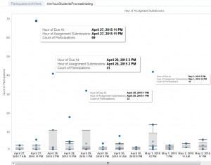
We are interested in learning about our students’ assignment submission activities, such as when our students tend to work on assignments and further whether adjusting assignments due date can better facilitate students assignment submission activities. We harvested students assignment submissions data being generated in A&S Spring 2015 Canvas courses during the week of April 26-May 4. In order to examine whether there is a relationship between assignments’ due dates and students’ assignment submissions, we also gathered information of the corresponding assignments’ due dates in the A&S Spring 2015 courses. The infograph demonstrates students’ assignment submissions activity by hours during the week, and the time of students assignment submissions in relation to the assignment due dates. The graph reveals that in that particular week, there was an assignment submission peak time during each day, and the peak time always corresponded to a due date, in other words, majority students tend to submit their assignments right at the due date/time.

https://public.tableau.com/profile/publish/CanvasCourses/NumberofAssignmentSubmissionsbyTimeofDay

studentsparticipationinaweek