Predictive Modeling: Using logistic regression to identify students who need help early on

Logistic regression method has been commonly used to predict the class of observations, which have only two possible outcome values: 0 or 1, yes or no, based on predictor variables.

The example in this blog is intended to demonstrate how we can employ the method to identify potential indicators and model a binary outcome, which predicts fail or pass for any graded assignments at a given time. For the sake of simplicity, in this blog, we started with the most common data points that can be harnessed from an LMS:
•Submission time – how early or late an assignment was submitted by a given student in relation to the due time of the assignment,
•total activity time – accumulative time spent in a course at a given time,
•total number of page views – accumulative number of clicks on course content, and
•the number of late submissions.

In this demo, student’s current score was converted to a binary value, pass or fail, as the response variable.

Using the logit model

The code below estimates a logistic regression model using the glm (generalized linear model) function in R. Based upon the initial explorations of the sample data, we decided to convert number of late submissions to a factor to indicate that it should be treated as a categorical variable. It should also work if you treat it as a continuous variable.

 glm(formula = score_status ~ submission_duetime_diff + late_submission + 
    total_activity_time + page_views, family = "binomial", data = df)

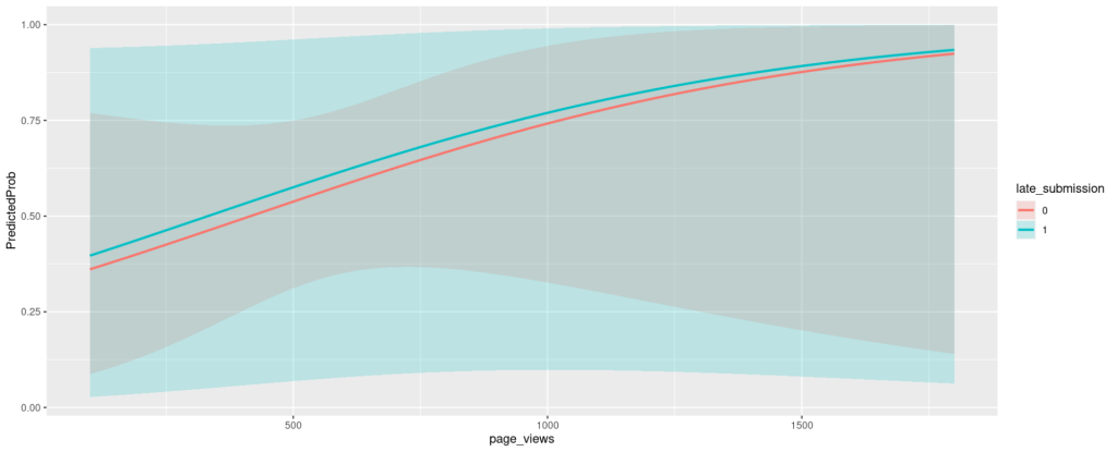
You can also use predicted probabilities to examine the model. Predicted probabilities can be computed for both categorical and continuous predictor variables. It is always helpful to use graphs of predicted probabilities to present the model. Below is a plot with the predicted probabilities pass or fail against indicator variable colored by late submission status.
Gathering more variables and repeating the process

Once you get a prototype working, you can then add more variables, such as discussion participation and content access. In this demo, we used degree centrality to generate a score for an individual learner based upon their discussion interaction activities. We quantified the content access by summing the total clicks on each content category, i.e., files, assignments, modules, discussions.
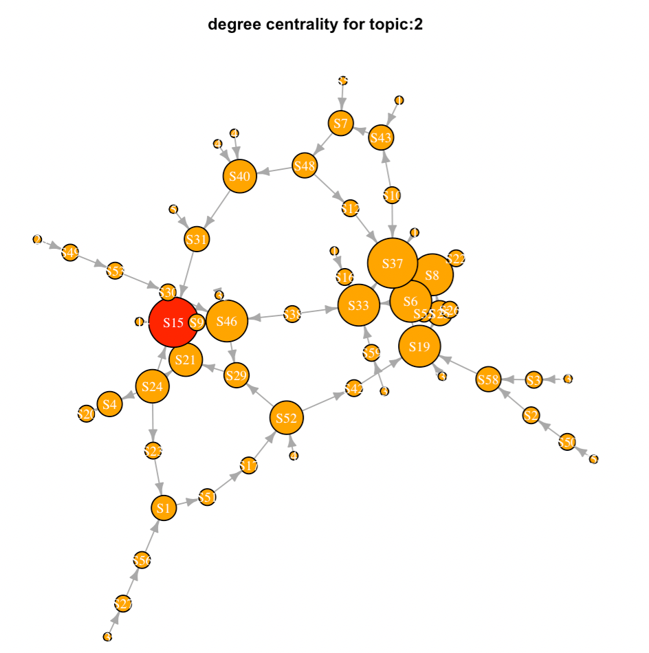
Degree Centrality: The size of each nodes corresponds to the number of interactions, the red node yields the highest degree (in and out) centrality score, and the arrow of each link denotes that direction of the interaction

Displaying the predictive outcome in a meaningful layout

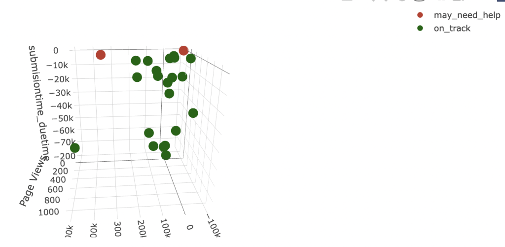
After all, the statistical analyses is to provide instructors with a visualization that presents the results in an user-friendly digestible format, which helps them make an informed decision to reach out to the student who was identified as an individual-may-need-help.
Resources: https://stats.oarc.ucla.edu/r/dae/logit-regression/

Evidence-centered design in micro-level learning analytics

In the original ECD framework formalized by Mislay and colleagues (2003), the initial phase is to define what to measure in terms of KSA (Knowledge, Skills and Attributes). Since the KSA cannot be observed directly, we need to come up with the measurable, which can constitute evidences about KSA variables. The next step is to identify tasks or situations that can elicit observable evidence about latent KSAs. In some cases, attributes are referred to as ‘psychological constructs.’ The noncognitive factors, such as engagement and perseverance, are often considered as strong predictors of academic outcomes.

Although the fundamental ideas of ECD framework remain solid, the current digital revolution has changed the content of each model within the framework, which introduced new possibilities of what evidence we are able to observe, what data we are able to track, how we are able to mine the data (EDM) and make inferences of it (LA).

Here is an example of demonstrating the conceptual linkages between observable evidence and inferences in the rapidly-evolved digital world.

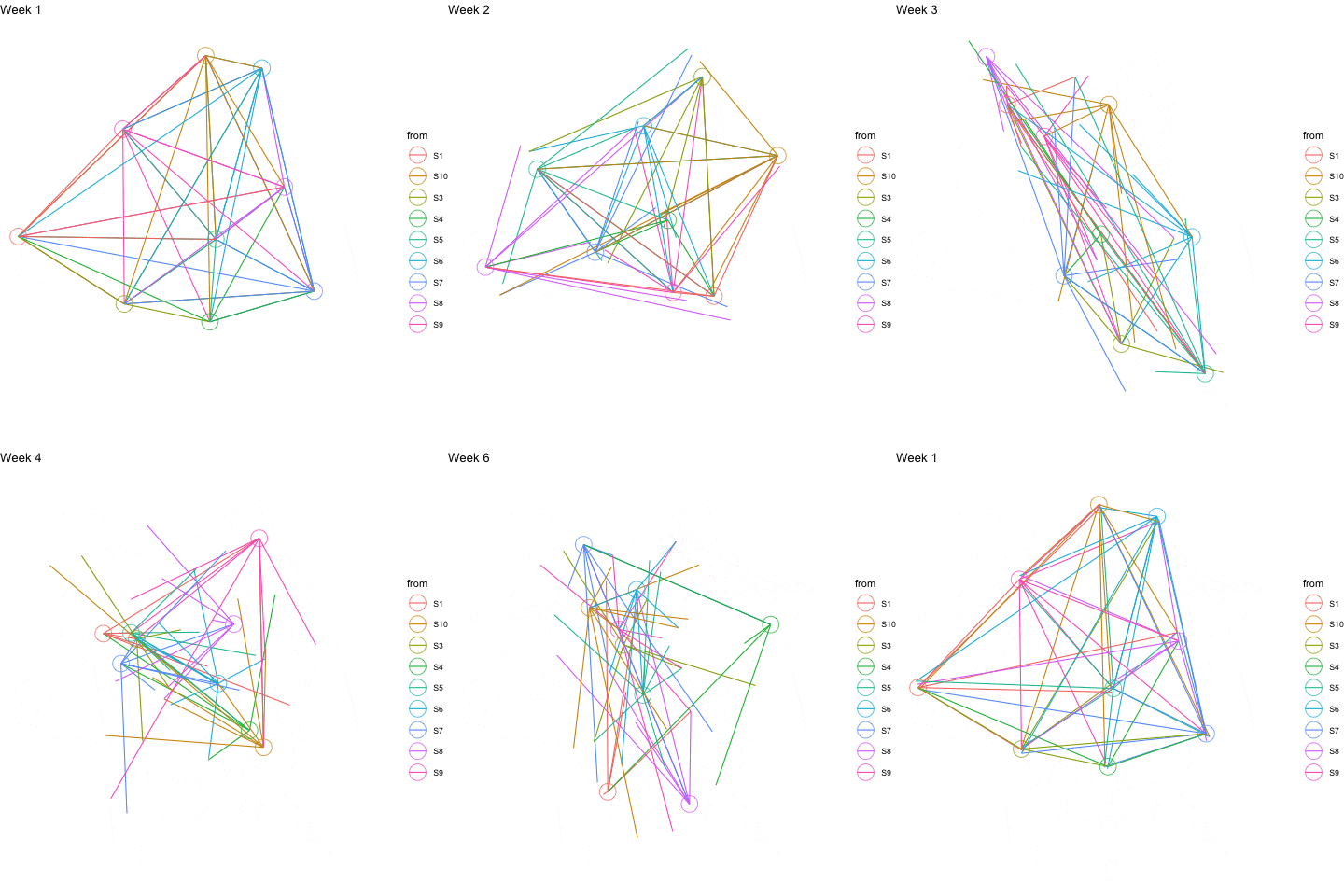
The data used was fabricated from group communications in Slack over several weeks, which consists directional weighted links that represent a direct message from one to another, message to the entire group and length of a reply. The tasks are composed of reflective writing and knowledge sharing. The task model elicits the evidence from individuals in response to given prompts about their understandings of topics. The technologies support us to harvest and harness the evidence, which otherwise, could not be fulfilled.

Temporal networks are network representations that flow over time. In educational settings, they are useful for visualizing how a learning community develops or evolves through time. The time indices are an ordered sequence. This ordering can reveal information about what is occurring in the network through time.

Below is an animated temporal network diagram, I generated in R using the fabricated data, that shows the dynamic of interactions over several weeks. Each node represents an individual, the links denote sending a message from one to another or addressing to the entire group, the color corresponds to the sender.

Reference:

A Brief Introduction to Evidence-centered Design

Evidence Centered Design for Learning and Assessment in the Digital World

Leveraging learning data to craft evidence-based visual feedback for small-sized classes

Course-level Learning Analytics is often perceived as an effective tool to help facilitate large-sized classes or MOOC courses, but not necessary useful for small-sized class as instructors can easily observe students engagement and assess their performance at a glance.

This blog is to demonstrate the application of learning analytics specifically designed/targeted for small-sized classes, i.e., how learning data can be leveraged to provide students with personalized evidenced-based real-time feedback.

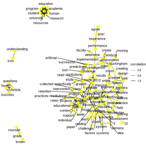
First, we employed text mining technique to harness student reflective writing on course materials/readings and produce diagrams derived from the corpus that represent word relationships. The link corresponds to the strength of term correlation and the density of terms denotes the degree of centrality in relation to sparsity.

Secondly, we aggregate student activity data and generate animated plot that represents number of valid clicks on a daily basis over a period of time.

Below is a sample of evidence-based feedback to student with the visual representation of student learning data:

As shown in the diagram below, your (the student) description of the research project demonstrates a solid understanding of the hypothesis, meaning of the study, its findings and implications.

Below is the line chart that represents the class activity over time. To comply with the guidance of data privacy and ethics in LA, the class is anonymized. The plot shows the engagement of individual students over time.

References:

https://uc-r.github.io/word_relationships

https://r-graph-gallery.com/animation.html

Using animated time series graph to illustrate activities over time

Animated visualizations can effectively bring graphs to life and translate data into actionable insights. There are a number of open source tools that we can leverage to create interactive animated graphs. Below is an example that I generated using fabricated data, R gganimate package and Plotly’s R graphing library.

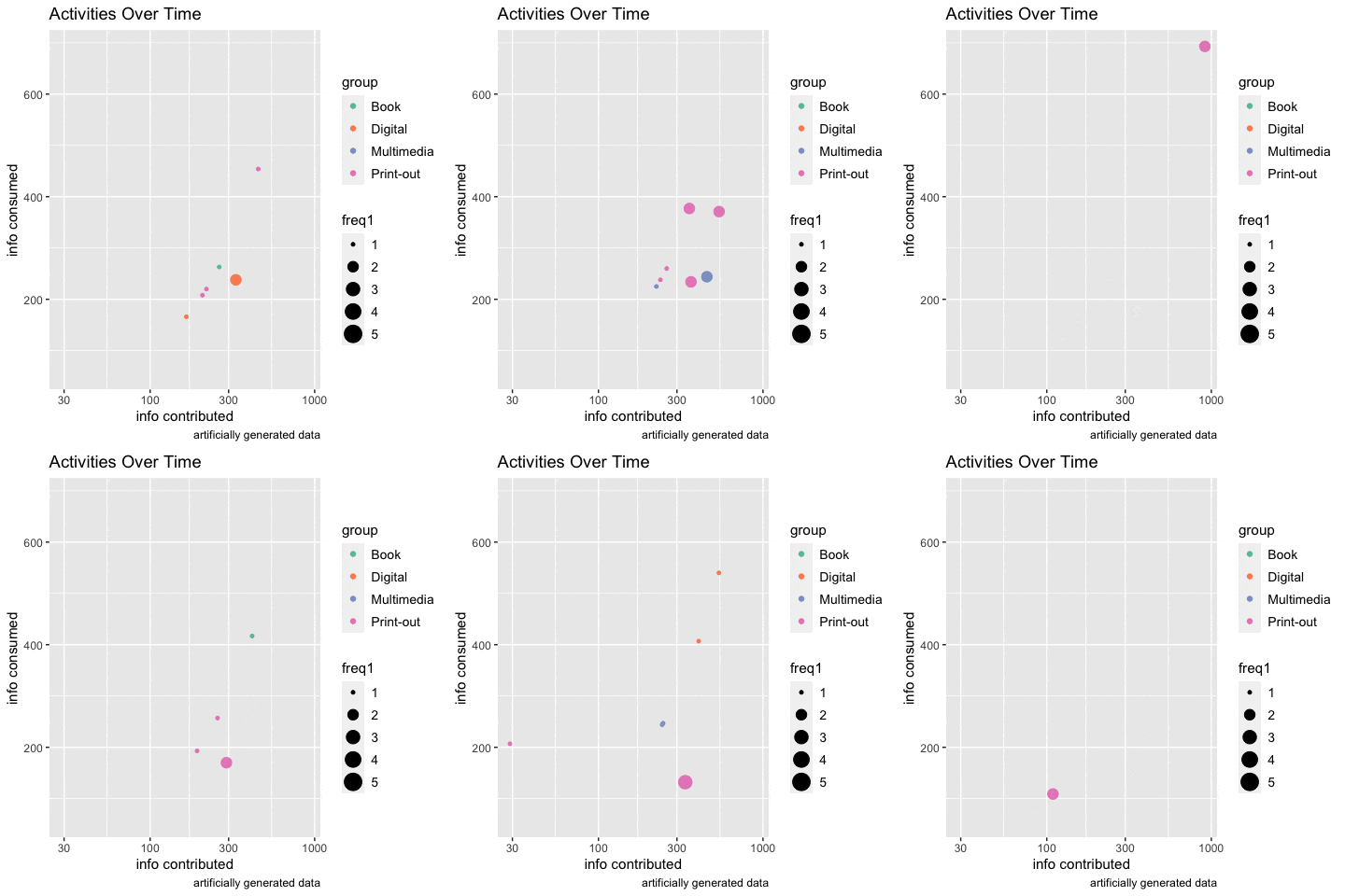
Please note, the data used to create the animated charts was artificially generated, and merely for the purpose of demonstrating the use of animated visualizations to present learning activities over time. Therefore, the meaning of results is irrelevant in this context.

Scenario One: Below is an example of using animated line chart to examine user interactivity with online training modules over a period of time. A growing number of employers are turning to online training for employees’ professional development, as online courses allow employees to learn at their own pace and at a time that’s convenient for them. The plot in below, which displays learner interactions with a variety of content over time, helps course designers evaluate the efficacy of online training modules and make informed decisions on design improvement.

Scenario Two: Participants were put into three groups and each group was provided access to the same materials in three distinct formats respectively, i.e., digital, multimedia and paper print-out. Below is a snapshot of the animated scatter plot, which demonstrates how participants interacted during the course of eight-week study.

Animated Visualization

You can use the Gapminder data that comes with gapminder package to experiment the R code and generate an animated plot, save it in gif file format:

References:

Animate Graphs in R: Make Gorgeous Animated Plots with gganimate

Intro To Animations

https://plotly.com/r/plotly-fundamentals/

The Promise of Learning Analytics: Micro-level analytics

The promise of Learning Analytics is a broad concept, I would like to use network and word correlation analysis to demonstrate micro-level analytics involves the finer-grained process data for individual learners, and answer a simple question, “what kinds of learning are we really able to track with LA?” In this context, Micro-level analytics is used as a technology of epistemology, and entails collaborative efforts among educators and learners.

Generally speaking, a well-designed course encourages both individual accomplishment and group knowledge construction. The core element of rich learning data, which we can harness, is around conversations and interactions. In the following, we will demonstrate an example of micro-level learning analytics. We employed community detection method to identify the nodes which were more closely connected within than to outside, and used natural language processing approach to examine the quality of learning conversations.

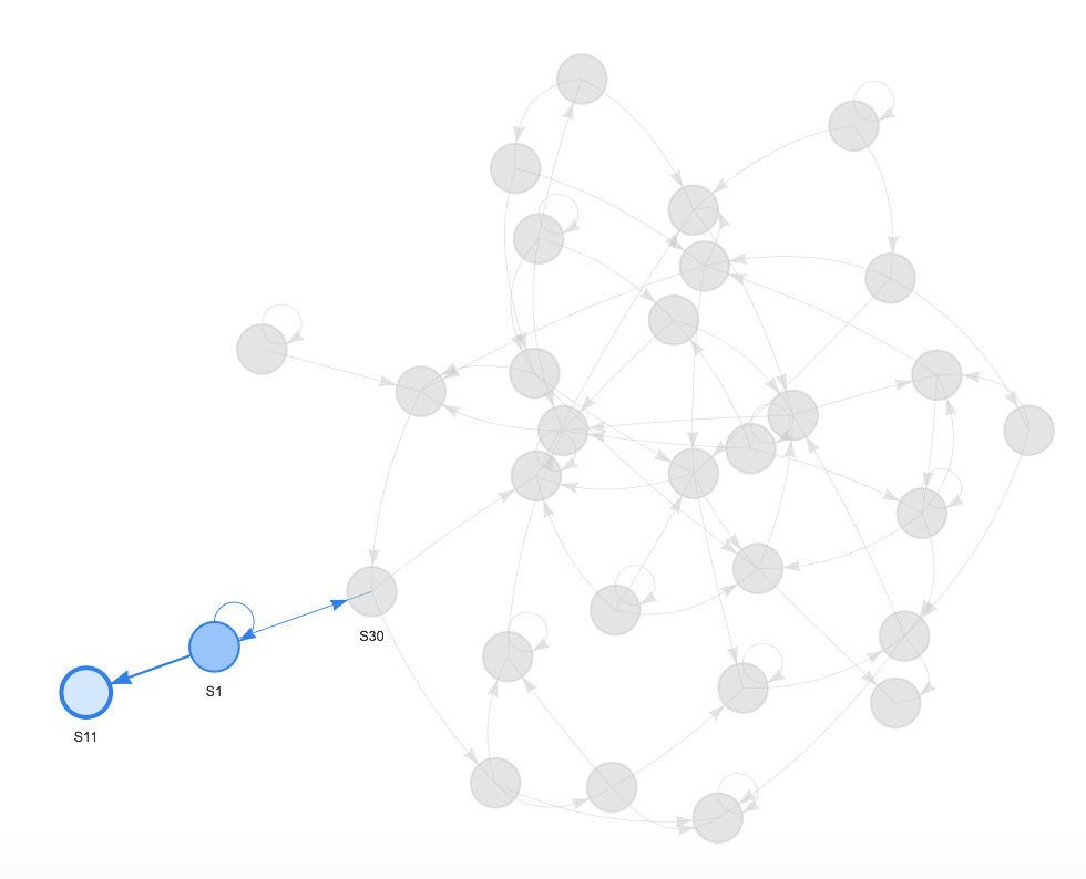
Networks often have different clusters or communities of nodes that are more densely connected to each other than to the rest of the network. The algorithm for detecting community is to identify subsets of network that are more connected within than to the rest of the network. Let’s harness the learner interaction data in a course to identify peripheral community if there is any. Each node represents a student of the class, and the edges indicate interactions, the quantity of each students responding to one another.


For the sake of this demonstration, we applied two different methods for community detection. Despite the fact that a few nodes were grouped to different clusters by comparing the two results, the peripheral subset (S1 and S11) pops out consistently in both diagrams. The diagram evolves as the dynamic of learner interaction shifts. With this information, faculty can easily tell whether there are ‘isolated’ groups or peripheral nodes. If there is any, they can further explore the possible factors contribute to such pattern, and make data-informed intervention if needed.

An even better way to understand the content of each cluster is to combine text analysis. To get a better understanding of the numerous relationships exist, we can use a network graph to depict words correlations. Let’s take a look of networks of words where the correlation is fairly high (> .70). The first graph was derived from the entire class, shows a few clusters with words appearing together more frequently than others. For instance, one cluster shows that education, human, resources, and a few other terms are more likely to appear together than not. This type of graph provides a great starting point to find content relationships within text. The second and third network graphs represent word relationships derived from the conversations contributed by S1 and S11 respectively.


Now back to the topic, the Promise of Learning Analytics, we must not ignore the human factor in algorithms. In order for educators to provide proper interventions, and for the learners to follow guidance and achieve desirable actions/behaviors, both educators and learners must be part of the process. They need to be trained and equipped with keen information as to what types of learning data was harnessed, and how the results were derived.

References:

Text Mining: Word Relationships. https://uc-r.github.io/word_relationships

The Promise of Learning Analytics. (2014, June 13). http://elearninginfographics.com/the-promise-of-learning-analytics-infographic

Buckingham Shum, S. (2012). Learning analytics: Policy Brief. Moscow: UNESCO Institute for Information Technologies in Education. http://iite.unesco.org/files/policy_briefs/pdf/en/learning_analytics.pdf

Tailored dashboards to suit instructional needs

Under the assumption that instructors may use online discussion with different focus to meet instructional needs, we tailor diagrams to effectively present the core elements of the same data and help faculty make informed interventions to engage students in discussion activities. For instance, some instructors would like to promote discussion interactions among students. They may choose not to provide answers/feedback to individuals’ postings, instead to encourage or specifically require students to read and comment on peers’ threads. While some other instructors tend to use online discussion as a means for students to share their written reflections upon a topic/concept, and then provide feedback to individual students’ work, all communications are intentionally designed to share with the entire class.

In the following, we will demonstrate how we can tailor the visual representation of same data to help instructor address a particular pedagogical concern.

Scenario One:

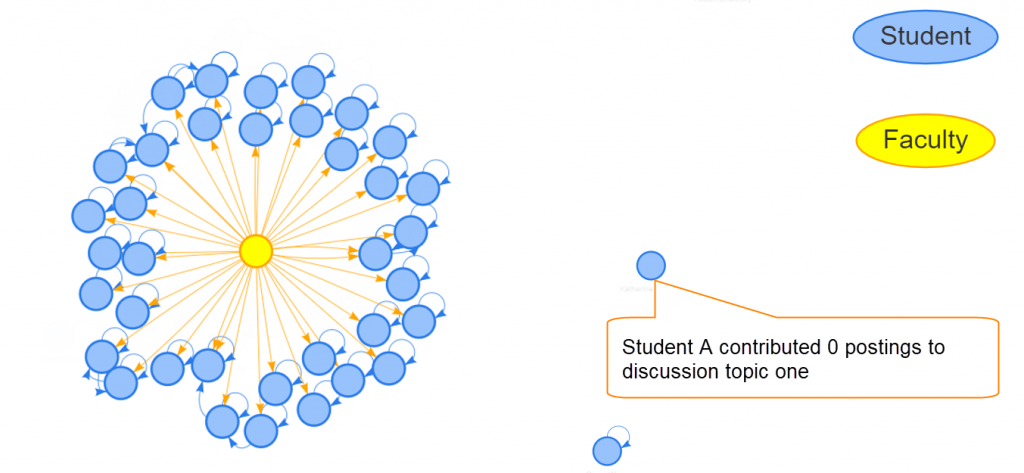
Instructor posted a discussion topic each week, the requirement for a complete participation was twofold: 1)post an initial thread; 2)comment on at least one peer’s posting. In order to effectively facilitate each discussion topic, the instructor would like to see 1)how students interacted among one another? 2)who did not provide any feedback to peers’ posting? 3)whether there were popular threads that receive many replies? 4)whether the amount of student interactions differed each week?

This diagram shows that S11 posted an initial thread, received one reply, but did not interact with rest of the class. Depending on nature of the discussion topic and circumstance, with the information, instructor can decide whether it was necessary to ‘nudge’ or send a ‘reminder’ to S11.


This diagram suggests that S8 was the most active student in this discussion topic. S8 posted a well-written initial thread, which received a number of replies, and also provided feedback to peers’ postings.


Boxplots indicate that there were difference in the number of interactions between Discussion 2 and Discussion 1, Discussion 4 and Discussion 1.The top and bottom lines of the rectangle are the 3rd and 1st quartiles (Q3 and Q1), respectively.  The length of the rectangle from top to bottom is the interquartile range (IQR). • The line in the middle of the rectangle is the median (or the 2nd quartile, Q2). • The top whisker denotes the maximum value or the 3rd quartile plus 1.5 times the interquartile range (Q3 + 1.5*IQR), whichever is smaller. • The bottom whisker denotes either the minimum value or the 1st quartile minus 1.5 times the interquartile range (Q1 – 1.5*IQR), whichever is larger.

Scenario Two:

Instructor used online discussion as a platform for students to share their written reflections with the class. The instructor requires students to post their essay on discussion without the expectation of student-to-student interactions, but only instructor-to-student interaction. In order to effectively facilitate the activity, the instructor would like to know: 1)who has not submitted his/her work? 2)which submission has not been replied and still needs feedback?

The diagram shows that the instructor provided feedback to most students’ assignments. S20 and S26 did not post their work. S31 submitted work, but his/her submission was not commented. S5 made a reply to peer’s thread, but did not receive comments from the instructor.

The matrix is another visual presentation of the same data.


Shiny applications for learning analytics

Shiny is an R package that makes it easy to build interactive web apps straight from R. You can host standalone apps on a webpage or embed them in R Markdown documents or build dashboards. You can also extend your Shiny apps with CSS themes, htmlwidgets, and JavaScript actions. Shiny combines the computational power of R with the interactivity of the modern web.

Using Shiny to share R-based analytics online can bring the core elements of a dashboard from prototyping to production in just a few hours.

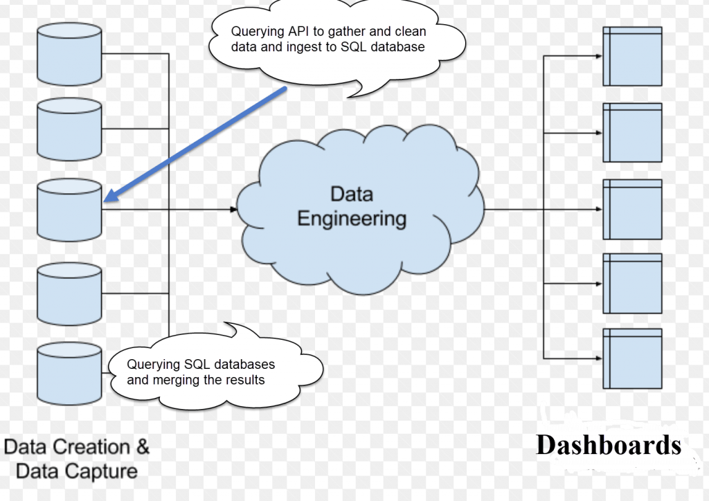
The back-end architecture (designed by Will Cowen at Dartmouth)

Data harvesting, analyzing and application deployment

Step 1: harvesting and storing the data

Querying API endpoints and ingest the results to SQL database.

MySQL is a very popular relational database that is similar to SQLite but is more powerful. MySQL databases can either be hosted locally (on the same machine as the Shiny app) or online using a hosting service.

You can use the RMySQL package to interact with MySQL from R. Since MySQL databases can be hosted on remote servers, the command to connect to the server involves more parameters, but the rest of the saving/loading code is identical to the SQLite approach. To connect to a MySQL database, you need to provide the following parameters: host, port, dbname, user, password.

Setup: You need to create a MySQL database (either locally or using a web service that hosts MySQL databases) and a table that will store the responses.

Step 2: Loading the data

loadData <- function() {
  # Connect to the database
  db <- dbConnect(MySQL(), dbname = databaseName, host = options()$mysql$host, 
      port = options()$mysql$port, user = options()$mysql$user, 
      password = options()$mysql$password)
  # Construct the fetching query
  query <- sprintf("SELECT * FROM %s", table)
  # Submit the fetch query and disconnect
  data <- dbGetQuery(db, query)
  dbDisconnect(db)
  data
}

Step 3: Analyzing and visualizing the data using R

Step 4: Deploying your Shiny app on the web

References:

https://shiny.rstudio.com/articles/persistent-data-storage.html

https://shiny.rstudio.com/


Using Google Bubble Chart to visualize data with 4 dimensions

Over the past year, we have done an extensive exploration for learning data associated with student discussion participation, the duration of online course access and quiz performance. But we had struggled with providing instructors with visualizations that clearly represent 4 or more dimensions of student learning data. The descriptive graphs generated in our custom analytics app are somewhat segmented, and not cohesive enough that allows our instructors to examine all aspects of student activities with single clicks.

Being inspired by the power of Google Charts with R, we built a Shiny app using R that merges student activity and performance data, and produces bubble charts that visualize learning data set with 4 dimensions. The first two dimensions are visualized as coordinates, the 3rd as color and the 4th as size.

  1. x-axis denotes the duration of activity (in seconds) that students spent in an LMS course
  2. y-axis represents quiz performance or running total score (in percentage)
  3. color represents groups
  4. radius of a bubble corresponds to the number of discussion participation (in order to compare two directional discussion activity between providing feedback to peers and receiving comments from peers, we added another dimension to the chart)

Chart one: the radius of a bubble corresponds to the number of comments received by a student.

Chart two: the radius of a bubble corresponds to the number of feedback provided by a student to his/her peers. 

References:

https://rdrr.io/github/jburos/GoogleVis/man/gvisBubbleChart.html

https://cran.r-project.org/web/packages/googleVis/vignettes/googleVis_examples.html

https://www.coursera.org/lecture/data-products/shiny-2-2-CtLAp

An example for translating LMS access data into actionable information

When we employ solid approach for data analysis, the results derived from LMS access data can bring actionable insights, and help instructors identify how top performing and at-risk students do differently. By comparing the results between the two groups, instructors can potentially determine where at-risk students struggle, and tailor course materials to effectively help student prepare for exams.

In this blog, we will show an example of how content access analytics can inform the efficacy of course materials in relation to students’ performance. Furthermore, we will share ideas about how to leverage the results to make data-informed changes.

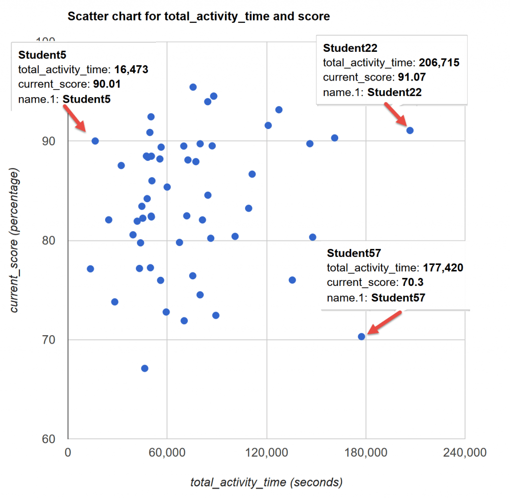
First, we are interested in learning whether there is a correlation between time spent in an LMS and performance. So we gathered LMS access data for a course and produced a scatter plot that shows the relationship between students activity time in a course and their performance on quiz. Although the scatter plot does not suggest strong relationship between course activity_time and quiz performance, it does reveal two ‘unique’ data points: One (marked as Student5) spent the least amount time (about 5 hours) in the course comparing to rest of the class, while did reasonably well on quizzes. The other one (marked as Student57) appeared to be quite active in the course (49 hours), but did not do as well as his/her peers did. Student22 seems to fit into the ‘ideal’ or ‘predictable’ model: If you spend time and study hard, you will perform well. For the sake of focus of this blog, we will only drill into file access activities for Student5 and Student57.

We know that there are many factors might have contributed to this scenario, but could comparing content access patterns between the two students shed some lights?

time-performanceThis histogram shows the frequency of times all students viewed a given course content. The x-axis represents number of times a given content was clicked/viewed, and the y-axis corresponds to the frequency of individual times. The blue dot indicates the average times a given student accessed the content, and the black dot shows the mean of entire class.In this case, on average, the number of times that student5 accessed course files is less than the class mean.

We are interested in learning what files that Student5 and Student57 most reviewed/accessed. Were their top-accessed files also frequently viewed by the entire class? Did certain course material effectively prepare students for quizzes?

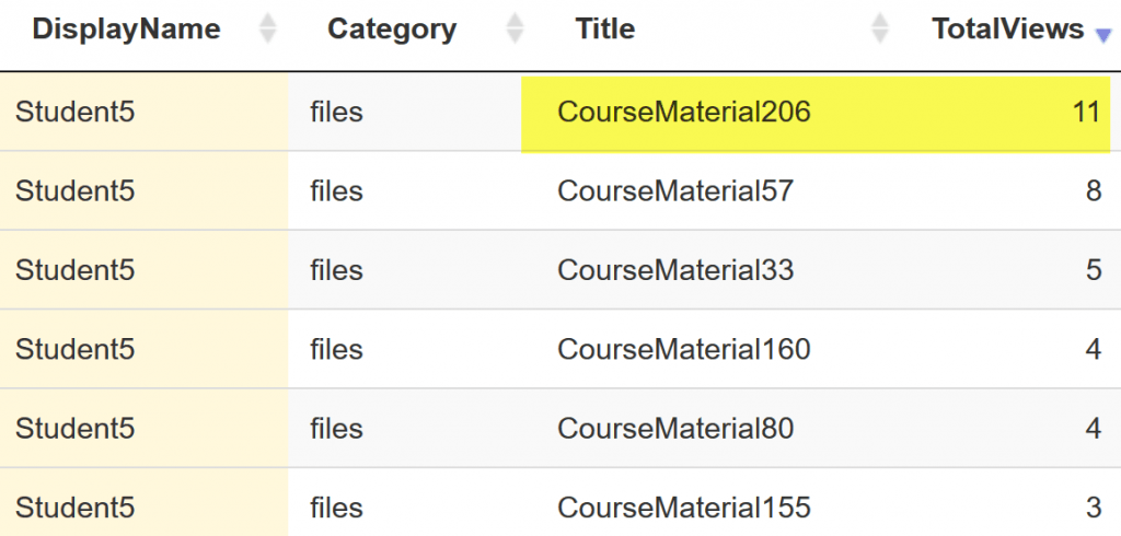
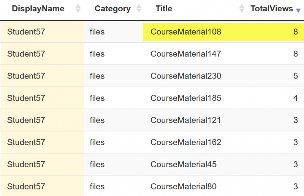
Let’s take a look of the list of files which Student5 and Student57 most frequently viewed. CourseMaterial206 and CourseMaterial108 show up as most-accessed-file for Student5 and Student57 respectively. In addition, in terms of file access, it does appear that Student5 and Student57 have different preference, because the lists of top reviewed files for the two students appear to be quite different.

Now let’s take a look of the pattern of access to the two files by the entire class. We used Sankey diagram to visualize students’ access to a course material. Return_visit refers to re-visiting a course material after an initial access, or more specific, students accessed the same material again after the day for their initial visit. New_visit indicates that a student accessed a material, but has not returned to click on the same material beyond the day made initial access.

CourseMaterial206 show up as most-frequently-accessed-file for Student5. Interestingly, we notice that all CourseMaterial206 ‘visitors’ are return ‘visitors,’ which means that students who had accessed CourseMaterial206 all came back at various points and reviewed the material (CourseMaterial206) again. In comparison, CourseMaterial108, which Student57 most frequently accessed, is less ‘popular’ than CourseMaterial206. Majority students who had accessed CourseMaterial108 did not revisit the material after initial visit.The data analysis and visualizations shed lights on good insights, but also lead to more questions: Why Student57 accessed CourseMaterial108 more times than rest of class? While didn’t Student57 review CourseMaterial206 like many of his peers did? Had Student57 been struggling with CourseMaterial108? Could additional help(intervention) or materials be provided to students like Student57?


Leveraging R Shiny as a scalable approach to analyze LMS course data

R is a free software environment for statistical computing and graphics. Shiny is an open source R package that provides an elegant and powerful web framework for building web applications straight from R.

As learning management systems (LMS) become more widely and deeply adopted to support teaching and learning, a substantial amount of data about how students participate in learning activities is available. How can we analyze the data and translate it into a useful form? How can we make the LMS data accessible to faculty to inform the efficacy of the instruction and the quality of students’ learning experience? To support the effort of exploring LMS data to address teaching and learning related questions, we leveraged R Shiny and developed a number of analytical applications that graphically analyze LMS data using R.

The following examples demonstrate three Shiny applications that analyzes and visualizes three common types of LMS (Canvas) learning data, which can be harvested using Canvas APIs:

  • Quiz submission data
  1. example Shiny app with sample quiz data https://dartmouth-edtech.shinyapps.io/samplequizexam/
  2. results interpretation and application Using quiz submission data to inform quiz design
  • Discussion interaction data
  1. example Shiny app with sample discussion interaction data https://dartmouth-edtech.shinyapps.io/networkvisualizationprototype/
  2. application one Using social network analysis to model online interactions
  3. application two Role modeling in Online discussion forums/
  • LMS access data
  1. example Shiny app with sample LMS access data https://dartmouth-edtech.shinyapps.io/contentaccessexample/
  2. data interpretation and application LMS course content access analytics

Additional resources about building Shiny apps with R: